LMD ElPack

Latest Version: 2024.2

Introduction

Boost your productivity!

LMD ElPack is a collection of more than 200 native VCL components (+ around 30 controls from shared runtime) for everyday work, that extend functionality of VCL controls, and also introduce lots of new features and customizable look-and-feel.

If you want to save time when performing routine programming and user interface tasks, if you want to provide your users with advanced user interfaces or if you want to avoid limitations (and problems) of standard Windows controls - then LMD ElPack is the right tool package for you.

LMD Innovative creates VCL tools since Delphi 1 and is dedicated to offer flexible components of superior qualitaty for a broad range of development tasks. You can trust this continuity in the future, too.

Never too much of a good thing…

LMD ElPack covers more than 200 components (+ controls of shared LMD VCL runtime) for any task you can imagine. Following component groups are only examples for the broad range of available components: LMD ElPack includes not only the famous tree- and grid controls for superior interface design - it also contains advanced tools for system programming and file access, database applications, multimedia projects, display of HTML text, printing tasks or handling resular expressions.

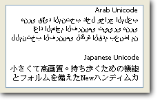
Most of the visual components support transparency, advanced font effects (3D, outline, …), different backgrounds or -effects and Windows XP Themes styles. LMD ElPack also integrates an built-in HTML engine which is used by many ElPack controls or a native Theme engine, which supports themed controls even on Win9X systems!

All together, they form a solid base for your development.

Finish your projects in record time!

We did not only create a large component suite: We want to help you to achieve your development goals fast and comfortable as well. Therefore several component and property editors are available. Examples are the Tree related editors, the new HTML Caption editor for all HTML supporting tools or the new DBRelation editor which allows specification of Master-Detail relationships visually.

Purchase ElPack once and use it everywhere…

LMD ElPack supports any version of Delphi/C++ Builder from release XE2 on. You can install precompiled packages indepently into any IDE available your system. In addition full sourcecode of complete library is included. You can use this sourcecode to add your own extensions or modifications. Registered user can download all updates with same major version number free of charge from customer areas.

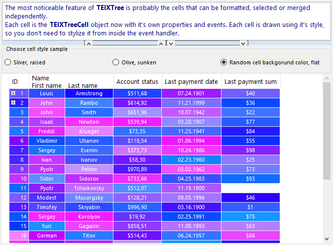
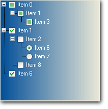
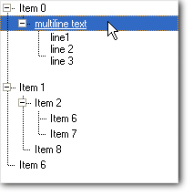
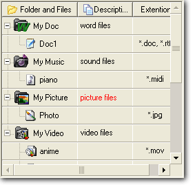
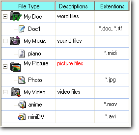
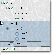
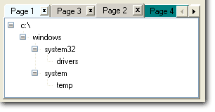
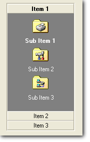
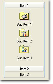
Use powerful Tree and Grid controls!

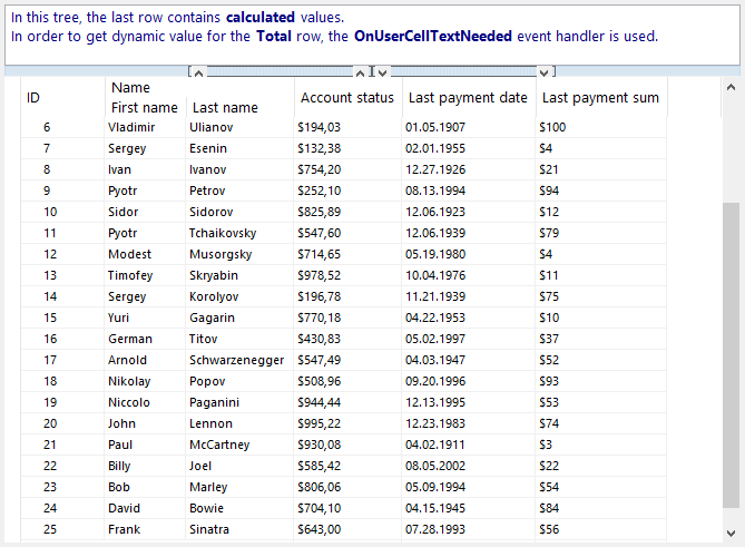
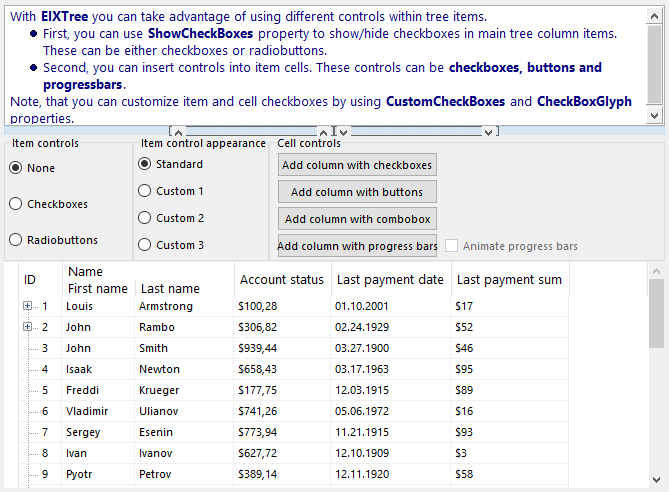
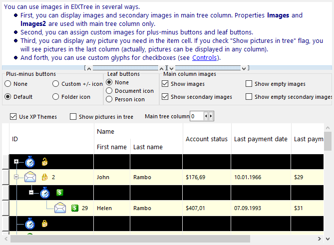
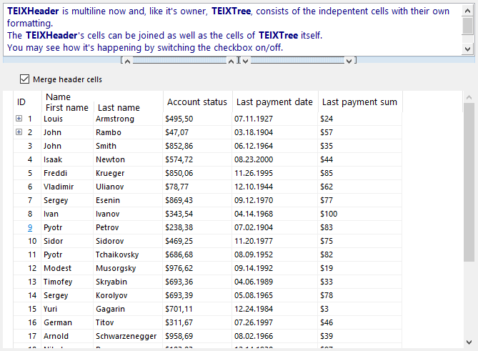
Especially TElXTree supports great features like independent item cells, cascading styles, cell merging, rectangular ranges and random cell selection, fixed top and bottom rows, new multiline header with independent cells, adjustable gutter columns, support of calculation cells with formula support and more more! Same features are certainly available for data-aware versions as well.

Team work inside!

Working in a team is more efficient. Realizing this, we added components and data containers which know and work with each other. Examples are StyleController or Form-/HTML container classes, which allow centralizing or sharing of code and resources. The result: everything fits together really well. Be suprised of what is possible!

Features

  • More than 200 components for various development tasks. The shared LMD VCL Runtime adds additional 25+ extra controls like LMD PrintPack, LMD InspectorPack, container classes (including LMD Imagelists), Vista support controls, the TLMDApplication object and much more.
  • More than 40 component and property editors
  • Powerful Tree- and Grid Controls!
  • MegaDemo project containing more than 100 single projects and additional function and feature related demos.
  • Full sourcecode of library included
  • Database, inspector, printing and shell controls are included
  • Support for Delphi/C++ Builder Release XE2 and higher
  • The current license includes access to earlier versions (e.g. 2020 to get support for compilers up to Delphi / C ++ Builder 6). If necessary, contact sales with the required product version. This will then be activated in your customer account.
  • Includes english online help files for Delphi/C++ Builder integration
  • Free updates and 1-year subscription for free major updates via Internet
  • Free technical support via public forum, e-mail, or fax

LMD ElPack Site Licenses

  • A Site License covers unlimited number of developers in same organization at one location
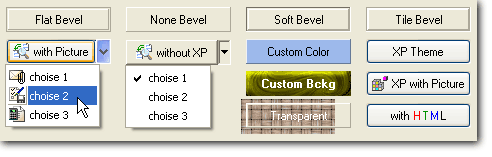
Screenshots

See also: LMD DockingPack
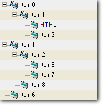
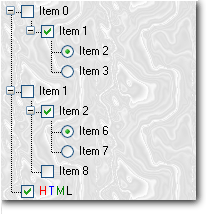
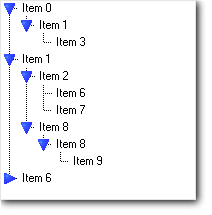
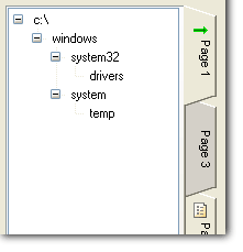
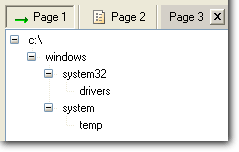
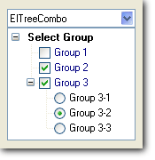
ElXTree

ElTree


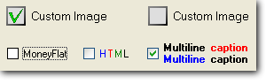
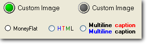
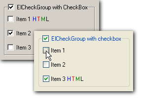
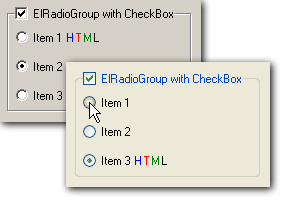
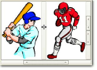
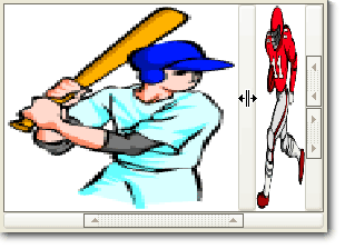
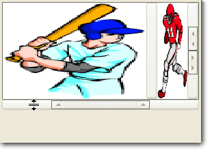
Buttons, Checkboxes and RadioButtons screenshots
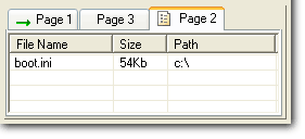
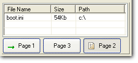
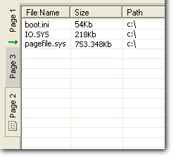
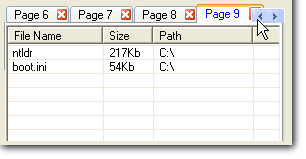
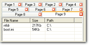
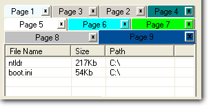
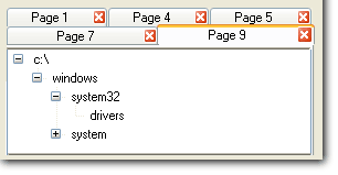
ElPageControl

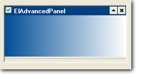
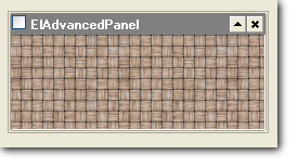
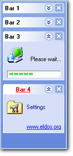
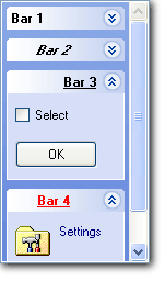
Panels, Groupboxes, Splitters, Sidebars, Explorer Bars screenshots
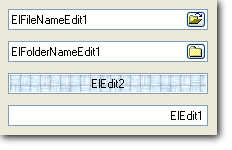
 

Edit controls

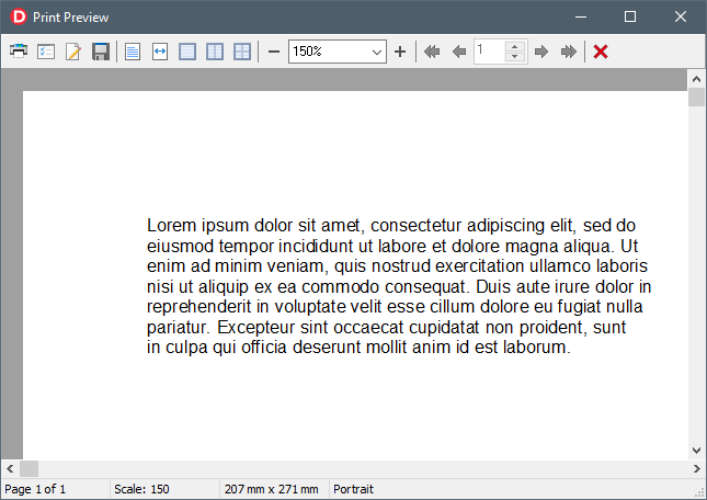
Printing and print preview
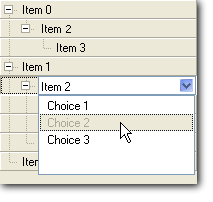
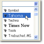
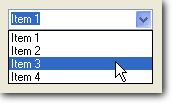
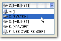
Combobox

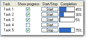
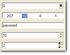
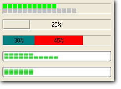
Progress bars, Trackbars, Scrollbars

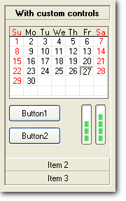
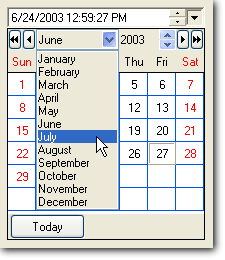
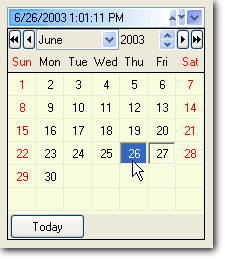
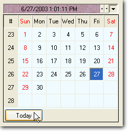
Calendars and Date & Time Pickers
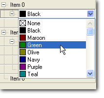
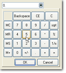
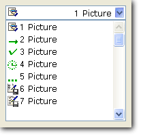
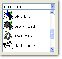
Components

TLMDErrorProvidersGroup
Allows grouping of several ErrorProvider components which can be used at the same time by a Validator component.
TLMDErrorProvider
An integrated ErrorProvider which provides several standard ways of error indication for a Validator component.
TLMDInPlaceErrorProvider
Enables a Validator component to indicate errors by changing the visual appearance of the validated control (font and background color and other effects are supported).
TLMDIconErrorProvider
Enables a Validator component to indicate errors by displaying icons near the validated control.
TLMDHintErrorProvider
Enables a Validator component to indicate errors by displaying hint messages for the validated control.
TLMDControlErrorProvider
Enables a Validator component to indicate errors by sending messages to a specified control which supports ILMDValidationMsgControl interface (e.g. LMDStatusBar, LMDListBox).
TLMDMessageBoxErrorProvider
Enables a Validator component to indicate errors by displaying a message box.
TLMDValidationGroup
Allows grouping of several Validator components to provide more complex data validation logic.
TLMDRequiredFieldValidator
A Validator which ensures that value in a control is not empty.
TLMDCompareValidator
A Validator which compares the value in the validated control with the value in some reference control.
TLMDRegExpValidator
A Validator which checks whether the string value in the control matches the specified regular expression (e.g. email address, number in certain format etc.).
TLMDRangeValidator
A Validator which checks whether a value of a validated control is within the specified range. Several datatypes are supported.
TLMDIntRangeValidator
A Validator which checks whether the integer value in the validated control is located within the specified range.
TLMDFloatRangeValidator
A Validator which checks whether the floating point value in the control is located within the specified range.
TLMDStringRangeValidator
A Validator which checks whether the string value in the control is located within the specified range.
TLMDDateTimeRangeValidator
A Validator which checks whether the date/time value in the validated control is located within the specified range.
TLMDMLGen
LMD *ML Generator separates data from presentation and lets you and your users change the format of the output text without rebuilding the application or changing the data source. *ML Generator uses a template (regular string with XML-like tags) as input and produces some output.
TLMDPrinter
TLMDPrinter is a component which handles all the low-level details of interaction with physical printer and Windows printer object hiding the complexity of Windows printing system from the user and allowing him to customize various printing settings like page margins, headers and footers etc.
TLMDPrintPreviewPanel
If you don't want to use predefined TLMDPrintPreviewDialog, this control together with TLMDPrintStatusBar and TLMDPrintToolBar can be used to implement a custom print preview.
TLMDPrintStatusBar
Use this component to add a status bar to a PreviewPanel component. It provides predefined info panels. Use it in connection to the TLMDPrintPreviewPanel component. LMD PrintPack itself makes use of it in the TLMDPrintPreviewDialog control.
TLMDPrintToolBar
A predefined toolbar for use with TLMDPrintPreviewPanel (for printing tasks).
TLMDPrintPageSetupDialog
Implements page setup dialog.
TLMDPrintDialog
Implements print dialog.
TLMDPrinterSetupDialog
Implements printer setup dialog.
TLMDStringsPrintTask
This component allows user to fully define the printable contents for printing strings.
TLMDImagePrintTask
This component allows user to fully define the printable contents for printing images.
TLMDEditPrintTask
This component allows to connect to an edit control and fetch the printable contents from it.
TLMDStringGridPrintTask
This component allows to connect directly to a string grid control and fetch the printable contents from it.
TLMDListViewPrintTask
This component allows printing of a ListView control contents in the tabular format.
TLMDPrintPreviewDialog
This component implements print preview dialog.
TLMDThemeEngineController
This component exposes some of LMDThemeEngine settings at design-time. LMDThemeEngine is one of custom LMD theme renderers, it implements support of WindowsXP styles (*.msstyles), allowing usage of custom WinXP styles in your application.
TLMDSimpleGradientThemeController
Drop TLMDSimpleGradientThemeController on a form to apply MS Office 2003-style look to LMD controls with native theme mode. Also, it allows to customize themed drawing via events.
TLMDFormThemeProvider
TLMDFormThemeProvider allows to apply themed look to form's non-client area.
TLMDSimpleGradientExtThemeController
Same as TLMDSimpleGradientThemeController, but controls TLMDSimpleGradientExtThemeRenderer.
TLMDThemesGradientThemeController
Drop TLMDThemesGradientThemeController to a form to add MS Office 2007/2010 styled look to LMD controls with native theme mode.
TLMDThemesRibbonAdapter
TLMDThemesRibbonAdapter allows to customize look of ribbon control.
TLMDPluginManager
This component allows to design easily host applications that can be enhanced by pluggable modules. PluginPack implements plugin framework with flexible architecture: modules can be easily compiled into the host application executable (e.g. for debug purposes, speed/resource usage optimization etc) and detached back with no efforts
TLMDSimplePropInspector
TLMDSimplePropInspector allows to use Delphi-like object inspector in your application.
TLMDDockSite
Main component of LMD DockingPack. Add to your applications advanced docking features with docked and floating panels as known from MS applications like Visual Studio!
TLMDDockManager
This control is used to save/restore layout data from/to XML in LMD-DockingPack. It also used to setup visual style related properties.
TElPopupMenu
TElPopupMenu is a popup menu with Unicode support. It also introduces Office XP and Windows XP styles.
TElMenuBar
TElMenuBar controls are used to provide floating menu bars.
TElBiProgressbar
Progress bars provide users with visual feedback about the progress of a procedure within an application. ElBiProgressBar shows the progress in two different colors allowing to display the progress of current operation and total progress. For example, when copying multiple files, your program can use ElBiProgressBar to show the progress of copying every file and status of the complete operation.
TElRadioGroup
TElRadioGroup replaces the standard TRadioGroup, and offers flat buttons style and transparency. Radio button text can be multiline and both radio button text and radiogroup caption can contain HTML formatting. Also, you can choose which sides of the frame rectangle are drawn. The TElRadioGroup component supports Unicode.
TElGraphicButton
ElGraphicButton is a replacement for TSpeedButton. ElGraphicButon is an acestor for TElToolButton. ElGraphicButton is similar to ElPopupButton but doesn't have a window handle. So ElGraphicButton can't be focused. It can show a glyph, caption or both. Glyphs can be taken from bitmap, icon or imagelist. The control supports transparency or custom backgrounds.
TElCheckGroup
The TElCheckGroup control represents a set of options for the user. Each checkbox in the group can have it's own caption and hint and independent state. The whole group can be enabled or disabled using CheckGroup caption checkbox. CheckGroup checkboxes support custom glyphs, Flat behavior (with standard glyphs), transparency, playing sound when the checkbox is being checked and provide XP Themes/Unicode support.
TElRadioButton
TElRadioButton replaces the standard TRadioButton and offers several additional features. TElRadioButton supports custom glyphs, Flat behavior (with standard glyphs), transparency, playing sound when the radio button is being checked and XP Themes/Unicode support. ElRadioButton doesn't introduce new properties, but changes some ElCheckItem's behaviour (the one related to radio buttons).
TElCheckBox
The TElCheckBox control provides an option for the emduser. The user can check the box to select the option, or uncheck it to deselect the option. TElCheckBox supports custom glyphs, Flat behavior (with standard glyphs), transparency, playing sound when the checkbox is being checked and XP themes/Unicode support.
TElGroupBox
TElGroupBox is the panel with border lines and caption (with optional checkbox) that is used to group several controls visually. It replaces the standard TGroupBox and supports transparency, HTML captions and selective frame sides. Also Unicode is supported.
TElPanel
ElPanel represents an extended Delphi panel. ElPanel is able to draw custom background, allows transparency and provides moving and resizing features at runtime.
TElSpinButton
TElSpinEdit component is a nice way to specify numeric values. The value can be changed by pressing keys, clicking on the buttons or dragging the divider (the one between arrow buttons).
TElSpeedButton
TElSpeedButton is a rounded button control, that provides some unique features like pull-down menu and flat form. User can display the menu down by pressing and holding the specified mouse button.
TElPopupButton
ElPopupButton provides the look and feel of Internet Explorer buttons. It can display an associated popup menu, provides "flat" display, and it is a windowed control (so it can receive focus).
TElLabel
TElLabel extends TLabel with unicode support features and additional visual effects.
TElMainMenu
TElMainMenu is a descendant of TMainMenu component that supports Unicode captions and custom drawing styles.
TElScrollBar
Replacement for standard TScrollBar component with advanced features like optional flat and no-borders style, blended or solid scroll field, automatically enabled/disabled arrows etc.
TElStyleManager
TElStyleManager handles component style sheets and allows changing appearance of controls at runtime using style sheets (by using only one centralized control).
TElTreeStringGrid
ElTreeStringGrid is a special sort of ElTree, that has the same properties, events and methods as TStringGrid does. And at the same time ElTreeStringGrid keeps all power of ElTree available. ElTreeStringGrid component supports Unicode. You can use ElTree inplace editors with TElTreeStringGrid. Alternatively, TElTreeStringGrid contains a built-in inplace editor similar to grid's inplace editor.
TElXTree
<b>TElXTree represents a 100% native VCL replacement for ListView, TreeView, ListBox, CheckList, RadioGroup and any Custom Grid! It replace the former TElTree control providing exciting new features.</b> Both ElXTree and ElTree are fully customizable visual components, that can represent virtually any type of data (both in hierarchical and list forms). It is excellent for exploring databases, directory structures, registries, or any other type of data, that are built like a tree. You don't need to use the combination of TTreeView and TListView anymore - TElTree gives you all their power. ElTree is also very useful for building multi-columned list boxes, radio groups and CheckLists. Common features are:<ul><li>complete Unicode support<li>HTML formatting with hyperlinks and images in every cell<li>right-to-left tree order support and right-to-left text support (for Hebrew and Arabic languages)<li>checkboxes and radiobuttons (both Windows and custom glyphs are supported).<li>filtered display of items. Unique! You can set items as hidden and it won't be displayed or (optionally) processed when selecting a range of items. This allows you to use just one control instead of several controls on the same place.<li>additional columns for every item<li>multiple selections<li>custom background images<li>auto-sizing support. When the user double-clicks the resize area of the header section ElTree can resize the section according to the optimal width of the underlying column.<li>customizable colors and fonts for every cell<li>items of different height<li>(optional) non-scrollable column<li>button-like style for items. Every item is drawn as a button, and focused item is drawn like pushed button<li>customizable drag'n'drop<li>OLE drag'n'drop support<li>smart line hints<li>item lookup (optional automatic lookup for every column)<li>inplace editing for every cell<li>owner-drawn items and cells<li>smart pictures displaying<li>draggable and resizable columns<li>filtering support (every header section can have a filter mark and fire an event when the mark is clicked)<li>almost complete compatibility with TTreeView</ul><br><p><b>ElXTree</b> adds among other features following notable enhancements:</p><ul><li>independent item cells;</li><li>cascading styles;</li><li>cell joining;</li><li>rectangular range and random cell selection;</li><li>fixed top and bottom rows;</li><li>multiline header with independent cells;</li><li>adjustable gutter column.</li></ul></p>
TElTree
ElTree is a fully customizable visual component, that can represent virtually any type data (both in hierarchical and list forms). It is excellent for exploring databases, directory structures, registries, or any other type of data that is built up like a tree. You don't need to use the combination of TTreeView and TListView anymore - TElTree gives you all their power. ElTree is also very useful for building multi-columned list boxes, radio groups and CheckLists. And it adds full Unicode support. <b>This control is replaced by TElXTree from ElPack 5.0 on.</b>
TElTreeInplaceButtonEdit
TElTreeInplaceButtonEdit is a specialized inplace editor for editing text and memo cells. It uses ElButtonEdit component to provide edit features.
TElTreeInplaceCheckBoxEdit
TElTreeInplaceCheckBoxEdit is a specialized inplace editor for editing boolean cells. It uses TElCheckBox component to provide edit features.
TElTreeInplaceTreeComboEdit
TElTreeInplaceTreeComboEdit is a specialized inplace editor that uses TElTreeCombo component to provide edit features.
TElTreeInplaceFloatSpinEdit
TElTreeInplaceFloatSpinEdit is a specialized inplace editor for editing floating-point cells. It uses TElFloatSpinEdit component to provide edit features.
TElTreeInplaceColorCombo
TElTreeInplaceColorCombo is a specialized inplace editor for editing color values. It uses TElColorCombo component to provide edit features.
TElTreeInplaceSpinEdit
TElTreeInplaceSpinEdit is a specialized inplace editor for editing numeric cells. It uses TElSpinEdit component to provide edit features.
TElTreeInplaceMemoEdit
TElTreeInplaceMemoEdit is a specialized inplace editor for editing text and memo cells. It uses TElAdvancedMemo component to provide edit features.
TElTreeInplaceMaskEdit
TElTreeInplaceMaskEdit is a specialized inplace editor for editing floating-point cells. It uses TElMaskEdit component to provide edit features.
TElTreeInplaceCurrencyEdit
TElTreeInplaceCurrencyEdit is a specialized inplace editor for editing currency cells. It uses TElCurrencyEdit component to provide edit features.
TElTreeInplaceAdvancedEdit
TElTreeInplaceAdvancedEdit is a specialized inplace editor for editing text cells. It uses ElAdvancedEdit component to provide edit features.
TElTreeInplaceModalEdit
TElTreeInplaceModalEdit can be used when the application needs to display a modal dialog instead on inplace editor control. Handle OnExecute event and display the dialog in the event handler.
TElTreeInplaceDateTimePicker
TElTreeInplaceDateTimePicker is a specialized inplace editor for editing datetime (in Standard package), date and time cells. It uses TDateTimePicker component in Lite package and TElDateTimePicker in Standard package to provide edit features.
TElTreeInplaceComboBox
TElTreeInplaceComboBox is a specialized inplace editor for editing enum cells. It uses TElAdvancedComboBox component in Standard package and TComboBox in Lite package to provide edit features.
TElTreeInplaceCheckBox
TElTreeInplaceCheckBox is a specialized inplace editor for editing boolean cells. It uses TCheckBox component to provide edit features.
TElTreeInplaceMemo
TElTreeInplaceMemo is a specialized inplace editor for editing text and memo cells. It uses TMemo component to provide edit features.
TElTreeInplaceEdit
TElTreeInplaceEdit is a specialized inplace editor for editing text cells. It uses TEdit component to provide edit features.
TElCalculatorEdit
ElCalculatorEdit is an editor control with attached drop-down calculator. The user can click the button to invoke calculator, do the calculations and put the result to the edit.
TElHotKey
ElHotKey is a descendant of ElEdit for specifying a key combination (shortcut, hotkey).
TElFolderNameEdit
TElFolderNameEdit is a specialized component for entering file names. The user can press a button or predefined key shortcut and invoke a folder selection dialog. After the user selects a folder in the dialog, control's edit field is filled with selected folder name.
TElFilenameEdit
TElFileNameEdit is a specialized component for entering file names. The user can press a button or predefined key shortcut and invoke a file open dialog. After the user selects a file in the dialog, control's edit field is filled with selected file name.
TElIPEdit
TElIPEdit is a replacement for standard Windows IP Edit control. It doesn't require IE 4.0 or any other DLL. You can restrict editing operation to only some parts of IP address (thus letting enter only address masks). ElIPEdit supports flat borders.
TElCurrencyEdit
TElCurrencyEdit is a specialized control for editing currency values. ElCurrencyEdit supports flat and selective borders, system or custom currency sign. ElCurrencyEdit supports a button for custom actions.
TElMaskEdit
TElMaskEdit is a MaskEdit with additional properties for user interface customization. Such properties include border control, background settings etc.
TElFloatSpinEdit
TElFloatSpinEdit component is a nice way to input floating-point values. The value can be changed by pressing keys, clicking on the buttons or dragging the divider (the one between arrow buttons).
TElSpinEdit
TElSpinEdit component is a nice way to input numeric values. The value can be changed by pressing keys, clicking on the buttons or dragging the divider (the one between arrow buttons).
TElButtonEdit
TElButtonEdit component extends the TEdit control to allow the user perform additional actions while text is entered into the control. The control consists of a text edit field and up to two visible buttons on the right side (Button and AltButton). Each of the buttons can have it's own settings andgenerates its own events. For example, if you implement filename editor component, you may use one button to invoke the open dialog, and the second button to display the list of most recently entered file names, or suggested file names.
TElMemo
TElMemo is a replacement for TMemo controls which supports Unicode on both WinNT/2000/XP and Win9X/WinME, can be transparent, supports custom backgrounds and much more.
TElAdvancedMemo
TElAdvancedMemo enhances functionality of standard Memo control by adding customizable border styles for both active and inactive states, transparency, custom background and selective borders.
TElEdit
TElEdit is a replacement for TEdit/TMemo controls which supports Unicode on both WinNT/2000/XP and Win9X/WinME, which can work both in single-line and multiline mode, can be transparent, supports custom backgrounds and much more.
TElAdvancedEdit
TElAdvancedEdit enhances functionality of standard Edit control in single-line mode, adding customizable border styles for both active and inactive states, transparency, custom background and selective borders.
TElDataTimePicker
TElDateTimePicker allows input of date and time values at the same time. The control supports ElImageForm and transparency, flat borders and pull-down calendar.
TElSuperEdit
super edit
TElListBox
TElListBox is a control based on Windows ListBox control. Unlike TListBox this control supports Unicode text on all Windows platforms.
TElComboBox
This class is a replacement for the Windows combobox. It features alternative button, support for background image, customizable colors for the list box etc.
TElDriveComboBox
TElDriveComboBox is a component for selecting a drive. You can limit selection to a certain type of drive.
TElAdvancedComboBox
TElAdvancedComboBox is based on Windows COMBOBOX control. It adds additional properties that control appearance of the component -- border styles, custom background, ImageForm support etc.. TElAdvancedComboBox is NOT Unicode-enabled. For Unicode functionality see TElComboBox control.
TElImageComboBox
ElImageComboBox is designed for selecting an image from the imagelist. Both image and image index (or image name or whatever you substitute) are displayed for every item. As with all combo boxes, styled borders are supported to keep consistency of your user interface.
TElTreeCombo
ElTreeCombo combines an edit control with ElTree. Imagine what can be done with ElTree. Now you can put ElTree into a combo box and have all its power inside. It's perfect for organizing lists that need to display in a dropdown!
TElMemoCombo
TElMemoCombo is a combobox for editing multi-line text. It looks like an edit box with button, and it drops down, memo appears. As with all combo boxes, styled borders are supported to keep consistency of your user interface. Currently ElMemoCombo does not support Unicode
TElFontComboBox
Use TElFontComboBox for selecting a font. ElFontComboBox lets you select which fonts will be available for selection and shows sample text (Unicode text is possible).
TElAdvancedListBox
TElAdvancedListBox is based on Windows LISTBOX control. It adds additional properties that control appearance of the component -- border styles, custom background, ImageForm support etc.. TElAdvancedListBox is NOT an Unicode-enabled control.
TElColorCombo
ElColorCombo allows the user to easily select colors. Clicking on a down arrow will offer a pull-down menu, and clicking on a rest of ElColorCombo will show the Windows color selection dialog.
TElFormPersist
ElFormPersist component allows to save and restore form's (state, size, position, active control) and components' properties in the ElIniFile (and in Registry). It may be also used to prevent form resize, and to make the form TopMost. The data is stored when the form is being hidden or destroyed. The data is restored when the form is being shown. Components properties list to save and restore can be defined in design-time.
TElRegExpr
Use this control to handle any kind of regular expressions (e.g. test for eMail-addresses, text expressions etc.).
TElExpressionEval
Use this control to evaluate any kind of math expression (custom functions, custom variables and so on are supported!).
TElAppBar
Application Bars are special windows, that are docked to one of the screen edges. Windows TaskBar and MSOfice Bar are also AppBars. AppBar can behave as a usual window when it is floating, or dock to the edge. Now more and more applications get the AppBar behaviour. Especially useful is AppBar's feature to hide automatically to the edge of the screen when the user moves focus away from the bar, and poping up when the user moves the mouse cursor over the window.
TElTopmost
Use this component to control TopMost state of VCL form. Unlike VCL's fsTopMost flag, this property correctly handles application deactivation and keeps the form topmost even when the application is inactive.
TElPowerManager
TElPowerManager component tracks power management events and notifies the application about them.
TElFlatMultiController
Being dropped on the form, this component turns all WinControl's descendants, that have a border, to flat. Flat border is drawn using only two colors, defined by clBtnFace and clWindow. When the control is not focused and there is no mouse cursor over it, the control looks flat. It's scrollbars (if any) also look flat. When the user moves the mouse over the control or focused the control, this control becomes usual control with 3-d border. Scrollbars optionally become 3-d too. Or they may stay flat, if you like.
TElFlatController
This component turns any WinControl's descendant, that has a border, to flat. Flat border is drawn using only two colors, defined by clBtnFace and clWindow. When the control is not focused and there is no mouse cursor over it, the control looks flat. It's scrollbars (if any) also look flat. When the user moves the mouse over the control or focused the control, this control becomes usual control with 3-d border. Scrollbars optionally become 3-d too. Or they may stay flat, if you like.
TElStyleController
TElStyleController is a component, that, when linked to TElStyleManager and to TControl, lets you change control's properties with TElStyleManager features. ElPack controls support style manager directly. To allow other (non-ElPack) controls support Style Manager, use TElStyleController.
TElClipboardMonitor
TElClipboardMonitor monitors the clipboard and generates an OnChange event, when the clipboard contents has changed. It also provides a way to access the data that is available in Clipboard.
TElTrayInfo
ElTrayInfo is a MessageBox-like component for notifying users about some events. ElTrayInfo represents a small window with icon that is displayed near system tray. This window can contain HTML-formatted text and react on clicks. 3.20: Also, you can add a Close button to TrayInfo window so that the user can close the message. This is similar to Windows XP baloon notifications.
TElImageForm
TElImageForm component is used for three purposes: To create forms with custom shapes (usually, non-rectangular), to offer flexible backgrounds for forms or to provide support for pseudo-transparent controls.
TElTimerPool
Using one TimerPool component one can avoid using lots of timer resources and also get precise timing since the TimerPool can optionally use multimedia timer, which is much more precise, than regular Windows timer.
TElHook
This component can be used to "hook" the messages, that are send to the window (actually, WinControl descendant object). Hooking the messages is useful when you need to change or track the component's reaction on some message. ElHook is used widely in ElPack itself.
TElDropTarget
ElDropTarget component turns a WinControl descendant, associated with its property into an OLE drop target, so that the user can drop some data into it.
TElMouseHint
ElMouseHint represents a component to explicitly show or hide a hint window that follows the mouse cursor while cursor is in some control.
TElSoundMap
TElSoundMap component is extremly useful to centralize an store sound data, that is used by your application. ElSoundMap can keep sounds information in Windows registry in format, that allows the user to tune up sounds using Sounds Control Panel applet (!), or use ElIniFile to store the configuration. For each sound to be played you just specify the name of the WAV file and that's all. Other parameters like the Sound Event Label are optional. You can work with the sound map either at design- or at runtime, turn off all sounds (make the application mute) or just one sound.
TElVersionInfo
TElVersionInfo component is used to read VersionInfo resource from the specified file (current module if no file is specified).
TElImageList
ElImageList doesn't introduce new methods and properties. It only fixes a bug with standard ImageList, that "loses" the images, when different versions of comctl32.dll are used. Also, ElImageList stores images in RLE-compressed form, thus making your form and application executable smaller.
TElFormCaption
Use ElFormCaption component to customize form's caption look and feel - to draw the caption in gradient color or using bitmap and to add colored caption text and additional buttons to the form caption.
TElTrayIcon
The ElTrayIcon component is used to add an icon to the system tray. Regular and animated icons can be added. Also, ElTrayIcon supports extended hint forms, and hides taskbar icons automatically when the application is minimized.
TElSysHotKey
The TElSysHotkey component allows you to define systemwide hotkeys.
TElOneInstance
ElOneInstance component allows your program to be run only once. When the second instance of the program is started you can define an action, or just switch to the first instance. The parameters of the second instance are passed to the first instance.
TElStringPool
ElStringPool is a container for strings, that can be placed to the form or data module. Unlike TStringList, you can easily add multiline elements to ElStringPool at designtime.
TElMRU
TElMRU component is a powerful MRU manager that is capable to store several lists of most recently used items in several sections and display them in a multicolumn menus with section captions. MRU contents can be stored in ElIniFile. TElMRU is able to work with a menu item and a popup menu at the same time.
TElIniFile
ElIniFile component is the powerful replacement for (and a combination of) TRegistry and TIniFile. ElIniFile allows you to store hierarchically organized data in a text file. ElIniFile stores boolean, integer, string, StringList and binary data in a usual text file, that can be opened with any text editor. The data in ElIniFile are organized into keys and values. Both keys and values can have some data, but keys are similar to IniFile sections (they contain values) and can also contain subkeys.
TElURLLabel
TElURLLabel is a simple TLabel descendant for displaying URLs and automatically processing user clicks. It also offers default menu with Copy and Open commands that let the user open the given URL and Copy it to the clipboard.
TElCalculatorDialog
ElCalculatorDialog is a simple calculator dialog. Use it separately or in connection with the edit control to let the user calculate and enter values.
TElInputDialog
TElInputDialog is a simple replacement for InputBox function. It supports flat buttons and edit fields, so when you use flat controls this dialog won't break your UI style. Also, ElInputDialog lets you show HTML-formatted prompt text. Improved InputQuery function is also available.
TElCalendarDialog
TElCalendarDialog component can be used to display a modal window with calendar and navigation buttons. The user can also select a date using this window. All TElCalendarDialog properties correspond to TElCalendar's properties.
TElDailyTipDialog
This component offers a simple "Tip of the Day" dialog. It picks tip text from resource strings. Tip ID is chosen randomly.
TElFolderDialog
This class is derived from TCommonDialog for representing a TElFolderDialog - folder selection dialog. ElFolderDialog lets you set custom root folder and initial selected folder.
TElPromptDialog
TElPromptDialog supports display of an input dialog for a certain amount of time -- the dialog is closed automatically after specified period if the user doesn't close the dialog. TElPromptDialog supports HTML formatted text with embedded images and hyperlinks.
TElHTMLContainer
Container for HTML snippets, providing a simple HTML-Editor for fast input of text. Furthermore automatic links between different text snippets in a container are supported when used with other TElHTML[..] controls like TLElHTMLView (thus simple hypertext funtionality is possible without much effort).
TElHTMLPanel
TElHTMLPanel represents a panel control which can have an HTML-formatted caption and which includes support for images and links. TElHTMLPanel doesn't provide any new functionality and only exposes properties of TCustomElHTMLPanel.
TElHTMLView
TElHTMLView represents a native control for viewing HTML-formatted text. TElHTMLView supports extended scrollbars and custom backgrounds.
TElHTMLComboBox
TElHTMLListBox represents an extented version of the standard combobox control. It handles all items as HTML-formatted text and displays them accordingly.
TElHTMLListBox
ElHTMLListBox represents an extented version of the standard listbox control. It handles all items as HTML-formatted text and displays them accordingly.
TElHTMLLabel
HTMLLabel lets you display static HTML-formatted text. Embedded images and links are supported.
TElAdvancedPanel
TElAdvancedPanel is a sophisticated panel that consists of two parts - caption panel with two buttons (Minimize and Close) and main panel that is a real panel where you put controls. Each part can have HTML-formatted text and caption has customizable color.
TElHTMLHint
ElHTMLHint component allows creation of HTML-formatted hints for your application. In addition it adds notification events when application displays or hides hint window.
TElDBTreeNavigator
TElDBTreeNavigator represents a specialized DBNavigator control, which provides additional features and support functionality browsing data which is displayed by a TElDBXTree control.
TElDBNavigator
TElDBNavigator is a replacement for TDBNavigator control which is descendant of ElToolBar control. TElDBNavigator offers you an extended set of buttons, more functionality and customization.
TElDBHTMLView
TElDBHTMLView is the DB-aware version of TElHTMLView control. It provides you with the same features as TElHTMLView does and also can be bound to the DataSource to give the user posibility to view the data in the dataset.
TElInspectorDBDataSource
Use this control to fill property inspector control with content of database tables. Using this control interactive browsing of database records is possible!
TElDBLabel
TElDBLabel is the DB-aware version of TElHTMLLabel control. It provides you with the same features as TElHTMLLabel does and also can be bound to the DataSource to give the user posibility to view the data in the dataset.
TelDBRadioGroup
TElDBRadioGroup is the DB-aware version of TElRadioGroup control. It provides you with the same features as TElRadioGroup does and also can be bound to the DataSource to give the user posibility to edit the data in the dataset.
TElDBCheckBox
TElDBCheckBox is the DB-aware version of TElCheckBox control. It provides you with the same features as TElCheckBox does and also can be bound to the DataSource to give the user posibility to edit the data in the dataset.
TElDBTreeLookupComboGridEdit
TElDBTreeLookupComboGridEdit is an inplace editor used with TElDBTree and TElDBTreeStringGrid components. It provides an instance of TElWideDBLookupComboGrid control for editing operation.
TElDBTreeLookupComboBoxEdit
TElDBTreeLookupComboEdit is an inplace editor used with TElDBTree and TElDBTreeStringGrid components. It provides an instance of TElDBLookupComboEdit control for editing operation.
TElDBTreeComboBoxEdit
TElDBTreeComboBoxEdit is an inplace editor used with TElDBTree and TElDBTreeStringGrid components. It provides an instance of TElDBComoBoxEdit control for editing operation.
TElXRelDataSource
This container control designed for TElDBXTree allows specification of several data sources relations between them. Supported datasources are all TDataSet descendants (TQuery, TTable). Relations between data are built on Master-Detail or SelfReference principle and are stored in TElRelations collection.
TElDBXTreeStringGrid
This grid provides grid-like features of TElDBXTree and is simplier to use when only grid display is required.
TElDBXTree
Use this visual component to display hierarchical data from your databases. The hierarchies are built using TElXRelDataSource class: the information about data sets and relations between data sets is taken from an instance of TElXRelDataSource component. TElDBXTree is a descendant of ElXTree, so when displaying the data you can use all functionality fo ElXTree. You can display the data from several fields, show images, show hints taking them from the database and so on.
TElDBTreeMemoEdit
TElDBTreeMemoEdit is an inplace editor used with TElDBTree and TElDBTreeStringGrid components. It provides an instance of TElDBMemoEdit control for editing operation.
TElDBTreeWideStringEdit
TElDBTreeWideStringEdit is an inplace editor used with TElDBTree and TElDBTreeStringGrid components. It provides an instance of TElDBWideStringEdit control for editing operation.
TElDBTreeCheckBoxEdit
TElDBTreeCheckBoxEdit is an inplace editor used with TElDBTree and TElDBTreeStringGrid components. It provides an instance of TElDBCheckBoxEdit control for editing operation.
TElDBTreeSpinEdit
TElDBTreeSpinEdit is an inplace editor used with TElDBTree and TElDBTreeStringGrid components. It provides an instance of TElDBSpinEdit control for editing operation.
TElDBTreeFloatSpinEdit
TElDBTreeFloatSpinEdit is an inplace editor used with TElDBTree and TElDBTreeStringGrid components. It provides an instance of TElDBFloatSpinEdit control for editing operation.
TElDBTreeCurrencyEdit
TElDBTreeCurrensyEdit is an inplace editor used with TElDBTree and TElDBTreeStringGrid components. It provides an instance of TElDBCurrensyEdit control for editing operation.
TElDBTreeDateTimePickerEdit
TElDBTreeDateTimePickerEdit is an inplace editor used with TElDBTree and TElDBTreeStringGrid components. It provides an instance of TElDBdateTimePickerEdit control for editing operation.
TElDBTreeEdit
TElDBTreeEdit is an inplace editor used with TElDBTree and TElDBTreeStringGrid components. It provides an instance of TElDBEdit control for editing operation.
TElDBTree
Use this visual component to display hierarchical data from your databases. The hierarchies are built using TElRelDataSource class: the information about data sets and relations between data sets is taken from the instance of TElRelDataSource component, linked to the tree through tree's DataSource field. The root level will display the root dataset. Then the relations between datasets will be checked. If the rule, where root data set is a master data set, is found, this rule is used tobuild the next data level, which are picked from the corresponding data set. The detail dataset becomes master for the next level when searching for the next rule. The process continues while the rule is found and the number of levels does not exceed the maximum specified by the user. TCustom ElDBTree is a descendant of ElTree, so when displaying the data you can use all functionality fo ElTree. You can display the data from everal fields, show images, show hints taking them from the database and so on.
TElRelDataSource
This is a container object that lets you specify several data sources and specify relations between that data sources. Data sources supported are TDataSet descendants (TQuery, TTable). Relations between data are built on Master-Detail or SelfReference principle and are stored in TElRelations collection.
TElDBTreeStringGrid
TCustomElDBTreeGrid implements grid-like behaviour in ElDBTree and lets you create all sorts of grids using ElDBTree as a backend.
TElXTreePrinter
TElXTreePrinter is a specialized component derived from TElPrinter to print content of ElXTree controls.
TElTreePrinter
TElTreePrinter is a specialized component to print ElTree contents using ElPrinter.
TElPrinter
TElPrinter represents a component that provides printing capabilities with Preview and SaveToFile features in your application. Use TElPrinter like TPrinter to render multi-page data, preview and modify them and send them to printer.
TElShellComboBox
Specialized combobox for display of directory trees (like in Windows Explorer).
TElShellList
Specialized listview for file display (like in Windows Explorer).
TElShellTree
Specialized treeview for display of directory trees (like in Windows Explorer).
TElXHeader
Represents a fully rewritten header control, that provides developers and end users more features than the VCL THeader control. The user can drag the sections in ElHeader, sections can have sort marks etc. ElHeader supports Unicode. Against the TElHeader control which was already available in previous ElPack releases this control supports the extended features of TElXTree (e.g. merged header cells etc.).
TElHeader
Represents a completely rewritten header control, that gives the developer and the user more capabilities than the VCL THeader control. The user can drag the sections in ElHeader, sections can have sort marks etc. ElHeader supports Unicode.
TElFormPageControl
This control provides all features of TLMDElPageControl, but similar to TLMDFormDisplay this control can display standard TForm descendants instead if internal stored pages. Such forms can be stored e.g. externally in TLMDFormContainer and thus shared among different controls.
TElPageControl
TElPageControl is a replacement for Windows page control component. ElPageControl contains a set of enhancements, adds new .NET style and is free from limitations of windows control (such as single-line vertically arranged tabs, possibility to hide borders while keeping tabs visible etc.).
TElHistogram
TElHistogram represents a visual control to display simple graphs.
TElStatusBar
TElStatusBar replaces the standard Windows statusbar control and adds enhanced features and special support for Delphi controls. ElStatusBar is compatible with standard TStatusBar, though..
TElToolBar
ElToolBar is a native replacement for standard Windows toolbar. It can act as container for ElToolButtons and other controls which are placed on the toolbar. As an ElPanel descendant, it offers custom backgrounds and is moveable and resizeable at runtime.
TElCalendar
ElCalendar component is an advanced calendar. It displays week-ends with a different color, displays week numbers, holiday marks, tracks periods ...
TElGraph
TElGraph component can be used to display multi-entry realtime graphs similar to the ones available in Task Manager.
TElClock
TElClock is a simple TCustomPanel descendant, that can be used to display current time. You can set it up to show time of any windows time zone. You can use a predefined time format or you can customize the time format as you desire. ElClock can also work as a timer, counting time from zero. It can also work as a countdown, counting time from the specified seconds to zero and firing an event when finished.
TElSplitter
TElSplitter provides autosnap feature (automatically hides left or right pane when panel's size is less than specified minimum). In addition TElSplitter automatically tracks Visible state change of the panes and hides them automatically when one or both panes are hidden.
TElTrackBar
TElTrackBar is a replacement for Windows trackbar control that is more flexible and that provides ownerdraw functions.
TElFormDisplay
This small but very useful component displays forms like a panel within the component. This is not only useful for faster loading of forms but also much more resource friendly than e.g. using a TNotebook. Besides forms are much easier reusable in other projects than pages of a TNoteBook or similar component. Different forms can be stored externally e.g. in TLMDFormContainer. This way simplifies reuse of certain form arrays (which can be mixed with HTML pages).
TElFormContainer
TElFormContainer allows specification of form arrays or HTML pages for use with TElFormDisplay and TElPageControl components This control simplifies reuse of certain form/HTML page arrays.
TElExplorerBar
TElExplorerBar is a sidebar similar to the one found in Explorer in Windows XP. You can place one or more groups to this bar, each group being a descendant of TElAdvancedPanel. Use AddPanel method to add new group, then access groups directly to add controls there.
TElScrollBox
TElScrollBox is a descendant of the VCL ScrollBox component that supports custom background, custom borders, pseudo-transparency, flat scrollbars and XP styles.
TElSideBar
ElSideBar is yet another implementation of the well-known OutlookBar. ElSideBar sections however can contain other controls, thus making ElSideBar act as a PageControl.
TElGauge
ElGauge can be used to display percentage or status information using a gauge or pie graph display.
TElDragDrop
TElDragDrop is a visual component, that can act as Drag Source and Drop Target for OLE drag'n'drop applications. By default, TElDragDrop shows some picture (it has Picture property), but OnPaint event allows to draw something else.
TElDBLookupComboBox
ElDBLookupComboBox is a replacement for VCL TDBLookupComboBox component.
TElDBLookupListBox
TElDBLookupListbox is a replacement for VCL TDBLookupListBox control. Use TElDBLookupListBox to provide users with a convenient list of lookup items to set a field value using the values of a field in another dataset. Lookup list boxes usually display values that are a represent a more meaningful description of the actual field value.
TElWideDBLookupComboGrid
The TElWideDBLookupComboGrid works similar to a DBLookupComboBox but allows selection of field values from a displayed grid.
TElWideDBLookupCombobox
TElWideDBLookupComboBox is a unicode analog for TElDBLookupComboBox.
TElWideDBLookupListBox
TElWideDBLookupListBox is a unicode analog for TElDBLookupListBox. Use TElWideDBLookupListBox to provide users with a convenient list of lookup items to set a field value using the values of a field in another dataset. Lookup list boxes usually display values that are a represent a more meaningful description of the actual field value.
TElDBComboBox
TElDBComboBox is the DB-aware version of TElHTMLComboBox control. It provides you with the same features as TElHTMLComboBox does and also can be bound to the DataSource to give the user posibility to edit the data in the dataset.
TElDBListBox
TElDBListBox is the DB-aware version of TElHTMLListBox control. It provides you with the same features as TElHTMLListBox does and also can be bound to the DataSource to give the user posibility to edit the data in the dataset.
TElWideDBMemo
TElWideDBMemo is based on control and supports unicode text fields.
TElWideDBEdit
TElWideDBEdit is based on TElEdit control and supports unicode text fields.
TElDBButtonEdit
TElDBButtonEdit is the DB-aware version of TElButtonEdit control. It provides you with the same features as TElButtonEdit does and also can be bound to the DataSource to give the user posibility to edit the data in the dataset.
TElDBFloatSpinEdit
TElDBFloatSpinEdit is the DB-aware version of TElSpinEdit control. It provides you with the same features as TElSpinEdit does and also can be bound to the DataSource to give the user posibility to edit the data in the dataset.
TElDBSpinEdit
TElDBSpinEdit is the DB-aware version of TElSpinEdit control. It provides you with the same features as TElSpinEdit does and also can be bound to the DataSource to give the user posibility to edit the data in the dataset.
TElDBDateTimePicker
TElDBDateTimePicker is the DB-aware version of TElDateTimePicker control. It provides you with the same features as TElDateTimePicker does and also can be bound to the DataSource to give the user posibility to edit the data in the dataset.
TElDBCurrencyEdit
TElDBCurrencyEdit is the DB-aware version of TElCurrencyEdit control. It provides you with the same features as TElCurrencyEdit does and also can be bound to the DataSource to give the user posibility to edit the data in the dataset.
TElDBMemo
TElDBMemo is the DB-aware version of TElAdvancedMemo control. It provides you with the same features as TElAdvancedMemo does and also can be bound to the DataSource to give the user posibility to edit the data in the dataset.
TElDBEdit
TElDBEdit is the DB-aware version of TElMaskEdit control. It provides you with the same features as TElMaskEdit does and also can be bound to the DataSource to give the user posibility to edit the data in the dataset.
TElInspectorStyleBorland
Use this control to assign standard Borland visual style to the property inspector control.
TElInspectorStyleNET
Use this control to assign Visual Studio style to the property inspector control.
TElInspectorStyleSidewinder
Use this control to assign Delphi 8 visual style to the property inspector control.
TElInspectorINIDataSource
Use this control to fill property inspector control with content of Inifiles. Using this control interactive browsing of inifiles is possible!
TElInspectorRTTIDataSource
Use this control to fill property inspector control with RTTI data of certain controls.
TElInspector
The TElInspector control simulates functionality of the object inspector which is known from the Delphi / CBuilder IDE.

Downloads

Description Date Available Files
LMD Universal Installer (Trial)

Universal trials installer - suitable for all LMD 2024 products. Only ~2MB in size - only the files which are required for the selected installation options will be downloaded.

If you need offline installation functionality: Since version 2024.1, zip files with all files for a specific IDE are available (download zip file for your IDE, extract it and run lmdsetup.exe).

Universal installer technology will be the preferred way for future releases. Please send feedback to mail@lmdsupport.com or use our forum.

Installation problems? Read the corresponding LMD Universal Installer Wiki entry.

Versions history

February 11, 2024
LMD ElPack Trial (Old Installer Technology)

Use this installer variant if you encounter problems with the new Universal installer variant. The installers in this section correspond to the installers from previous versions.

Includes automatic installer including demos, without helpfile.

This is a LMD 2024 release and should not be used at the same time with older release packages.

All releases contain 32bit + 64bit support, latest ServicePack required!

Installation problems? Read the corresponding Package Installation Wiki entry.

Terms of use (Trials) / License Agreement / Support Topics

February 11, 2024
LMD ElPack Helpfiles

Delphi/C++ Builder Help Package for LMD ElPack. Includes automatic installer.

February 11, 2024
LMD ElPack precompiled demos

ElPack VCL Styles :ElPack VCL Styles support
MegaDemo: ElPack components Overview
ElXTree Demo: Demo of several new TElXTree features
PrintPack Demo: Demo of PrintPack features, which contains support for many LMD VCL controls.
Spellcheck executable demonstrates SpellPack support standard VCL controls

February 11, 2024

© LMD Innovative, Germany. All rights reserved. All other trademarks are acknowledged.