LMD VCL Complete

Latest Version: 2024.2

Introduction

LMD VCL Complete includes all current LMD Innovative VCL main products including all standalone packs. To review a list of included packages check the feature matrix page.

Actually all features of the following main products are included:

Since LMD VCL 2016 platform release 1-year Subscription Package is always included with each product. This package contains all features of the standard LMD VCL Complete package plus free major updates (including all new VCL packages) released within the subscription period. LMD VCL Complete user with valid subscription can optionally access the LMD VCL source repository (based on GIT) and use our own utilities to download/create daily builds (check description of LMD DevUtil for more info). Accessing our GIT repository and using LMD DevUtil a very fast and flexible way of creating packages from the LMD VCL source is possible - anytime with the most current available source.

Features

  • More than 750 native components for any kind of task.
  • Full sourcecode of all controls included
  • All features of the most current platform release: LMD-Tools, ElPack and LMD IDE-Tools.
  • Includes free license of NG Complete!
  • The current license includes access to earlier versions (e.g. 2020 to get support for compilers up to Delphi / C ++ Builder 6). If necessary, contact sales with the required product version. This will then be activated in your customer account.
  • New in 2024 release: Introduction of new installer technology (small initial download, only required files are downloaded). Updated and vastly improved NG HTMLPack, enhancements for almost all other NG packs along with the new NG Control center demonstrating features of all NG controls (except NG ConnectionPack).
  • New in 2022 release: New redesigned RichPack and common PrintPack; new Font/Replica image list controls in LMD-Tools along with dozens of improvements; several improvements for LMD SyntaxEdit; updated DemoCenter and AnyLogger app (e.g. using the new scalable font icons)
  • New in 2021 release: Full rework of core and common packages (made possible by supporting XE2 or better only); better support of newer VCL features (TVirtualImageList DPI scaling support, 32bit glyph support); new controls like TLMDFontImageList with auto dpi support; Further improved high dpi and multimonitor support (e.g. DockingPack); many fixes and enhancements based on customer feedback; unified installers for NG and LMD products; new democenter and extensive updates for demo projects (e.g. overworked DB demos); extensive update for NG ConnectionPack.
  • New in 2020 release: Improved high dpi support; Reworked PrintPack; massive update for edit/memo controls in LMD-Tools; LMD SpellPack; Sydney 10.4 support.
  • New in 2019 release: Improved high dpi support; new IDE Themes support; vastly improved HTML controls in ElPack/LMD-Tools and certainly Rio 10.3 support.
  • New in 2018 release: We moved our sources to new git-based project structure. All VCL/NG Complete 2018 customers receive free access to the Git repositories (based on GitLab). Visit your customer area and use the displayed link in your 2018 license to connect to GitLab. SSO with credentials for customer area is supported). This new feature replaces the old SVN access option, which was a paid add-on. Check also Quick overview for more info.
  • New in 2017 release: Improved VCL Styles support in major packages (LMD-Tools, ElPack etc.). Full source code of the AnyLogger client available which allows the creation of customized logging clients.
  • New in 2016 release: NG Drag&DropPack! VCL Styles support in DockingPack, more LMD-Tools controls etc.
  • New in 2015 release: NG ConnectionPack!
  • New in 2014 release: LMD DialogPack, LMD GridPack, LMD InspectorPack and enhanced LMD DockingPack!
  • Extensive demo projects with sourcecode
  • 1-year subscription period included with each purchase (full version or update)
  • A Site License covers unlimited number of developers in same organization at one location
  • Free technical support via public form (forum.lmd.de), e-mail, fax or mail

Following additional benefits are available for LMD VCL Complete:

  • Access to git repository (check Quick overview for more info).
  • DevUtil support (use automatic compilation system to generate/install any custom package combination
  • Full source code of AnyLogger Console and DockStyleEditor applications

Screenshots

See also: LMD-Tools, LMD ElPack, LMD IDE-Tools, NG Complete
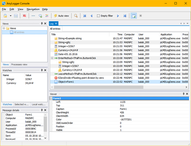
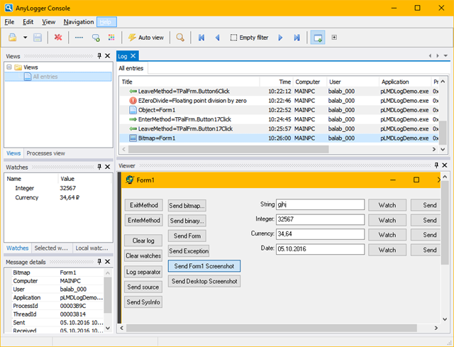
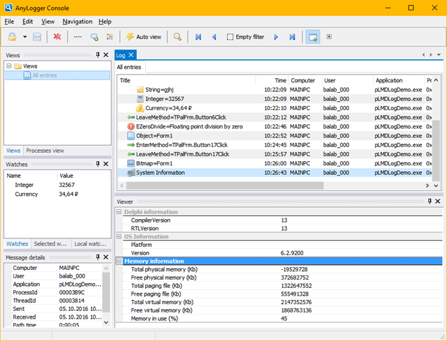
AnyLogger

LMD Anylogger is a visual companion to LMD LogTools which allows to output debug and realtime information of your application to a visual interface for locating problems quicker and easier. The compiled version is included in all major products - LMD VCL complete includes full source code of the project. Feel free to customize this app for your needs.

Top

History

Top

Components

TLMDSimpleLabel
Fast label component providing 3D-effects and extended layout settings. Since version 3.5 this component supports additional hyperjump properties (jump to Internet URL, start email client, execute applications or custom actions).
TLMDLabel
Extended label control allowing free rotation, 3D-effects, bevel and extended alignment settings compared to the standard label.
TLMDDockLabel
Descendant of TLMDSimpleLabel which is dockable to any TWinControl-component (e.g. TEdit - movement and sizes changes affect both controls).
TLMDGlyphLabel
Fast label component providing 3D-effects and extended layout settings. In addition TLMDGlyphLabel is linkable to Image- and BitmapList components for displaying graphics beside the caption.
TLMDInformationLabel
Fast label component providing 3D-effects and extended layout settings. In addition one of more than two dozens of system information settings can be displayed by setting simply one property (e.g. current username, state of NUM/CAPS/SCROLL keys, memory settings, customizable date/time formats). Besides special tab settings, support for different measurement units and a full featured Bevel object are available.
TLMDSpeedButton
Extended replacement for TSpeedButton. Among other features additional texteffects (3D, rotation, free positionining, multiline text) and display of popup-menus were added. Supports several different styles (e.g. Win31, Win40, Office97, flat display). Button is linkable to Image- and BitmapList components as well (for sharing bitmap resources with other button components).
TLMDDockSpeedButton
All features+é-á of TLMDSpeedButton. In addition 8 predefined glyphs (e.g. ellipsis, select directory, select font etc.) are provided and the button is "dockable" to other TWinControl descendants (e.g. TEdit - movement and size changes affect both controls+é-á at design- and runtime).
TLMDButton
Extended replacement for TButton. Among other features additional texteffects (3D, rotation, free positionining, multiline text) and display of popup-menus were added. Besides repeated button clicks are supported. Button is linkable to Image- and BitmapList components as well (for sharing bitmap resources with other button components).
TLMDDockButton
All features of TLMDButton. In addition 8 predefined glyphs (e.g. ellipsis, select directory, select font etc.) are provided and the button is "dockable" to other TWinControl descendants (e.g. TEdit - movement and size changes affect both controls at design- and runtime).
TLMDSimplePanel
Fast panel (including full Bevel object) without caption with special support for LMD button classes. Besides a Transparent property is available when component is placed on TLMDBackPanel or TLMDGroupBox components.
TLMDBackPanel
Descendant of TLMDSimplePanel which is specialized on fast display of background images and support of real transparent LMD controls (e.g. TLMDSpeedButton, TLMDAniCtrl) or rather semitransparent controls. 'Transparent' display supported. Must be linked to an Image- or BitmapList component.
TLMDDrawEdge
Draw 3D- lines, boxes and diagonals using the fast Win32-API-function DrawEdge. Also available for 16bit-platforms!
TLMDProgress
Replaces TLMDMeter, adds 3D-effects and extended properties.
TLMDGroupBox
Improved replacement of TGroupBox. This component supports a full Bevel object, free positioning of caption (even vertical!) and transparent display (e.g. when placed on TLMDBackPanel)
TLMDCheckBox
Improved replacement of TCheckBox. Supports various 3D-font and layout settings. Customizable picture settings for all states (checkbox may be a two- or three state one). Transparent display possible.
TLMDRadioButton
Improved replacement of TRadioButton. Supports various 3D-font and layout settings. Customizable picture settings for both states. Transparent display possible.
TLMDCheckGroup
Like TLMDRadioGroup but supporting TLMDCheckBox components instead of TLMDRadioButtons. The component supports up to 32 different entries. All entries can be retrieved or set by a single LongInt property.
TLMDRadioGroup
Improved replacement of TRadioGroup. This component supports a full Bevel object, free positioning of caption (even vertical!) and transparent display. Customizable picture settings available.
TLMDScrollBar
Replacement for TScrollBar. Supports customizable background (including transparency), values larger than 65535 and autosized thumb.
TLMDStaticText
This component is a TWinControl descendant label with many different possibilities.
TLMDHTMLLabel
TLMDHTMLLabel represents a label control with simple HTML rendering capabilities (mainly font faces and standard font attributes). However the control uses a very lean and fast internal parser.
TLMDFaceController
TLMDFaceController is used to specify bevel-/font- and color properties at a central place. All LMD components with FaceController property can linked to a FaceController control and share same settings. If settings are changed, all linked controls will be automatically updated.
TLMDHeaderControl
TLMDHeaderControl is a header control that supports LMD native theme mode. Helps to organize some other control's content in several resizable columns.
TLMDActionList
In addition to standard actions of TActionList, TLMDActionList implements a number of unicode-enabled actions.
TLMDContainerCtrl
LMD-Tools 3 supports a global container object (LMDContainer, supporting internal TLMDBitmapList, TLMDImagelist, TLMDStringList and TLMDWaveList component) which is accessible at runtime from any place in your sourcecode. TLMDContainerCtrl provides a visual interface for adding data to these containers at designtime.+é-á
TLMDImageList
Container component for storing imagelists as form data. An imagelist consists of several bitmaps of same size using the same palette (e.g. animations or button glyphs). These bitmaps will be stored in one bitmap internally (thus saving resources). Several LMD-Tools components (especially all button components and TLMDAnimationCtrl) support 'linking' to a TLMDImageList component to share imagelist resources. In addition native compression and conversion to DIB files is supported.
TLMDBitmapList
Container component for storing bitmaps as form data. Use this component to store bitmaps with different sizes and different palettes. Several LMD-Tools components support 'linking' to a TLMDBitmapList component to share bitmap resources. In addition native compression and conversion to DIB files is supported.
TLMDStringList
Container component for storing stringlists as form data. This feature is especially useful for multilingual applications or changing caption or text properties at runtime. In addition native compression of the stringlists is supported.
TLMDWaveList
Container component for storing wave files as form data. Use this component to store all required wave files for your application at one place. In addition native compression of wave data+é-á is supported.
TLMDWaveComp
Easily encapsulates .WAV files in your program and your finished .EXE by saving sound files as form data.
TLMDStrList
Useful and small component to save strings as form-data at designtime.
TLMDImageListConnector
With this component you can integrate the default image lists into our controls.
TLMDGraphicList
Store any supported graphics format in an 'imagelist'.
TLMDGenericList
Store any files in you application exe file and use it out of you application.
TLMDStackComponent
This component is a simple implementation of the well known data structure of a stack.
TLMDQueueComponent
This component is a simple implementation of the well known data structure of a queue.
TLMDListComponent
This component is a simple implemantation of a list buffer.
TLMDMMButtonFaceController
Use TLMDMMButtonFaceController to store button states for TLMDMMButton controls (thus all connected control share same settings),
TLMDImageListVCLConnector
Use TLMDImageListVCLConnector control to make LMD ImageLists available for standard VCL controls.
TLMDPNGImageList
Container component for storing PNG files as form data.
TLMDStyleManager
This component allows to design, store and apply styles (set of predefined properties), that can be arranged in hierarchies. It is possible to to apply these styles in accordance with control's state automatically by means of TLMDFaceController component.
TLMDButtonBar
MS Outlook(TM) like buttonbar. Provides various effects and support of the LMD Container controls (including trasnparency). Editing features and Drag&Drop supported.
TLMDButtonBarPopupMenu
Use this component to add additional menuentries to the standard contextmenu of TLMDButtonBar.
TLMDAssist
This panel like control allows fast creation of Windows 95 like "assistants" or "wizards". Automatic navigation within multiple pages (as many as you want), buttons with additional properties (e.g. different captions or hints for multilingial applications) and several custom properties are supported.
TLMDTrackBar
Extended slider control supporting userdefinable display and thumb (can be linked to an Image- or BitmapList). In addition several extended properties (e.g. various settings for tickmarks) and features (e.g. mousewheel support) were added. Transparent display (when placed on TLMDBackPanel or TLMDGroupBox) possible.
TLMDStatusBar
TLMDStatusBar is a specialized panel component for displaying status information and provides special support for several LMDLabel components with bevel property (to achive a Windows40-look). Any number of sections are allowed. Besides any component can be placed on this component.
TLMDSplitterPanel
SplitterPanel replaces all previous LMD SplitterControls (dynamically handling of up to four panes). Special new features are: SplitterBars and Panels are selectable in the objectinspector, full control over Bevel settings (for panels, splitters and control itself!), panes can be hidden or order can be changed at runtime.All settings by the enduser can be saved and restored automatically using a TLMDIniCtrl link.
TLMDScrollBox
Replacement of the TScrollBox component. Supports full Bevel-Object and Transparency.
TLMDFormDisplay
This small but very useful component displays forms like a panel within the component. This is not only useful for faster loading of forms but also much more resource friendly than e.g. using a TNotebook. Besides forms are much easier reusable in other projects than pages of a TNoteBook or similar component.
TLMDFormTabControl
Like TLMDFormDisplay, but forms are displayed like sheets in a TPageControl. Several forms can be organized in so called form lists and are handled by the component automatically.
TLMDCalendar
Check this unique calendar component! Unlimited design features (bevel, background, several date types, header settings, etc.). Supports special datelists.
TLMDLEDLabel
Represents text and numbers like an LED-display. Unlike other components the size and colors of single LED's are fully customizable. Besides a full bevel object and transparent property are supported.
TLMDFill
A component for filling an area and surrounding it with a bevel. You can choose a gradient, any bitmap with attributes like tile, stretch and center or naturally any brush style.
TLMDPanelFill
Like TLMDFill but also usable as container. Beyond that, all important properties of labels with the LMD-Tools alike 3D- and rotation-effects are included.
TLMDShadowFill
Fill areas with a shadow- or semitransparent effect (e.g. to darken or lighten certain regions).
TLMDProgressFill
Like TLMDProgress. Adds additional Fillobject for progress bars painted with textures/gradient fills or any brushstyle. Not as fast as TLMDProgress but much cooler!
TLMDLImage
Extended Image component. Distinctly improved speed (on drawing transparent) and providing new display modes (e. g. stretching or compressing retaining the original ratio). Contains full featured bevel object. Must be linked to TLMDBitmap- or TLMDImageList (so the component never holds a bitmap itself).
TLMDNImage
Extended Image component. Distinctly improved speed (on drawing transparent) and providing new display modes (e. g. stretching or compressing retaining the original ratio). Contains full featured bevel object. In addition several TLMDNImage components can share same bitmap for saving graphic resources.
TLMDTechnicalLine
The TLMDTechnicalLine component allows fast display of several common used line types. Start and end signs are fully customizable. In addtion the component supports several shadow and bevel properties.
TLMDClock
Easily incorporate an analog or digital clock into your application. The clock is similar to the Window's CLOCK.EXE but more powerful. Supports time measurement, countdown or alarm functions.
TLMDSwitch
A switch for defining boolean-states. Many properties for changing display modes (color, caption, 3D-effects and more).
TLMDLight
Displays boolean-states easy but very fast.
TLMDButtonPanel
This panel can hold as many equal speed buttons as you like. This panel supports auto - arraning any much more ...
TLMDCalculator
This component is a panel with calculator functionality.
TLMDDlgButtonPanel
Panel which shows common dialog buttons - can be used for fast dialog building.
TLMDNotebook
Extended notebook component. Supports extended bevel- and transparency effects.
TLMDHeaderPanel
Special panel component which can be hidden, displayed for making one choice or integrated fixed into your application surface.
TLMDHeaderPanelButton
Special button control for the TLMDHeaderPanel component. Can reopen a closed panel.
TLMDHeader
The TLMDHeader component works as supplement for TLMDHeaderPanel. Use it for changing the display status of the HeaderPanel.
TLMDPageControl
Completely renewed! Provides real native themed look (including left/right tabs), different tab-/theme styles, closebuttons and other advanced features.
TLMDCaptionPanelGroup
TLMDCaptionPanelGroup acts as container for several TLMDCaptionPanel controls which can be sized, moved or hidden within the PanelGroup.
TLMDCaptionPanel
TLMDCaptionPanel controls provide caption bar widh advanced options and moving/sizing abilities.
TLMDTabControl
TTabControl replacement with real native themed look (including left/right tabs), different tab-/theme styles, closebuttons and other advanced features.
TLMDScrollBoxExt
Same as TLMDScrollBox, but supports native scrollbars
TLMDToolBar
TLMDToolBar is a tool bar that supports custom background, buttons with different width, button-wrapping when toolbar's size is changing. Also, it has an editor with many preloaded icons.
TLMDHexView
Hex viewer component
TLMDEdit
Powerful TEdit replacement, supports e.g. Insert/Overwrite Mode, transparency, different cursor settings, 3D font effects and much more.
TLMDMemo
Powerful TEdit replacement, supports e.g. Insert/Overwrite Mode, transparency, different cursor settings, 3D font effects, unlimited textsize and much more.
TLMDMaskEdit
Powerful mask edit providing extensive mask settings and any number custom buttons. Besides all features of TLMDEdit are available.
TLMDSpinEdit
Improved replacement for TSpinEdit component.
TLMDCalendarEdit
Special edit control used for date settings. Provides custom button which displays Calendar dialog.
TLMDBrowseEdit
Special edit control used for path settings. Provides custom button which displays BrowseFolder dialog.
TLMDColorEdit
Special edit control used for color settings. Provides custom button which displays Color dialog.
TLMDFileOpenEdit
Special edit control used for filename settings. Provides custom button which displays Fileopen dialog.
TLMDFileSaveEdit
Special edit control used for filename settings. Provides custom button which displays Filesave dialog.
TLMDExtSpinEdit
This spin edit field supports several different styles like int numbers, float numbers or date input.
TLMDCalculatorEdit
This number edit field contains a button for poping up a calculator dialog.
TLMDEditAutoComplete
Support component for new autocomplete feature of LMD Edit controls.
TLMDDateTimePicker
TLMDDateTimePicker is a native LMD date time picker control. It is derived from TLMDCustomMaskEdit and allows to edit date and time both in the edit field and via drop down calendar with clock.
TLMDFormComboBox
TLMDFormComboBox is a generic combobox that allows to dropdown a form containing any visual control.
TLMDAboutDlg
Easily incorporate an "about box" into your application. Supports two different styles (LMD or standard Windows about box). Several custom caption / button / hint settings and Internet links are supported. Can be linked to TLMDBitmapList- or TLMDImageList component for displaying a custom background. Gradient fill in caption bar is supported as well.
TLMDDirDlg
Using this non-visual component the user is given the opportunity to change a path name quickly. Several custom caption / button / hint settings and Internet links are supported. Can be linked to TLMDBitmapList- or TLMDImageList component for displaying a custom background. Gradient fill in caption bar is supported as well.
TLMDTipDlg
Use the familiar TipDialog you see in many applications to guide the user through your application. Several custom caption / button / hint settings and Internet links are supported. Can be linked to TLMDBitmapList- or TLMDImageList component for displaying a custom background. Gradient fill in caption bar is supported as well.
TLMDWindowListDlg
The TLMDWindowListDialog component allows selection of windows or forms within your application (e.g. for displaying or hiding them). Supports several custom captions/buttons/hints. Can be linked to TLMDBitmapList- or TLMDImageList component for display of custom background. Gradient fill in caption bar is supported as well.
TLMDMessageDlg
This component has been designed to replace the standard Delphi and Windows API message dialogs. Many new properties and features are available, e.g. custom backgrounds (linked to TLMDBitmapList or TLMDImageList)+é-á symbol, button/hint/caption, wave and font settings. Gradient fill in caption bar is supported as well.
TLMDFormOpenDialog
Replacement for the nonvisual FileOpen common dialog. Allows visual creation and manipulation of the dialog at designtime.
TLMDFormSaveDialog
Replacement for the nonvisual FileSave common dialog. Allows visual creation and manipulation of the dialog at designtime.
TLMDFormColorDialog
Replacement for the nonvisual Color common dialog. Allows visual creation and manipulation of the dialog at designtime.
TLMDFormFontDialog
Replacement for the nonvisual Font common dialog. Allows visual creation and manipulation of the dialog at designtime.
TLMDFormPageSetupDialog
Replacement for the Page Setup common dialog. Allows visual creation and manipulation of the dialog at designtime.
TLMDFormPrinterSetupDialog
Replacement for the nonvisual Printer Setup common dialog. Allows visual creation and manipulation of the dialog at designtime.
TLMDFormPrintCommDialog
Replacement for the Print common dialog. Allows visual creation and manipulation of the dialog at designtime.
TLMDFormFolderDialog
Replacement for the Browse For Folder common dialog. Allows visual creation and manipulation of the dialog at designtime.
TLMDFormChangeIconDialog
Replacement for the OLE Change Icon common dialog. Allows visual creation and manipulation of the dialog at designtime.
TLMDFormInsertObjectDialog
Replacement for the OLE Inser Object common dialog. Allows visual creation and manipulation of the dialog at designtime..
TLMDCalendarDlg
Easily incorporate an Calendar dialog into your application.
TLMDInputDlg
This component can popup a dialog which contains one text edit field. As you are used you can change many settings.
TLMDCalculatorDlg
This dialog displays a calculator and returns the calculated result. Use it e.g. in connection with the LMD edit controls.
TLMDTextEditDlg
This component displays a simple text input editor.
TLMDCheckListDlg
The TMDCheckListDialog control is used to display a modal dialog with integrated CheckListBox component (providing either checkbox- or radiobutton group).
TLMDApplicationCtrl
First of all this component allows property and event handler settings of the non visual global TApplication object at design- instead of runtime. Secondarily additional properties and events of the global TLMDApplication object are provided. The TLMDApplication object adds e.g.+é-á new methods for controlling logfiles, global exception handling, time measurement or a global TLMDIniCtrl-object which can be accessed from your application at any place.
TLMDTimerPool
Use just one timer for various time-depending purposes. Processing is controlled either by using a central event-routine or calling a user-defined method. This component helps you saving resources especially on Windows 3.X (but certainly on other Windows versions as well).
TLMDIniCtrl
The TLMDIniCtrl component is an easy to use but very powerful tool to control inifiles or registry settings in one single component. All methods are used in the same way on Inifiles or Registry-Path depending on the setting of one property. In addition several LMD-Tools components can be linked to a TLMDIniCtrl component for saving their configuration values without writing any sourcecode.
TLMDMRUList
The TLMDMRUList component offers an easy to use tool to add a MRU(Most recently used)-Filelist to the files menu of your application. This component does almost all work for you! Since version 4.5 the menu can be connected to a TLMDSpeedButton component as well.
TLMDOneInstance
Safeguards that only one instance of your application can be executed. The component offers several options and an additional action event.
TLMDSysInfo
Provides system information like resources, environment variables, registrated user- and company-names. Many of these properties can be even set system-wide by this event.
TLMDHint
Extension of the standard hint. Use multiline hints at designtime, any font, various 3D- and bevel-effects are possible.
TLMDShapeHint
In contrast with TLMDHint this component is no descendant of the standard-hint. It provides extended abilities like special shapes (e. g. bubble, ellipse), several shadow modes, free positioning and various font- and 3D-effects.
TLMDMessageHint
Use this component to popup hint windows (as known from the TLMDShapeHint component) for displaying hint messages programmatically via methods at runtime.
TLMDFMDrop
Let your form/any TWinControl receive files easily per Drag&Drop from the filemanager.
TLMDTrayIcon
Allows easy creation of applications for the traybar within Windows 95/Windows NT 4 (32bit only).
TLMDGlobalHotKey
The TLMDGlobalHotkey component allows you to define a global hotkey (systemwide). (32bit only).
TLMDHideNonVC
This small but useful component allows to hide non visual components on your form.This feature is specially useful when dozens of TDataSources or TTables are used on one form. Nevertheless this component provides full access to all properties and editors of the hidden components.
TLMDMousePositioner
Positions the mousecursor relating to any control, a form or the default button.
TLMDMouseFencer
"Fences" the mousecursor in a control, a form or any given rectangle.
TLMDStopWatch
Use this component for precise time measurements. Can be connected to a Label (for automatic updates)
TLMDSendKeys
With this component you can send any key strokes to running applications.
TLMDTxtPrinter
This component helps you printing ASCII - text files to any windows printer. Line numbering, page dividing, font effects and many more things are supported.
TLMDObjectStorage
Component for saving/restoring properties from/to components at runtime. Desired properties can be selected visually at designtime. No code required!
TLMDPopupMenu
Extended popup menu component.
TLMDAlarmComponent
Use TLMDAlarmComponent to specify events which should occur at specific dates/times . Date-/Time and number of repetitions (including correspoding interval) can be specified for these events.
TLMDHookComponent
Use the TLMDHookComponent control to subclass the window procedure of any TWinControl descendant (e.g. to analyze message queue of this control) using an event handler.
TLMDRegExpr
The TLMDRegExpr control can be used to handle any kind of regular expressions (e.g. test for valid eMail-address, text expressions etc.).
TLMDExpressionEval
This control can be used to evaluate any kind of math expression. Predefined and custom functions along with variables are supported.
TLMDCabCompress
The TLMDCabCompress control allows simple and comfortable use of the compression features in Microsoft CABINET.DLL (well known from CAB files used by Microsoft installers). Advanced features like compression of complete directories, changing the compression ratio or progress event handlers (to provide end customer information about status of current operations) are provided.
TLMDCabDeCompress
The TLMDCabDeCompress control allows simple and comfortable use of the compression features in Microsoft CABINET.DLL (well known from CAB files used by Microsoft installers). This component is used to extract file(s) or directories fro m CAB files.
TLMDNativeHint
Simple control which allows use of Windows native (balloon) hints.
TLMDMessageHintController
This component is designed to be used together with TLMDMessageHint for displaying multiple hints at once. It allows to store a collection of messages, each message can be linked to some control on a form. TLMDMessageHintController allows to display all messages of the collection or a subset of them simultaneously.
TLMDPanelShape
This component allows any shape you can imagine for your panel (either defined by a bitmap or a special region). Provides a visual interface for specifiying the desired settings.
TLMDWndButtonShape
This focusable button supports any shape you can imagine (either defined by a bitmap or a special region). Great for multimedia applications!
TLMDLabelFill
Extended label control, allowing you to paint any bitmap texture or a gradient on the letters of a text. As a descendant of TLMDLabel, it is of course also featured with 3D-effects and rotating text (3D, rotation, tracing, free positioning, multiline text). Can be linked to a TLMDBitmap- or TLMDImageList component.
TLMDGraphicLabel
The TLMDGraphicLabel has been designed for implementing some special effects to your applications. Besides the features of TLMDLabelFill additional shadow, perspective and transform (e.g. think of "WordArt") effects were added.
TLMDAniCtrl
Improved animation component. Display of images is controlled by linked ImageList. Many new modes including fast and flickerfree transparent display of animations.
TLMDScrollText
Allows display of scrolling text (horizontal or vertical). Supports transparent display, several font- and 3D-effects and a full featured bevel object. Since version 4 a special Marquee-Mode is supported.
TLMDMMButton
Any bitmap can be a button! Supports imagelists and transparent areas for really stunning effects. The buttonface is built up from different bitmaps of a TLMDImageList. Up to nine different states are supported.
TLMDShapeButton
The TLMDShapeButton component unites the functionality of TLMDShapeControl and TLMDSpeedButton. Let your apps look more friendly!
TLMD3DEffectButton
Effect button which provides any bitmap or caption with amazing 3D-effects. The creation of the 3D-border is suppored by an easy to use visual editor.
TLMDHiTimer
The component represents an alternative to the Delphi-Timer. As it is interrupt controlled high resolution intervals of one millisecond are possible (contrary to the TTimer). Since version 4 threaded timer are supported as well.
TLMDShapeControl
Extends Delphi's standard shape control adding various shapes (e. g. Star, Comb, Octagon, direction indicator) as well as special color-, bevel- and shadow-effects. Beyond that it contains almost all properties of the LMDLabel (3D-effects, rotating, etc.).
TLMDRepeatedShape
Displays geometrical shapes repeating themselves. Supports textures, gradients or brushes and shadow-effects. Suitable as background for graphic applications.
TLMDDBNavigator
LMD Database Navigator. Supports currently more than 20 buttons, supports transparency, custom buttons, multiple rows and columns, different looks, captions and much more.
TLMDDBSpeedButton
TLMDSpeedButton which can be connected to a TDataSource. Supports more than 20 different modes and ready to use database actions.
TLMDBookmarkCont
Container which is used for automatic handling of database bookmarks. E.g. it can be used in connection with the TLMDDBNavigator component (which supports buttons for setting/removing and accessing bookmarks).
TLMDDBRestoreGrid
Within a TDBGrid component an enduser is usually able to resize and move columns within a datagrid .If you want to provide saving and restoring of these settings you should use this component (without writing any code).
TLMDDBSimpleLabel
Like TLMDSimpleLabel, can be connected to a TDataSource.
TLMDDBLabel
Like TLMDLabel, can be connected to a TDataSource.
TLMDDBInformationLabel
The TLMDDBInformationLabel is the database version of TLMDInformationLabel and has been designed to display current states or informations of a connected TDataSource component. Supported are e.g. Current/All recordnumber, fieldcount, modified or readonly state, recordsize and more. In addition all properties and formatting features of TLMDInformationLabel are available. Special support for TLMDStatusBar component is included.
TLMDDBGlyphInfoLabel
The TLMDDBGlyphInformationLabel represents a special version of TLMDDBInformationLabel and is specialized on displaying +é-á the state of the current+é-á dataset. In addition all features of TLMDGlyphLabel are available.
TLMDDBLabelFill
Like TLMDLabelFill, can be connected to a TDataSource.
TLMDDBGraphicLabel
Like TLMDGraphicLabel, can be connected to a TDataSource.
TLMDDBProgress
Like TLMDProgress, can be connected to a TDataSource.
TLMDDBLEDLabel
Like TLMDLEDLabel, can be connected to a TDataSource.
TLMDDBProgressFill
Like TLMDProgressFill, can be connected to a TDataSource.
TLMDDBNImage
Like TLMDNImage, can be connected to a TDataSource. Uses less resources than a TDBImage control.
TLMDDBShapeControl
Like TLMDShapeControl, can be connected to a TDataSource.
TLMDDBSwitch
Like TLMDSwitch, can be connected to a TDataSource.
TLMDDBLight
Like TLMDLight, can be connected to a TDataSource.
TLMDDBExport
This component supports you to export your database tables to ASCII or HTML.
TLMDCSV2DBImport
A simple nonvisual control which helps to import form formatted ASCII text into a database table.
TLMDDBFilter
The TLMDDBFilter is a small component which adds a Filter-event to a DataSet within Delphi 1. This feature is included in Delphi 2, therefore the component routes in Delphi 2 all funtionality to the corresponding Dataset.
TLMDDBShapeLabel
Datasensitive version of TLMDShapeLabel
TLMDOfficeButton
Support of flat Office 97 Look. Replaced by additional functionality of TLMDSpeedButton since version 3.5
TLMDDockOfficeButton
Support of flat Office 97 Look. Replaced by TLMDDockSpeedButton from version 3.5
TLMDExplorerButton
Support of extended modes and transparent display. Replaced by TLMDSpeedButton from version 3.5
TLMD3DCaptionButton
Effect button which provides any text display with amazing 3D-effects. Replaced by TLMD3DEffectButton from version 4.
TLMD3DShapeButton
Functionality provided by TLMDShapeButton from version 3.5
TLMD3DShapeLabelButton
Functionality provided by TLMDShapeButton from version 3.5
TLMD2PaneSplitCtrl
This professional splitter component allows easy access to all properties of single panes (e.g. Color and Autoscroll-feature) or the splitterbar (e.g. color, width etc.). Unlike other available splitter components this one support panes and splitter-bars in one component (up to 4 different panes and up to 3 movable bars). The TLMD2PaneSplitControl supports two panes and one splitterbar.
TLMD3PaneSplitCtrl
Like before, but 3 panes and two movable splitter bars supported.
TLMD4Pane3SplitCtrl
Like TLMD2PaneSplitCtrl, but 4 panes are divided up by 3 movable splitter bars (thus every pane can have any size).
TLMD4PaneSplitCtrl
Like TLMD2PaneSplitCtrl, but 4 panes and two movable splitter bars supported.
TLMDShapeLabel
Extension of the TLMDShapeControl using any fill-options like textures, gradients and brushes. Text can be clipped into the shape. Functionality is now integrated in TLMDShapeControl.
TLMDShapeLabelButton
The TLMDShapeButton component unites the functionality of TLMDShapeLabel and TLMDSpeedButton. Functionality is now integrated in TLMDShapeButton.
TLMDTeethShape
A TLMDTeethShape control offers frame effects at the edge of q document/form as seen in multimedia-applications or internet pages. Functionality integrated in TLMDShapeControl since version 4.
TLMDTeethShapeLabel
Like TLMDTeethShape, but providing fill-options like texture (with bitmaps), gradient, brushes.+é-áFunctionality integrated in TLMDShapeControl since version 4.
TLMDPicClip
Encapsulates images in your .EXE as form data and thus makes working with images much more easily. Functionality of this component is supported by TLMDImageList or TLMDBitmapList component.
TLMDAniPicClip
Encapsulates animation in your .EXE as form data. Serves as container for TLMDAniImage. Functionality of this component is supported by TLMDImageList or TLMDBitmapList component.
TLMDAniImage
Displaying of animations consisting of bitmaps. Many different settings like transparent display are possible. Functionality of this component is supported by TLMDAniCtrl.
TLMDImage
Extended TImage-component, e. g. with several transparent display-modes. Functionality of this component is supported by TLMDLImage or TLMDNImage.
TLMDTile
This component which is derived from TGraphicControl serves to fill the background quickly with given textures / patterns (consisting of bitmaps) or gradient fills. Functionality of this component is supported by TLMDFill.
TLMDMeter
Appealing process-display that supports five modes, e. g. gradients or bitmaps. Functionality of this component is supported by TLMDProgress or TLMDProgressFill.
TLMDPanel
Extended panel which supports free text-rotation, 3D-Effects, bevel, extended alignment and filling the background like TLMDTile. Functionality of this component is supported (according to the corresponding task) by TLMDSimplePanel, TLMDBackPanel or TLMDP
TLMDFile
A handy control that offers properties to allow manipulating a single file easily (e.g. copy, move, create, retrieve attributes, etc.). Replaced by the Win 32bit-aware TLMDFileControl.
TLMDRuler
Display of horizontal or vertical rulers. Measuring between two points is supported.
TLMDScreenSaver
With its help the creation of a screensaver is child's play! Place the component on a form - and the 'Blank-Screen'-screensaver is ready for your further modifications.
TLMDJoystick
Allows simple access to connected joystick(s). Includes function for calibration.
TLMDApp
Sets properties of an application at design time instead of runtime, allowing you to attach event-handlers as well. Functionality replaced by TLMDApplicationCtrl.
TLMDScreenCanvas
Makes it possible for you to paint on your whole desktop saving resources. With its help you can also build a copy of the screen before painting on it.
TDock97
Dockpanel for ToolBar97 components.
TToolBar97
The main (dockable) toolbar component.
TToolWindow97
Custom dockable window component.
TToolbarButton97
TSpeedButton descendant for use with TToolBar97.
TToolBarSep97
ToolBar separator component.
TEdit97
TEdit descendant for use with TToolBar97.
TLMDDBEdit
Datasensitive version of TLMDEdit.
TLMDDBSpinEdit
Like TLMDSpinEdit, can be connected to a TDataSource.
TLMDDBCalendar
Datasensitive version of TLMDCalendar.
TLMDDBCheckBox
Like TLMDCheckBox, can be connected to a TDataSource.
TLMDDBRadioGroup
Like TLMDDBRadioGroup, can be connected to a TDataSource.
TLMDDBCheckGroup
Like TLMDCheckGroup, can be connected to a TDataSource. Be aware that only 1 longint value is required to save up to 32 different states.
TLMDDBTrackBar
Like TLMDTrackBar, can be connected to a TDataSource.
TLMDDBMaskEdit
Edit field for masked text input. Supports many predefined and a very high customizable mask style. Datasensitive Version.
TLMDDBExtSpinEdit
Edit field for numeric values with spin buttons. Datasensitive Version of TLMDExtSpinEdit.
TLMDDBMemo
Input of large texts. With many effects like transparency, font effects, etc. Datasensitive Version of TLMDMemo.
TLMDDBEditDBLookup
Special datasensitive edit field which supports autocompletion of text. While text is entered, a datasource specified in the LookupSource property is searched for similar entries. Furthermore extended features like bevel, flat style, transparency, background graphics etc. are supported.
TLMDEditDBLookup
Special edit field which supports autocompletion of text. While text is entered, a datasource specified in the LookupSource property is searched for similar entries. Furthermore extended features like bevel, flat style, transparency, background graphics etc. are supported.
TLMDDBDateTimePicker
TLMDDBDateTimePicker db-aware controls
TLMDForm
Versatile tool which adds functionality like receiving system-events, controlling of window's position, max./min. height and width, saving or restoring size and position values to your form.
TLMDBack
Like TLMDFormFill but specialized on fast display of background images and support of semitransparent LMD controls (e.g. TLMDAniCtrl or TLMDScrollText). Must be linked to an Image- or BitmapList.
TLMDFormFill
Fills your form (also MDI forms) very fast with a background. You can choose a gradient, any bitmap with attributes like tile, stretch and center or naturally any brush styles. Can be linked to Image- or BitmapList components.
TLMDFormShadow
This small component adds a shadow effect to any form. Simply drop the component on the form and set the Shadow property - That's all! The color and transparency effects are customizable.
TLMDFormStyler
Amazingly change the look of your window's title bar. Use the gradient you know from the office-programs or use the 3D-fonts provided. You can even paint the title bar yourself!
TLMDFormShape
This component allows any shape you can imagine for your form (either defined by a bitmap or a special region). Provides a visual interface for specifiying the desired settings.
TLMDSysMenu
Allows manipulation of the system menu (adds an ordinary TPopMenu to the system menu!).
TLMDCaptionButtons
Add as many buttons to the form caption as you like. Group them, make thenem flat or transparent, add glyphs, ...
TLMDFormThemeProvider
TLMDFormThemeProvider allows to apply current theme to the owner form on which it resides. Also, it provides alternative mechanism for theme changes notification.
TLMDFormVistaExtension
This component allows to enable certain Windows Vista Aero specific features for Delphi/C++ IDEs before release 2007. On other operating systems this component has no functionality.
TLMDFormGlass
This component allows to enable the 'Glass'-effect for forms in Windows Vista Aero style (in Delphi/C++ IDEs before release 2007). On other operating systems this component has no functionality.
TLMDFormPersistent
Component which allows to control position, max./min. height and width of a form. Saving or restoring of size and position data (registry/inifile) is supported via connection to a TLMDIniCtrl component.
TLMDStarter
Use the TLMDStarter component to execute applications or processes. Several start parameters and events are supported. In addition the exact time and date of the start process may be specified.
TLMDVersionInfo
Retrieves resource info of a file / dll (CompanyName, BuildNr, LegalTrademark, ...)
TLMDFileCtrl
Supports various file actions for one or more files (copy, delete, remove, rename) and retrieves various file infos for one single file. Includes methods for system imagelist support.
TLMDFileGrep
This powerful component helps you creating FileGrep like applications. Searches for files on a specified set of paths. Possible paramters are creation date, access time, modified time, filemasks, fileattributes, filesize. Result values can be specified (e.g. Filename, FileExtension, Size or+é-á Filename, CreationTime). Can be connected to a LMDListBox for output of result.
TLMDShellFolder
'Controller' Component for TLMDShellList, TLMDShellTree and TLMDShellComboBox. Use only one interface to handle current displayed data, because all mentioned components are linked to TLMDShellFolder.
TLMDShellTree
Specialized treeview for display of directory trees (like in Windows Explorer). Used in connection with TLMDShellFolder.
TLMDShellList
Specialized listview for file display (like in Windows Explorer). Used in connection with TLMDShellFolder.
TLMDShellComboBox
Specialized combobox for display of directory trees (like in Windows Explorer). Used in connection with TLMDShellFolder.
TLMDShellNotify
This components provides events for several system events.
TLMDShellFindDialog
This component displays the standard Find Computer... or Find Files... dialog.
TLMDShellFormatDrivesDialog
This component displays the Format Drives dialog.
TLMDShellObjectPropertiesDialog
This component displays the Properties dialog of an object or file.
TLMDShellRunFileDialog
This component displays the Run File... dialog.
TLMDShellPickIconDialog
This component displays the Icon selection dialog for a file or an object.
TLMDShellRestartDialog
This component displays the Windows ShutDown dialog.
TLMDShellAppletLoader
This component displays several applets and tabs of the control panel.
TLMDShellAddFavoritesDialog
Displays the Add Favorite Dialog from Internet Explorer (if IE 3 or higher is installed on the target system).
TLMDShellFavoritesDialog
Displays the Favorites Dialog from Internet Explorer to organize the prefered links and URLs (if IE 3 or higher is installed on the target system).
TLMDShellFavoritesMenu
Add to your application a Favorites menu for URLs like in Internet Explorer.
TLMDShellListDialog
This control provides an ready-to-use enduser dialog for customizing header and column display in a TLMDShellList component.
TLMDShellPathDialog
Use this control to provide enduser possibility to administrate a list of paths in a very simple and comfortable way.
TLMDShellLink
The TLMDShellLink control can be used to create or read windows LNK files.
TLMDShellBrowseDialog
The TLMDShellBrowseDialog control provides an extended 'Browse for folder' dialog with additional options against the system folder dialog.
TLMDShellSysBrowseDialog
Wrapper for the WIN32 BrowseForFolderDialog procedure, customized for use within LMD ShellPack component suite.
TLMDShellAboutDialog
Simple Component to display the Windows About-Dialog.
TLMDShellListFilterDialog
This control provides an ready-to-use enduser dialog for specifying file/folder filter settings of a TLMDShellFolder component.
TLMDShellDriveListBox
TLMDShellDriveListBox displays the system drives, allowing fast selection of a specific drive.
TLMDShellNetConnectionDialog
This component displays Map-/UnMap Drive dialogs for shared network resources.
TLMDShellConsoleView
Use TLMDShellConsoleView control to redirect output of command line batch files to a memo or string list.
TLMDWebUpdate
Add automated web update functionality to your application
TLMDMAPISendMail
Use TLMDMapiSendMail for simple e-Mail messaging using a MAPI capable email-Client.
TLMDWebNews
Use this component to provide enduser the news and information about your product or company like e.g. the Delphi IDE does (see "Delphi News" functionality). News items are read from the Web out of XML-files.
TLMDWebConfig
Use TLMDWebConfig component for specifying global available internet configuration settings(e.g. Proxy pr password settings) for several WebPack components.
TLMDWebHTTPGet
Component to retrieve any file from the web. Furthermore it is able to download complete HTML files along with its graphics.
TLMDWebHTMLScan
Component for parsing HTML Tags of an HTML file. Either an HTML file is loaded or a StringList property is filled. Comments, scripts, imagetags, blocks, text and many other items are detected by triggering events.
TLMDWebHTTPScan
TLDMWebHTTPScan represents a very powerful search component which recursively analyzes HTML pages (e.g. from a web site) and reports all found links (e.g. images, audio files, etc.). This component can be, for example, used to recreate display the structure of a web site within a tree.
TLMDRAS
Use this component to get access to simple RAS functionality.
TLMDWebNewsView
Like TLMDWebNews, but complete user interface is provided. Simply call Execute method and all other things work automatically.
TLMDWebInfo
Use this simple control to retrieve information about current internet connection.
TLMDRichLabel
Displays RTF text in a very fast and resource saving label - text can not be edited at runtime, but hyperlinks are supported.
TLMDRichEdit
Extended RichText edit control. Use this component to add RichText editing feature to your apps - including hyperlinks, bitmaps, image support etc....
TLMDRichStorage
Storage component for RichText snippets. This component allows to share text snippets among several LMD RichText controls - saving time and diskspace. In addition hyperlinks between different text snippets are automatically detected.
TLMDDBRichLabel
Datasensitive version of the RichLabel component. Store any RichText in a database and display it using this component.
TLMDDBRichEdit
RichText Edit component for editing formatted text stored in a database.
TLMDRichHyperTextStorage
The TLMDHypertTextStorage component is used to store RichText items including hypertext information. Can be linked to RichLabel and -Edit controls.
TLMDRichScrollText
Allows display of scrolling (formatted) text.
TLMDRichScrollBox
Use this component to display larger RichText items which extend dimension of the component.
TLMDRichSyntaxEdit
Extended RichText edit control. Use this component for adding simple a RichText editing feature to your apps - including simple syntax highlighting features.
TLMDRichPageSetupDialog
Nonvisual component for displaying the standard Windows PageSetup dialog.
TLMDRichFontComboBox
Special combobox for selecting a font from a listbox. Displays all available or a special subset of the fonts on the current system.
TLMDRichFontSizeComboBox
When connected to a TLMDFontComboBox component, this control displays available font sizes for the current selected font and allows selection of font sizes for current active RichEdit control.
TLMDDBRichScrollText
Datasensitive version of TLMDRichScrollText.
TLMDDBRichScrollBox
Datasensitive version of TLMDRichScrollBox.
TLMDDBSyntaxEdit
Datasensitive version of TLMDSyntaxEdit.
TLMDRichInsertDateTimeDialog
Nonvisual control which provides at runtime a ready to use "Insert Date&Time dialog" as know from wordprocessors like WordPad. If TLMDRichEdit control is connected, insertion of user selection will be performed automatically.
TLMDRichInsertCharMapDialog
Nonvisual control which provides at runtime a ready to use charmap dialog as know from wordprocessors like Word. If TLMDRichEdit control is connected, insertion of user selection will be performed automatically.
TLMDRichEditPrintTask
This component allows to connect directly to a TLMDRichEdit component to fetch and print its contents.
TLMDSysSystemInfo
Mighty system info component. Encapsulates all information, which can be extracted by using the more specific, partial sys info components.
TLMDSysLog
Special logging component for actions done with one of the system info component.
TLMDSysMouse
Extracts information about the mouse installed in the system.
TLMDSysKeyboard
Information about the system keyboard.
TLMDSysDrive
Information about a system drive/partition.
TLMDSysDisplay
Information about the system display capabilities.
TLMDSysLocale
Locale information.
TLMDSysMemory
Information about system memory (amount, usage).
TLMDSysPowerStatus
Information about the system power status.
TLMDSysTimeZone
Information about the current time zone.
TLMDSysWindows
Information aboutt windows settings / paths.
TLMDSysPrinters
Information about the available printers.
TLMDSysProcessor
Information about the system processors.
TLMDSysUninstall
System software uninstall information.
TLMDSysFonts
Detailed information about the installed fonts.
TLMDSysMultimedia
Information about the system multimedia capabilities.
TLMDSysFileAssoc
Information about the file associations valid in the current system.
TLMDSysInternet
Information about he internet capabilities.
TLMDSysModem
Information about the available modem.
TLMDSysNetwork
Information about the installed network adapters and protocol settings.
TLMDSysEventLog
The TLMDSysEventLog control provides extended access to the different event logs on Windows NT/2K/XP systems. A built-in dialog is provided to display event info details (as known from the Windows Event Log).
TLMDSysDrives
The TLMDSysDrives control replaces TLMDSysDrive which was included in SysPack 1. Unlike its predecessor this control can not handle the info data for one drive but the info for all drives is stored in a TCollection class instead.
TLMDSysInfoTreeView
The TLMDSysInfoTreeView control is used to display hierarchical data provided by LMD SysPack nonvisual info controls (mainly from TLMDSysSystemInfo, but also from e.g. TLMDSyDisplay). Together with TLMDSysInfoListView an Explorer like browser for system info data can be created without any coding
TLMDSysEventListView
The TLMDSysEventListView control is used to display event log data which was retrieved by a TLMDSysEventLog control. It supports all features like the Windows Event Log display like sorted columns etc.
TLMDSysNetTreeView
The TLMDSysNetTreeView control is used to display a network structure which was retrieved by a TLMDSysNetworkEnumerator control.
TLMDSysNetworkEnumerator
The TLMDSysNetworkEnumerator control is used to enumerate all items (domains, computers, shared resources and printers etc.). in a network. Connecting a TLMDSysNetTreeView control the network structure can be displayed visually in a tree view.
TLMDSysInfoListView
The TLMDSysInfoListView control is used to display system info data retrieved by LMD SysPack nonvisual info controls. The component can be either connected to a System Info control like TLMDSysMemory or TLMDSysProcessor to visualize the corresponding info data or it can be connected to a TLMDSysInfoTreeView which controls data display then.
TLMDTextLabel
Label component for displaying formatted text.
TLMDTextPanel
Panel component which can display formatted text.
TLMDTextScroll
Scrolling text component which scrolls formatted text.
TLMDTextCheckBox
Check box component which can display formatted text.
TLMDTextRadioButton
Radio button component whereby the text can be formatted.
TLMDTextHint
Hint component for displaying hints containing formatted text.
TLMDTextShapeHint
Shapeable hint which can show formatted text.
TLMDTextButton
Button component which displays formatted text.
TLMDTextSpeedButton
SpeedButton component which displays formatted text.
TLMDTextRadioGroup
Group of radio buttons, whereby the radio buttons can use formatted texts ...
TLMDTextCheckGroup
Group of check boxes which can display formatted texts.
TLMDTextListBox
List box whereby the items can use text formatting.
TLMDTextContainer
Container for HTML snippets, providing a simple HTML-Editor for fast input of text. Furthermore automatic links between different text snippets in a container are supported in connection e.g. with TLMDTextLabel components.
TLMDTextScrollPanel
In addition to features of TLMDTextPanel the TLMDTextScrollPanel allows display of text which extends the boundaries of the control.
TLMDTextDBLabel
Label component which displays the content of a database attribute (text may be formatted, e.g. using HTML tags).
TLMDTextDBViewLabel
This label can be used for embedding a database record into a formatted text (whereby several fields can be displayed at the same time). It can be easily used for database view tasks.
TLMDTextDBExport
This component was designed for exporting recordsets of a database using an HTML template for generating the output file.
TLMDListBox
Extended listbox with new bevel-, header-, column- and multiline-properties.
TLMDImageListBox
Extended TListBox which can be linked to an ImageList or BitmapList component for displaying graphics easily. In addtion 3D-font and extended layout settings are supported for each entry in the list. Transparent display possible.
TLMDComboBox
Replacement for TComboBox. Supports Flat Style (as all TLMDComboBoxes do now), additional events, incremental search and new FocusControl property.
TLMDImageComboBox
Extended TComboBox which can be linked to an ImageList or BitmapList component for displaying graphics easily. In addtion 3D-font and extended layout settings are supported for each entry in the list.
TLMDColorComboBox
Special combobox for selecting colors at runtime. Supports standard-, system- and user-defined colors + an extented colordialog.
TLMDFontComboBox
Like TLMDColorComboBox. Use it for fast selection of fonts at runtime.
TLMDFontSizeComboBox
Linked to a TLMDFontComboBox component, available font sizes for the current selected font can be specified.
TLMDPrinterComboBox
Special combobox which displays all printer available on the system.
TLMDDriveComboBox
Special combobox which displays all drives available on the system.
TLMDFontSizeListBox
Fast selection of a font size from a list box. Can be combined with the font list or font listbox.
TLMDFontListBox
Special combobox for selecting a font from a listbox. Displays all available or a special subset of the fonts on the current system.
TLMDColorListBox
Select colors from a color list box (like TLMDColorComboBox).
TLMDCheckListBox
TLMDCheckListBox allows selection of one or several values from a list of values. Furthermore extended features like bevel, flat style, transparency, background graphics etc. are supported.
TLMDListComboBox
TLMDListComboBox works similar to the standard TComboBox. Furthermore extended features like bevel, flat style, transparency, background graphics etc. are supported.
TLMDTreeComboBox
This ComboBox allows selection of any value from a connected treeview. Furthermore extended features like bevel, flat style, transparency, background graphics etc. are supported.
TLMDHeaderListComboBox
A special combobox component, which allows display of a list with several columns. Furthermore extended features like bevel, flat style, transparency, background graphics etc. are supported.
TLMDCheckListComboBox
TLMDCheckListComboBox allows selection of one or several values from a list of values. Selected values will be diplayed comma seprated in the edit field. Use this component if space is too limited for a TLMDCheckListBox or TLMDRadioGroup component. Furthermore extended features like bevel, flat style, transparency, background graphics etc. are supported.
TLMDCalendarComboBox
Special combobox for input of date and time values. For support of enduser a calendar panel can be displayed. Furthermore extended features like bevel, flat style, transparency, background graphics etc. are supported.
TLMDCalculatorComboBox
Special combobox for input of numeric values. For support of enduser a calculator panel can be displayed. Furthermore extended features like bevel, flat style, transparency, background graphics etc. are supported.
TLMDExtListBox
Provides real inplace editing, multiline items, horizontal scrollbar/hint support for large items, transparency and flat bevel support for XP and standard borders.
TLMDTrackBarComboBox
Special combobox for input of numeric values. For support of enduser a popup trackbar panel can be displayed.
TLMDComboBoxExt
Same as TLMDComboBox, but drop-down list is a TLMDListBoxExt control, so TLMDComboBoxExt's dropdown list has native scrollbars, can have header and several columns.
TLMDListBoxExt
Same as TLMDListBox, but with native scrollbars, supporting native theme mode.
TLMDValueListBox
TLMDValueListBox provides additional string value associated with each item. Controls have Values: TStrings, and Value: string properties. Design-time support is also implemented
TLMDValueComboBox
TLMDValueComboBox provides additional string value associated with each item. Controls have Values: TStrings, and Value: string properties. Design-time support is also implemented
TLMDDBColorComboBox
Datasensitive version of TLMDColorComboBox. The selected color can be stored directly into a database field.
TLMDDBImageComboBox
Like TLMDImageComboBox, can be connected to a TDataSource.
TLMDDBImageListBox
Like TLMDImageListBox, can be connected to a TDataSource.
TLMDDBListComboBox
This ComboBox allows selection of any value from a non-database list of values. Furthermore extended features like bevel, flat style, transparency, background graphics etc. are supported.
TLMDDBTreeComboBox
This ComboBox allows selection of any value from a connected treeview. This value can be stored in a database field. Furthermore extended features like bevel, flat style, transparency, background graphics etc. are supported.
TLMDDBCalendarComboBox
This combobox is useful for handling date & time database fields. Opening the combobox a dropdown calendar is displayed. Furthermore extended features like bevel, flat style, transparency, background graphics etc. are supported.
TLMDDBCalculatorComboBox
This combobox is useful for handling numeric database fields. Opening the combobox a small calculator is displayed which helps calculating desired values. Furthermore extended features like bevel, flat style, transparency, background graphics etc. are supported.
TLMDDBFieldComboBox
Use TLMDDBFieldComboBox to display fieldnames of a table.
TLMDDBTableComboBox
Use TLMDDBTableComboBox to display tablenames of a database.
TLMDDBDriverComboBox
Use TLMDDBDriverComboBox to display available database drivers on the current system.
TLMDDBAliasNameComboBox
Use TLMDDBAliasNameComboBox to display available database aliases on the current system.
TLMDDBDiagramm
The TLMDDBDiagram class represents a more specialized variant of TLMDDiagram component. It is usually used to visualize relationships of database tables, similar to the table relationship diagrams e.g. known from MS Access.
TLMDDesigner
Use TLMDDesigner to make enduser design features similar to the form designer in Delphi IDE available. The control can be used in two ways: At first as stand alone control to set a form in "design mode" or used in connection with TLMDDesignPanel. A TLMDDesignPanel control acts as container for any TWinControl descendant for which runtime design features should be made available.
TLMDDesignPanel
The DesignPanel control is required if you want to use TLMDDesigner in connection with a TWinControl descendant (instead of using the "form designer" mode). This control does not provide any design features itself, it handles only the control for which design feature should be enabled (e.g. adds scrollbars when design area extends dimensions of TLMDDesignPanel etc.).
TLMDDiagram
The TLMDDiagram component allows display of boxes which can be linked to each other, so that relationships between different items can be made visible.
TLMDPropertyInspector
The TLMDPropertyInspector control simulates functionality of the object inspector which is known from the Delphi / CBuilder IDE. With a couple of mouse clicks and a few lines of code you can integrate advanced design features into your applications. In addition the component provides a powerful interface which allows simple integration of own property editors or extended features.
TLMDDesignManager
Use TLMDDesignManager to connect designer control(s) with object combobox and property inspector components. Thus creation of a designer with object inspector like features is simplified, because almost no synchronization code is required.
TLMDObjectComboBox
ComboBox like in Delphi object inspector, allowing display and selection of controls in the current designer.
TLMDDesignObjects
TLMDDesignObjects is a component for representing object collections. Instances of this class can be connected to several LMD DesignPack components and play different roles. Like DB-aware Delphi visual controls automatically communicate with datasets, Design Pack controls communicate with TLMDDesignObjects collections.
TLMDModule
The TLMDModule component represents within DesignPack the designing-module where several module-related functions and events are centralized. Those utilities are used by other DesignPack controls or by the streaming system.
TLMDServiceProvider
The TLMDServiceProvider component is used to organize a service architecture in IDE-Tools applications.
TLMDStorPropertyStorage
Component for saving/restoring properties from/to components at runtime. Desired properties can be selected visually at designtime. No code required! Unlike TLMDObjectStorage available in LMD-Tools the control is not limited to work with Windows Registry but can be connected to the different TLMDStor[..]Vault controls.
TLMDStorRegistryVault
The TLMDStorRegistryVault will be used if configuration data should be stored into Windows Registry. The control provides many predefined Read-/Write methods supporting various data types. Also controls like TLMDStorPropertyStorage can be connected to TLMDStorRegistryVault to specify target of save/load operations.
TLMDStorBinVault
The TLMDStorBinVault will be used if configuration data should be stored into binary files (which are usually unreadable by endusers). The control provides many predefined Read-/Write methods supporting various data types. Also controls like TLMDStorPropertyStorage can be connected to TLMDStorBinVault to specify target of save/load operations.
TLMDStorXMLVault
The TLMDStorXMLVault will be used if configuration data should be stored into XML files. The control provides many predefined Read-/Write methods supporting various data types. Also controls like TLMDStorPropertyStorage can be connected to TLMDStorXMLVault to specify target of save/load operations.
TLMDStorIniVault
The TLMDStorIniVault will be used if configuration data should be stored into inifiles files (against other [..]Vault controls limitations must be observed). The control provides many predefined Read-/Write methods supporting various data types. Also controls like TLMDStorPropertyStorage can be connected to TLMDStorIniVault to specify target of save/load operations.
TLMDStorXORCryptor
The functionality of LMD StoragePack controls can be easily extended by deriving own controls. TLMDStorXORCryptor is an example for demonstrating how to add a simple en-/decrypting technique to streams which are saved/loaded by the different TLMDStor[..]Vault controls.
TLMDStorTemplateStorage
Use the TLMDStorTemplateStorage control to store object/control templates into binary files for later reuse. By this you can build up some kind of feature like in the Delphi IDE.
TLMDStorCustomCryptor
Nonvisual control which allows implementation of custom en-/decoding functionality at designtime by writing event handlers.
TLMDStorControllerVault
Interface control which can be connected to any other Vault control. The control is used as common adapter to Vault controls if target format is not determined during project development.
TLMDStorFormStorage
TLMDStorFormStorage allows simple saving/restoring of position and dimension data for a form. The target format is determined by the connected Vault-control.
TLMDExplorerBar
TLMDExplorerBar mimics the behaviour of the Explorer Bar known from MS Windows XP. Similar like a ButtonBar, the sections can be extended/minimized by arrow buttons to show/hide the content of the panels. The control provides various possibilities to implement different visual styles. Inner panels can be either usual item lists, control containers or owner drawn areas.
TLMDExplorerBarStorage
TLMDExplorerBarStorage is used to store different sets of panels for display in TLMDExplorerBar. Thus switching between different "pages" at runtime is made simple (for example to achieve a dynamic set of options like in Windows Explorer, where shown options depend on the current folder).
TLMDExplorerBarController
TLMDExplorerBarController is used to predefine different custom visual settings for TLMDExplorerBar, so that at runtime only one line of code is required to switch to a new visual style.
TLMDSectionBar
TLMDSectionBar represents an extended variation of TLMDButtonBar known from LMD-Tools. Notable differences are the slightly changed look and feel (like in Visual Studio), the extended funktionality for inner items (can be selected and pressed via code) and certainly the possible use of TLMDSectionBarStorage and TLMDSectionBarController components.
TLMDSectionBarStorage
TLMDSectionBarStorage is used to store different sets of sections for use in TLMDSectionBar. Thus switching between different "section set" at runtime is made simple.
TLMDSectionBarController
TLMDSectionBarController is used to predefine different custom visual settings for TLMDSectionBar, so that at runtime only one line of code is required to switch to a new visual style.
TLMDSectionBarPopupMenu
The TLMDSectionBarPopupMenu control has been designed for adding enduser design features to section bars without coding. Enduser may add, rename or delete sections or items. In addition the popup menu will take care of enabling/disabling possible actions automatically.
TLMDBarHTMLLabel
TLMDBarHTMLLabel represents a label control with simple HTML rendering capabilities (mainly font faces and standard font attributes). However the control uses a very lean and fast internal parser.
TLMDFxAnimationList
The TLMDFxAnimationList control is used to specify animation and transition effect settings. Several FxPack controls can share settings of an AnimationList control.
TLMDFxAnimationForm
The TLMDFxAnimationForm component enhances features of a form by making transition effects and custom form masks available.
TLMDFxImageList
The TLMDFxImageList control is used to store image collections which can be displayed in TLMDFxImage components.
TLMDFxImage
The TLMDFxImage control is derived from TImage and supports transition effects between display of different images.
TLMDScriptControl
Enables Delphi/CBuilder applications to support active scripting languages installed in Windows Scripting Host. In doing so VCL objects can be used within scripts and vice versa.
TLMDSourceUtils
The TLMDSourceUtils control provides services for parsing, searching and generating of script fragments (e.g. procedures) which can be used as event handlers for components. It is useful when LMD-ScriptPack and LMD-DesignPack packages are combined for setting up an integrated scripting languages IDE.
TLMDScriptDebugger
TLMDScriptDebugger allows true multi-module multi-language debugging capabilities for the script controls.
TLMDErrorProvidersGroup
Allows grouping of several ErrorProvider components which can be used at the same time by a Validator component.
TLMDErrorProvider
An integrated ErrorProvider which provides several standard ways of error indication for a Validator component.
TLMDInPlaceErrorProvider
Enables a Validator component to indicate errors by changing the visual appearance of the validated control (font and background color and other effects are supported).
TLMDIconErrorProvider
Enables a Validator component to indicate errors by displaying icons near the validated control.
TLMDHintErrorProvider
Enables a Validator component to indicate errors by displaying hint messages for the validated control.
TLMDControlErrorProvider
Enables a Validator component to indicate errors by sending messages to a specified control which supports ILMDValidationMsgControl interface (e.g. LMDStatusBar, LMDListBox).
TLMDMessageBoxErrorProvider
Enables a Validator component to indicate errors by displaying a message box.
TLMDValidationGroup
Allows grouping of several Validator components to provide more complex data validation logic.
TLMDRequiredFieldValidator
A Validator which ensures that value in a control is not empty.
TLMDCompareValidator
A Validator which compares the value in the validated control with the value in some reference control.
TLMDRegExpValidator
A Validator which checks whether the string value in the control matches the specified regular expression (e.g. email address, number in certain format etc.).
TLMDRangeValidator
A Validator which checks whether a value of a validated control is within the specified range. Several datatypes are supported.
TLMDIntRangeValidator
A Validator which checks whether the integer value in the validated control is located within the specified range.
TLMDFloatRangeValidator
A Validator which checks whether the floating point value in the control is located within the specified range.
TLMDStringRangeValidator
A Validator which checks whether the string value in the control is located within the specified range.
TLMDDateTimeRangeValidator
A Validator which checks whether the date/time value in the validated control is located within the specified range.
TLMDEditDocument
Content/properties of a document and its view are separated in LMD SyntaxEdit. Use the TLMDEditDocument control to handle the content of the document.
TLMDEditView
TLMDEditView is the visible part in LMD SyntaxEdit. Use this control to specify look and feel, specify different gutter bars, handle keystrokes etc.
TLMDEditViewPrintTask
This component allows to connect directly to a TLMDEditView control and fetch the printable contents from it.
TLMDEditFindDialog
TLMDEditFindDialog is a non-visual component which can be used to show text search modal dialog. It indended to be used with TLMDEditView control.
TLMDEditReplaceDialog
TLMDEditReplaceDialog is a non-visual component which can be used to show text replacement modal dialog. It indended to be used with TLMDEditView control.
TLMDEditKeyBindingDialog
TLMDEditKeyBindingDialog is a non-visual component which can be used to show syntax edit key binding modifying dialog. It indended to be used with TLMDEditView control.
TLMDEditSyntaxSchemeDialog
TLMDEditSyntaxSchemeDialog is a non-visual component which can be used to show syntax scheme editing dialog. It indended to be used with TLMDEditView control.
TLMDEditColorSchemeDialog
TLMDEditColorSchemeDialog is a non-visual component which can be used to show colot scheme editing dialog. It indended to be used with TLMDEditView control.
TLMDEditGotoLineDialog
TLMDEditGotoLineDialog is a non-visual component which can be used to show Delphi IDE like Goto Line dialog. It indended to be used with TLMDEditView control.
TLMDChart
Main component of LMD ChartPack. Handles common data for header/footer/legend settings. Also contains series data which should be visualized in charts.
TLMDChartCTColumn
Use this component to specify visual settings for 2D-Column charts.
TLMDChartCTBar
Use this component to specify visual settings for 2D-Bar charts.
TLMDChartCTAreaLine
Use this component to specify visual settings for line charts.
TLMDChartCTPie2D
Use this component to specify visual settings for 2D-Pie charts.
TLMDChartCTColumn3D
Use this component to specify visual settings for 3D-Column charts.
TLMDChartCTBar3D
Use this component to specify visual settings for 2D-Bar charts.
TLMDChartCTAreaLine3D
Use this component to specify visual settings for 3D-Line charts.
TLMDChartCTAreaSpline
Use this component to specify visual settings for AreaSpline charts.
TLMDChartCTDoughnut
Use this component to specify visual settings for doughnut charts.
TLMDChartCTAreaSpline3D
Use this component to specify visual settings for 3D-AreaSpline charts.
TLMDDBChartSeries
Datasensitive version of TLMDChartSeries which uses databases as data container.
TLMDChartSeries
Represents a data container for Chart series (which contain those values which should be displayed in visual Chart controls).
TLMDChartPrintTask
This component allows to connect to a TLMDChart component to fetch and print its contents.
TLMDIDEManager
Use the TLMDIdeManager component to organize/concentrate communication between other LMD IDE-Tools components. It also provides several services to allow automated features and synchronization between affected components (e.g. property inspector, object combo box, component and alignment palette, component tree etc.).
TLMDProjectManager
The TLMDProjectManager component is a non-visual component that helps to manage IDE-like projects. In LMD IDE-Tools achitecture a project is a tree of abstract nodes that can represent any project related information, e.g. project groups, projects, documents inside projects, documents parts.
TLMDOpenedDocument
The TLMDOpenedDocument component represent an opened project document within an IDE application (generally it connects to a node in the Project Manager and receives required notifications (close, save, show etc.)).
TLMDComponentTree
This powerful control allows to use a Delphi IDE like Object TreeView. Collections, child controls etc. are automatically handled.
TLMDComponentPalette
The TLMDComponentPalette control allows to display Delphi like component palette. Any number of components can be registered, different tabs and component images are supported.
TLMDObjectEditorManager
TLMDObjectEditorManager implements an infrastructure system for component editors. Now writing specific component editors is as easy as writing simple property editors!
TLMDAlignPalette
The non-visual TLMDAlignPalette component allows to display an component alignment palette (as known from the Delphi/C++ IDE). All operations are performed automatically. Simply connect at design-time to a Designer component and show palette at run-time - that's all!
TLMDProjectManagerView
This component implements hierarchical view for project documents represented by TLMDProjectManager component.
TLMDDocEditorsView
This component implements tabbed editor view for editing opened project documents.
TLMDComponentBar
TLMDComponentBar control allows to display modern, BDS-like, component palette. Any number of components can be registered, different pages and component images are supported.
TLMDDebuggerSource
TLMDDebuggerSource is used as an intermediate component between TLMDScriptDebugger from LMD-ScriptPack and debugger related visual controls, such as TLMDVariablesView. From some viewpoint its analogous to TDataSource stadard VCL component which is used to link data sets with visual data aware controls.
TLMDCallStackView
TLMDCallStackView control shows Delphi IDE like Call Stack view. It can be easily linked with LMD-ScriptPack debugger using TLMDDebuggerSource component.
TLMDCallStackComboBox
TLMDCallStackComboBox control allows to select a procedure from the list of procedures of currently debugging script call stack. It can be easily linked with LMD-ScriptPack debugger using TLMDDebuggerSource component.
TLMDVariablesView
TLMDVariablesView control can be used to show local variables of a debugging script in a hierarchical way; it can be also used to show the result of debug expression evaluations. It can be easily linked with LMD-ScriptPack debugger using TLMDDebuggerSource component.
TLMDWatchView
TLMDWatchView shows Delphi IDE like Watches window. It can be easily linked with LMD-ScriptPack debugger using TLMDDebuggerSource component.
TLMDEventLogView
TLMDEventLogView shows Delphi IDE like Event Log window. Been connected to the script debugger it can automatically catch some standard events, like "breakpoint reached", breakpoint log message, breakpoint log call stack, ect. It can be easily linked with LMD-ScriptPack debugger using TLMDDebuggerSource component.
TLMDBreakpointsView
TLMDBreakpointsView shows Delphi IDE like Breakpoints list. It can be easily linked with LMD-ScriptPack debugger using TLMDDebuggerSource component.
TLMDMLGen
LMD *ML Generator separates data from presentation and lets you and your users change the format of the output text without rebuilding the application or changing the data source. *ML Generator uses a template (regular string with XML-like tags) as input and produces some output.
TLMDPrinter
TLMDPrinter is a component which handles all the low-level details of interaction with physical printer and Windows printer object hiding the complexity of Windows printing system from the user and allowing him to customize various printing settings like page margins, headers and footers etc.
TLMDPrintPreviewPanel
If you don't want to use predefined TLMDPrintPreviewDialog, this control together with TLMDPrintStatusBar and TLMDPrintToolBar can be used to implement a custom print preview.
TLMDPrintStatusBar
Use this component to add a status bar to a PreviewPanel component. It provides predefined info panels. Use it in connection to the TLMDPrintPreviewPanel component. LMD PrintPack itself makes use of it in the TLMDPrintPreviewDialog control.
TLMDPrintToolBar
A predefined toolbar for use with TLMDPrintPreviewPanel (for printing tasks).
TLMDPrintPageSetupDialog
Implements page setup dialog.
TLMDPrintDialog
Implements print dialog.
TLMDPrinterSetupDialog
Implements printer setup dialog.
TLMDStringsPrintTask
This component allows user to fully define the printable contents for printing strings.
TLMDImagePrintTask
This component allows user to fully define the printable contents for printing images.
TLMDEditPrintTask
This component allows to connect to an edit control and fetch the printable contents from it.
TLMDStringGridPrintTask
This component allows to connect directly to a string grid control and fetch the printable contents from it.
TLMDListViewPrintTask
This component allows printing of a ListView control contents in the tabular format.
TLMDPrintPreviewDialog
This component implements print preview dialog.
TLMDBrowseDlg
Simple wrapper for the WIN32 BrowseForFolderDialog procedure. Created for the use in specialized edit controls.
TLMDTaskDialog
TLMDTaskDialog is a component that provides the modern Vista task dialog not only in Windows Vista, but also in earlier Windows releases (the task dialog is emulated there). The list of features that enable a better user experience include HTML and Unicode support, customizable common buttons, radio buttons, "command link" buttons, expandable text area, progress bar, verification checkbox, user function callback on timer etc. All of these features can be easily set via an extensive component editor at designtime or via code at runtime.
TLMDFileOpenDialog
This File open dialog allows display of Microsoft Windows Vista style file open dialogs (in Vista). On non-Vista systems either default open dialog is shown or settings are taken from a linked TOpenDialog control.
TLMDFileSaveDialog
This File save dialog allows display of Microsoft Windows Vista style file open dialogs (in Vista). On non-Vista systems either default save dialog is shown or settings are taken from a linked TSaveDialog control.
TLMDOpenWaveDialog
TLMDOpenWaveDialog displays a modal Windows dialog box for selecting and opening Wave files.
TLMDSaveWaveDialog
TLMDSaveWaveDialog displays a modal Windows dialog box for selecting file names and saving Wave files.
TLMDOpenDialog
This component is a unicode wrapper for TOpenDialog.
TLMDSaveDialog
This component is a unicode wrapper for TSaveDialog.
TLMDThemeEngineController
This component exposes some of LMDThemeEngine settings at design-time. LMDThemeEngine is one of custom LMD theme renderers, it implements support of WindowsXP styles (*.msstyles), allowing usage of custom WinXP styles in your application.
TLMDSimpleGradientThemeController
Drop TLMDSimpleGradientThemeController on a form to apply MS Office 2003-style look to LMD controls with native theme mode. Also, it allows to customize themed drawing via events.
TLMDFormThemeProvider
TLMDFormThemeProvider allows to apply themed look to form's non-client area.
TLMDSimpleGradientExtThemeController
Same as TLMDSimpleGradientThemeController, but controls TLMDSimpleGradientExtThemeRenderer.
TLMDThemesGradientThemeController
Drop TLMDThemesGradientThemeController to a form to add MS Office 2007/2010 styled look to LMD controls with native theme mode.
TLMDThemesRibbonAdapter
TLMDThemesRibbonAdapter allows to customize look of ribbon control.
TLMDPluginManager
This component allows to design easily host applications that can be enhanced by pluggable modules. PluginPack implements plugin framework with flexible architecture: modules can be easily compiled into the host application executable (e.g. for debug purposes, speed/resource usage optimization etc) and detached back with no efforts
TLMDSimplePropInspector
TLMDSimplePropInspector allows to use Delphi-like object inspector in your application.
TLMDDockSite
Main component of LMD DockingPack. Add to your applications advanced docking features with docked and floating panels as known from MS applications like Visual Studio!
TLMDDockManager
This control is used to save/restore layout data from/to XML in LMD-DockingPack. It also used to setup visual style related properties.
TElPopupMenu
TElPopupMenu is a popup menu with Unicode support. It also introduces Office XP and Windows XP styles.
TElMenuBar
TElMenuBar controls are used to provide floating menu bars.
TElBiProgressbar
Progress bars provide users with visual feedback about the progress of a procedure within an application. ElBiProgressBar shows the progress in two different colors allowing to display the progress of current operation and total progress. For example, when copying multiple files, your program can use ElBiProgressBar to show the progress of copying every file and status of the complete operation.
TElRadioGroup
TElRadioGroup replaces the standard TRadioGroup, and offers flat buttons style and transparency. Radio button text can be multiline and both radio button text and radiogroup caption can contain HTML formatting. Also, you can choose which sides of the frame rectangle are drawn. The TElRadioGroup component supports Unicode.
TElGraphicButton
ElGraphicButton is a replacement for TSpeedButton. ElGraphicButon is an acestor for TElToolButton. ElGraphicButton is similar to ElPopupButton but doesn't have a window handle. So ElGraphicButton can't be focused. It can show a glyph, caption or both. Glyphs can be taken from bitmap, icon or imagelist. The control supports transparency or custom backgrounds.
TElCheckGroup
The TElCheckGroup control represents a set of options for the user. Each checkbox in the group can have it's own caption and hint and independent state. The whole group can be enabled or disabled using CheckGroup caption checkbox. CheckGroup checkboxes support custom glyphs, Flat behavior (with standard glyphs), transparency, playing sound when the checkbox is being checked and provide XP Themes/Unicode support.
TElRadioButton
TElRadioButton replaces the standard TRadioButton and offers several additional features. TElRadioButton supports custom glyphs, Flat behavior (with standard glyphs), transparency, playing sound when the radio button is being checked and XP Themes/Unicode support. ElRadioButton doesn't introduce new properties, but changes some ElCheckItem's behaviour (the one related to radio buttons).
TElCheckBox
The TElCheckBox control provides an option for the emduser. The user can check the box to select the option, or uncheck it to deselect the option. TElCheckBox supports custom glyphs, Flat behavior (with standard glyphs), transparency, playing sound when the checkbox is being checked and XP themes/Unicode support.
TElGroupBox
TElGroupBox is the panel with border lines and caption (with optional checkbox) that is used to group several controls visually. It replaces the standard TGroupBox and supports transparency, HTML captions and selective frame sides. Also Unicode is supported.
TElPanel
ElPanel represents an extended Delphi panel. ElPanel is able to draw custom background, allows transparency and provides moving and resizing features at runtime.
TElSpinButton
TElSpinEdit component is a nice way to specify numeric values. The value can be changed by pressing keys, clicking on the buttons or dragging the divider (the one between arrow buttons).
TElSpeedButton
TElSpeedButton is a rounded button control, that provides some unique features like pull-down menu and flat form. User can display the menu down by pressing and holding the specified mouse button.
TElPopupButton
ElPopupButton provides the look and feel of Internet Explorer buttons. It can display an associated popup menu, provides "flat" display, and it is a windowed control (so it can receive focus).
TElLabel
TElLabel extends TLabel with unicode support features and additional visual effects.
TElMainMenu
TElMainMenu is a descendant of TMainMenu component that supports Unicode captions and custom drawing styles.
TElScrollBar
Replacement for standard TScrollBar component with advanced features like optional flat and no-borders style, blended or solid scroll field, automatically enabled/disabled arrows etc.
TElStyleManager
TElStyleManager handles component style sheets and allows changing appearance of controls at runtime using style sheets (by using only one centralized control).
TElTreeStringGrid
ElTreeStringGrid is a special sort of ElTree, that has the same properties, events and methods as TStringGrid does. And at the same time ElTreeStringGrid keeps all power of ElTree available. ElTreeStringGrid component supports Unicode. You can use ElTree inplace editors with TElTreeStringGrid. Alternatively, TElTreeStringGrid contains a built-in inplace editor similar to grid's inplace editor.
TElXTree
<b>TElXTree represents a 100% native VCL replacement for ListView, TreeView, ListBox, CheckList, RadioGroup and any Custom Grid! It replace the former TElTree control providing exciting new features.</b> Both ElXTree and ElTree are fully customizable visual components, that can represent virtually any type of data (both in hierarchical and list forms). It is excellent for exploring databases, directory structures, registries, or any other type of data, that are built like a tree. You don't need to use the combination of TTreeView and TListView anymore - TElTree gives you all their power. ElTree is also very useful for building multi-columned list boxes, radio groups and CheckLists. Common features are:<ul><li>complete Unicode support<li>HTML formatting with hyperlinks and images in every cell<li>right-to-left tree order support and right-to-left text support (for Hebrew and Arabic languages)<li>checkboxes and radiobuttons (both Windows and custom glyphs are supported).<li>filtered display of items. Unique! You can set items as hidden and it won't be displayed or (optionally) processed when selecting a range of items. This allows you to use just one control instead of several controls on the same place.<li>additional columns for every item<li>multiple selections<li>custom background images<li>auto-sizing support. When the user double-clicks the resize area of the header section ElTree can resize the section according to the optimal width of the underlying column.<li>customizable colors and fonts for every cell<li>items of different height<li>(optional) non-scrollable column<li>button-like style for items. Every item is drawn as a button, and focused item is drawn like pushed button<li>customizable drag'n'drop<li>OLE drag'n'drop support<li>smart line hints<li>item lookup (optional automatic lookup for every column)<li>inplace editing for every cell<li>owner-drawn items and cells<li>smart pictures displaying<li>draggable and resizable columns<li>filtering support (every header section can have a filter mark and fire an event when the mark is clicked)<li>almost complete compatibility with TTreeView</ul><br><p><b>ElXTree</b> adds among other features following notable enhancements:</p><ul><li>independent item cells;</li><li>cascading styles;</li><li>cell joining;</li><li>rectangular range and random cell selection;</li><li>fixed top and bottom rows;</li><li>multiline header with independent cells;</li><li>adjustable gutter column.</li></ul></p>
TElTree
ElTree is a fully customizable visual component, that can represent virtually any type data (both in hierarchical and list forms). It is excellent for exploring databases, directory structures, registries, or any other type of data that is built up like a tree. You don't need to use the combination of TTreeView and TListView anymore - TElTree gives you all their power. ElTree is also very useful for building multi-columned list boxes, radio groups and CheckLists. And it adds full Unicode support. <b>This control is replaced by TElXTree from ElPack 5.0 on.</b>
TElTreeInplaceButtonEdit
TElTreeInplaceButtonEdit is a specialized inplace editor for editing text and memo cells. It uses ElButtonEdit component to provide edit features.
TElTreeInplaceCheckBoxEdit
TElTreeInplaceCheckBoxEdit is a specialized inplace editor for editing boolean cells. It uses TElCheckBox component to provide edit features.
TElTreeInplaceTreeComboEdit
TElTreeInplaceTreeComboEdit is a specialized inplace editor that uses TElTreeCombo component to provide edit features.
TElTreeInplaceFloatSpinEdit
TElTreeInplaceFloatSpinEdit is a specialized inplace editor for editing floating-point cells. It uses TElFloatSpinEdit component to provide edit features.
TElTreeInplaceColorCombo
TElTreeInplaceColorCombo is a specialized inplace editor for editing color values. It uses TElColorCombo component to provide edit features.
TElTreeInplaceSpinEdit
TElTreeInplaceSpinEdit is a specialized inplace editor for editing numeric cells. It uses TElSpinEdit component to provide edit features.
TElTreeInplaceMemoEdit
TElTreeInplaceMemoEdit is a specialized inplace editor for editing text and memo cells. It uses TElAdvancedMemo component to provide edit features.
TElTreeInplaceMaskEdit
TElTreeInplaceMaskEdit is a specialized inplace editor for editing floating-point cells. It uses TElMaskEdit component to provide edit features.
TElTreeInplaceCurrencyEdit
TElTreeInplaceCurrencyEdit is a specialized inplace editor for editing currency cells. It uses TElCurrencyEdit component to provide edit features.
TElTreeInplaceAdvancedEdit
TElTreeInplaceAdvancedEdit is a specialized inplace editor for editing text cells. It uses ElAdvancedEdit component to provide edit features.
TElTreeInplaceModalEdit
TElTreeInplaceModalEdit can be used when the application needs to display a modal dialog instead on inplace editor control. Handle OnExecute event and display the dialog in the event handler.
TElTreeInplaceDateTimePicker
TElTreeInplaceDateTimePicker is a specialized inplace editor for editing datetime (in Standard package), date and time cells. It uses TDateTimePicker component in Lite package and TElDateTimePicker in Standard package to provide edit features.
TElTreeInplaceComboBox
TElTreeInplaceComboBox is a specialized inplace editor for editing enum cells. It uses TElAdvancedComboBox component in Standard package and TComboBox in Lite package to provide edit features.
TElTreeInplaceCheckBox
TElTreeInplaceCheckBox is a specialized inplace editor for editing boolean cells. It uses TCheckBox component to provide edit features.
TElTreeInplaceMemo
TElTreeInplaceMemo is a specialized inplace editor for editing text and memo cells. It uses TMemo component to provide edit features.
TElTreeInplaceEdit
TElTreeInplaceEdit is a specialized inplace editor for editing text cells. It uses TEdit component to provide edit features.
TElCalculatorEdit
ElCalculatorEdit is an editor control with attached drop-down calculator. The user can click the button to invoke calculator, do the calculations and put the result to the edit.
TElHotKey
ElHotKey is a descendant of ElEdit for specifying a key combination (shortcut, hotkey).
TElFolderNameEdit
TElFolderNameEdit is a specialized component for entering file names. The user can press a button or predefined key shortcut and invoke a folder selection dialog. After the user selects a folder in the dialog, control's edit field is filled with selected folder name.
TElFilenameEdit
TElFileNameEdit is a specialized component for entering file names. The user can press a button or predefined key shortcut and invoke a file open dialog. After the user selects a file in the dialog, control's edit field is filled with selected file name.
TElIPEdit
TElIPEdit is a replacement for standard Windows IP Edit control. It doesn't require IE 4.0 or any other DLL. You can restrict editing operation to only some parts of IP address (thus letting enter only address masks). ElIPEdit supports flat borders.
TElCurrencyEdit
TElCurrencyEdit is a specialized control for editing currency values. ElCurrencyEdit supports flat and selective borders, system or custom currency sign. ElCurrencyEdit supports a button for custom actions.
TElMaskEdit
TElMaskEdit is a MaskEdit with additional properties for user interface customization. Such properties include border control, background settings etc.
TElFloatSpinEdit
TElFloatSpinEdit component is a nice way to input floating-point values. The value can be changed by pressing keys, clicking on the buttons or dragging the divider (the one between arrow buttons).
TElSpinEdit
TElSpinEdit component is a nice way to input numeric values. The value can be changed by pressing keys, clicking on the buttons or dragging the divider (the one between arrow buttons).
TElButtonEdit
TElButtonEdit component extends the TEdit control to allow the user perform additional actions while text is entered into the control. The control consists of a text edit field and up to two visible buttons on the right side (Button and AltButton). Each of the buttons can have it's own settings andgenerates its own events. For example, if you implement filename editor component, you may use one button to invoke the open dialog, and the second button to display the list of most recently entered file names, or suggested file names.
TElMemo
TElMemo is a replacement for TMemo controls which supports Unicode on both WinNT/2000/XP and Win9X/WinME, can be transparent, supports custom backgrounds and much more.
TElAdvancedMemo
TElAdvancedMemo enhances functionality of standard Memo control by adding customizable border styles for both active and inactive states, transparency, custom background and selective borders.
TElEdit
TElEdit is a replacement for TEdit/TMemo controls which supports Unicode on both WinNT/2000/XP and Win9X/WinME, which can work both in single-line and multiline mode, can be transparent, supports custom backgrounds and much more.
TElAdvancedEdit
TElAdvancedEdit enhances functionality of standard Edit control in single-line mode, adding customizable border styles for both active and inactive states, transparency, custom background and selective borders.
TElDataTimePicker
TElDateTimePicker allows input of date and time values at the same time. The control supports ElImageForm and transparency, flat borders and pull-down calendar.
TElSuperEdit
super edit
TElListBox
TElListBox is a control based on Windows ListBox control. Unlike TListBox this control supports Unicode text on all Windows platforms.
TElComboBox
This class is a replacement for the Windows combobox. It features alternative button, support for background image, customizable colors for the list box etc.
TElDriveComboBox
TElDriveComboBox is a component for selecting a drive. You can limit selection to a certain type of drive.
TElAdvancedComboBox
TElAdvancedComboBox is based on Windows COMBOBOX control. It adds additional properties that control appearance of the component -- border styles, custom background, ImageForm support etc.. TElAdvancedComboBox is NOT Unicode-enabled. For Unicode functionality see TElComboBox control.
TElImageComboBox
ElImageComboBox is designed for selecting an image from the imagelist. Both image and image index (or image name or whatever you substitute) are displayed for every item. As with all combo boxes, styled borders are supported to keep consistency of your user interface.
TElTreeCombo
ElTreeCombo combines an edit control with ElTree. Imagine what can be done with ElTree. Now you can put ElTree into a combo box and have all its power inside. It's perfect for organizing lists that need to display in a dropdown!
TElMemoCombo
TElMemoCombo is a combobox for editing multi-line text. It looks like an edit box with button, and it drops down, memo appears. As with all combo boxes, styled borders are supported to keep consistency of your user interface. Currently ElMemoCombo does not support Unicode
TElFontComboBox
Use TElFontComboBox for selecting a font. ElFontComboBox lets you select which fonts will be available for selection and shows sample text (Unicode text is possible).
TElAdvancedListBox
TElAdvancedListBox is based on Windows LISTBOX control. It adds additional properties that control appearance of the component -- border styles, custom background, ImageForm support etc.. TElAdvancedListBox is NOT an Unicode-enabled control.
TElColorCombo
ElColorCombo allows the user to easily select colors. Clicking on a down arrow will offer a pull-down menu, and clicking on a rest of ElColorCombo will show the Windows color selection dialog.
TElFormPersist
ElFormPersist component allows to save and restore form's (state, size, position, active control) and components' properties in the ElIniFile (and in Registry). It may be also used to prevent form resize, and to make the form TopMost. The data is stored when the form is being hidden or destroyed. The data is restored when the form is being shown. Components properties list to save and restore can be defined in design-time.
TElRegExpr
Use this control to handle any kind of regular expressions (e.g. test for eMail-addresses, text expressions etc.).
TElExpressionEval
Use this control to evaluate any kind of math expression (custom functions, custom variables and so on are supported!).
TElAppBar
Application Bars are special windows, that are docked to one of the screen edges. Windows TaskBar and MSOfice Bar are also AppBars. AppBar can behave as a usual window when it is floating, or dock to the edge. Now more and more applications get the AppBar behaviour. Especially useful is AppBar's feature to hide automatically to the edge of the screen when the user moves focus away from the bar, and poping up when the user moves the mouse cursor over the window.
TElTopmost
Use this component to control TopMost state of VCL form. Unlike VCL's fsTopMost flag, this property correctly handles application deactivation and keeps the form topmost even when the application is inactive.
TElPowerManager
TElPowerManager component tracks power management events and notifies the application about them.
TElFlatMultiController
Being dropped on the form, this component turns all WinControl's descendants, that have a border, to flat. Flat border is drawn using only two colors, defined by clBtnFace and clWindow. When the control is not focused and there is no mouse cursor over it, the control looks flat. It's scrollbars (if any) also look flat. When the user moves the mouse over the control or focused the control, this control becomes usual control with 3-d border. Scrollbars optionally become 3-d too. Or they may stay flat, if you like.
TElFlatController
This component turns any WinControl's descendant, that has a border, to flat. Flat border is drawn using only two colors, defined by clBtnFace and clWindow. When the control is not focused and there is no mouse cursor over it, the control looks flat. It's scrollbars (if any) also look flat. When the user moves the mouse over the control or focused the control, this control becomes usual control with 3-d border. Scrollbars optionally become 3-d too. Or they may stay flat, if you like.
TElStyleController
TElStyleController is a component, that, when linked to TElStyleManager and to TControl, lets you change control's properties with TElStyleManager features. ElPack controls support style manager directly. To allow other (non-ElPack) controls support Style Manager, use TElStyleController.
TElClipboardMonitor
TElClipboardMonitor monitors the clipboard and generates an OnChange event, when the clipboard contents has changed. It also provides a way to access the data that is available in Clipboard.
TElTrayInfo
ElTrayInfo is a MessageBox-like component for notifying users about some events. ElTrayInfo represents a small window with icon that is displayed near system tray. This window can contain HTML-formatted text and react on clicks. 3.20: Also, you can add a Close button to TrayInfo window so that the user can close the message. This is similar to Windows XP baloon notifications.
TElImageForm
TElImageForm component is used for three purposes: To create forms with custom shapes (usually, non-rectangular), to offer flexible backgrounds for forms or to provide support for pseudo-transparent controls.
TElTimerPool
Using one TimerPool component one can avoid using lots of timer resources and also get precise timing since the TimerPool can optionally use multimedia timer, which is much more precise, than regular Windows timer.
TElHook
This component can be used to "hook" the messages, that are send to the window (actually, WinControl descendant object). Hooking the messages is useful when you need to change or track the component's reaction on some message. ElHook is used widely in ElPack itself.
TElDropTarget
ElDropTarget component turns a WinControl descendant, associated with its property into an OLE drop target, so that the user can drop some data into it.
TElMouseHint
ElMouseHint represents a component to explicitly show or hide a hint window that follows the mouse cursor while cursor is in some control.
TElSoundMap
TElSoundMap component is extremly useful to centralize an store sound data, that is used by your application. ElSoundMap can keep sounds information in Windows registry in format, that allows the user to tune up sounds using Sounds Control Panel applet (!), or use ElIniFile to store the configuration. For each sound to be played you just specify the name of the WAV file and that's all. Other parameters like the Sound Event Label are optional. You can work with the sound map either at design- or at runtime, turn off all sounds (make the application mute) or just one sound.
TElVersionInfo
TElVersionInfo component is used to read VersionInfo resource from the specified file (current module if no file is specified).
TElImageList
ElImageList doesn't introduce new methods and properties. It only fixes a bug with standard ImageList, that "loses" the images, when different versions of comctl32.dll are used. Also, ElImageList stores images in RLE-compressed form, thus making your form and application executable smaller.
TElFormCaption
Use ElFormCaption component to customize form's caption look and feel - to draw the caption in gradient color or using bitmap and to add colored caption text and additional buttons to the form caption.
TElTrayIcon
The ElTrayIcon component is used to add an icon to the system tray. Regular and animated icons can be added. Also, ElTrayIcon supports extended hint forms, and hides taskbar icons automatically when the application is minimized.
TElSysHotKey
The TElSysHotkey component allows you to define systemwide hotkeys.
TElOneInstance
ElOneInstance component allows your program to be run only once. When the second instance of the program is started you can define an action, or just switch to the first instance. The parameters of the second instance are passed to the first instance.
TElStringPool
ElStringPool is a container for strings, that can be placed to the form or data module. Unlike TStringList, you can easily add multiline elements to ElStringPool at designtime.
TElMRU
TElMRU component is a powerful MRU manager that is capable to store several lists of most recently used items in several sections and display them in a multicolumn menus with section captions. MRU contents can be stored in ElIniFile. TElMRU is able to work with a menu item and a popup menu at the same time.
TElIniFile
ElIniFile component is the powerful replacement for (and a combination of) TRegistry and TIniFile. ElIniFile allows you to store hierarchically organized data in a text file. ElIniFile stores boolean, integer, string, StringList and binary data in a usual text file, that can be opened with any text editor. The data in ElIniFile are organized into keys and values. Both keys and values can have some data, but keys are similar to IniFile sections (they contain values) and can also contain subkeys.
TElURLLabel
TElURLLabel is a simple TLabel descendant for displaying URLs and automatically processing user clicks. It also offers default menu with Copy and Open commands that let the user open the given URL and Copy it to the clipboard.
TElCalculatorDialog
ElCalculatorDialog is a simple calculator dialog. Use it separately or in connection with the edit control to let the user calculate and enter values.
TElInputDialog
TElInputDialog is a simple replacement for InputBox function. It supports flat buttons and edit fields, so when you use flat controls this dialog won't break your UI style. Also, ElInputDialog lets you show HTML-formatted prompt text. Improved InputQuery function is also available.
TElCalendarDialog
TElCalendarDialog component can be used to display a modal window with calendar and navigation buttons. The user can also select a date using this window. All TElCalendarDialog properties correspond to TElCalendar's properties.
TElDailyTipDialog
This component offers a simple "Tip of the Day" dialog. It picks tip text from resource strings. Tip ID is chosen randomly.
TElFolderDialog
This class is derived from TCommonDialog for representing a TElFolderDialog - folder selection dialog. ElFolderDialog lets you set custom root folder and initial selected folder.
TElPromptDialog
TElPromptDialog supports display of an input dialog for a certain amount of time -- the dialog is closed automatically after specified period if the user doesn't close the dialog. TElPromptDialog supports HTML formatted text with embedded images and hyperlinks.
TElHTMLContainer
Container for HTML snippets, providing a simple HTML-Editor for fast input of text. Furthermore automatic links between different text snippets in a container are supported when used with other TElHTML[..] controls like TLElHTMLView (thus simple hypertext funtionality is possible without much effort).
TElHTMLPanel
TElHTMLPanel represents a panel control which can have an HTML-formatted caption and which includes support for images and links. TElHTMLPanel doesn't provide any new functionality and only exposes properties of TCustomElHTMLPanel.
TElHTMLView
TElHTMLView represents a native control for viewing HTML-formatted text. TElHTMLView supports extended scrollbars and custom backgrounds.
TElHTMLComboBox
TElHTMLListBox represents an extented version of the standard combobox control. It handles all items as HTML-formatted text and displays them accordingly.
TElHTMLListBox
ElHTMLListBox represents an extented version of the standard listbox control. It handles all items as HTML-formatted text and displays them accordingly.
TElHTMLLabel
HTMLLabel lets you display static HTML-formatted text. Embedded images and links are supported.
TElAdvancedPanel
TElAdvancedPanel is a sophisticated panel that consists of two parts - caption panel with two buttons (Minimize and Close) and main panel that is a real panel where you put controls. Each part can have HTML-formatted text and caption has customizable color.
TElHTMLHint
ElHTMLHint component allows creation of HTML-formatted hints for your application. In addition it adds notification events when application displays or hides hint window.
TElDBTreeNavigator
TElDBTreeNavigator represents a specialized DBNavigator control, which provides additional features and support functionality browsing data which is displayed by a TElDBXTree control.
TElDBNavigator
TElDBNavigator is a replacement for TDBNavigator control which is descendant of ElToolBar control. TElDBNavigator offers you an extended set of buttons, more functionality and customization.
TElDBHTMLView
TElDBHTMLView is the DB-aware version of TElHTMLView control. It provides you with the same features as TElHTMLView does and also can be bound to the DataSource to give the user posibility to view the data in the dataset.
TElInspectorDBDataSource
Use this control to fill property inspector control with content of database tables. Using this control interactive browsing of database records is possible!
TElDBLabel
TElDBLabel is the DB-aware version of TElHTMLLabel control. It provides you with the same features as TElHTMLLabel does and also can be bound to the DataSource to give the user posibility to view the data in the dataset.
TelDBRadioGroup
TElDBRadioGroup is the DB-aware version of TElRadioGroup control. It provides you with the same features as TElRadioGroup does and also can be bound to the DataSource to give the user posibility to edit the data in the dataset.
TElDBCheckBox
TElDBCheckBox is the DB-aware version of TElCheckBox control. It provides you with the same features as TElCheckBox does and also can be bound to the DataSource to give the user posibility to edit the data in the dataset.
TElDBTreeLookupComboGridEdit
TElDBTreeLookupComboGridEdit is an inplace editor used with TElDBTree and TElDBTreeStringGrid components. It provides an instance of TElWideDBLookupComboGrid control for editing operation.
TElDBTreeLookupComboBoxEdit
TElDBTreeLookupComboEdit is an inplace editor used with TElDBTree and TElDBTreeStringGrid components. It provides an instance of TElDBLookupComboEdit control for editing operation.
TElDBTreeComboBoxEdit
TElDBTreeComboBoxEdit is an inplace editor used with TElDBTree and TElDBTreeStringGrid components. It provides an instance of TElDBComoBoxEdit control for editing operation.
TElXRelDataSource
This container control designed for TElDBXTree allows specification of several data sources relations between them. Supported datasources are all TDataSet descendants (TQuery, TTable). Relations between data are built on Master-Detail or SelfReference principle and are stored in TElRelations collection.
TElDBXTreeStringGrid
This grid provides grid-like features of TElDBXTree and is simplier to use when only grid display is required.
TElDBXTree
Use this visual component to display hierarchical data from your databases. The hierarchies are built using TElXRelDataSource class: the information about data sets and relations between data sets is taken from an instance of TElXRelDataSource component. TElDBXTree is a descendant of ElXTree, so when displaying the data you can use all functionality fo ElXTree. You can display the data from several fields, show images, show hints taking them from the database and so on.
TElDBTreeMemoEdit
TElDBTreeMemoEdit is an inplace editor used with TElDBTree and TElDBTreeStringGrid components. It provides an instance of TElDBMemoEdit control for editing operation.
TElDBTreeWideStringEdit
TElDBTreeWideStringEdit is an inplace editor used with TElDBTree and TElDBTreeStringGrid components. It provides an instance of TElDBWideStringEdit control for editing operation.
TElDBTreeCheckBoxEdit
TElDBTreeCheckBoxEdit is an inplace editor used with TElDBTree and TElDBTreeStringGrid components. It provides an instance of TElDBCheckBoxEdit control for editing operation.
TElDBTreeSpinEdit
TElDBTreeSpinEdit is an inplace editor used with TElDBTree and TElDBTreeStringGrid components. It provides an instance of TElDBSpinEdit control for editing operation.
TElDBTreeFloatSpinEdit
TElDBTreeFloatSpinEdit is an inplace editor used with TElDBTree and TElDBTreeStringGrid components. It provides an instance of TElDBFloatSpinEdit control for editing operation.
TElDBTreeCurrencyEdit
TElDBTreeCurrensyEdit is an inplace editor used with TElDBTree and TElDBTreeStringGrid components. It provides an instance of TElDBCurrensyEdit control for editing operation.
TElDBTreeDateTimePickerEdit
TElDBTreeDateTimePickerEdit is an inplace editor used with TElDBTree and TElDBTreeStringGrid components. It provides an instance of TElDBdateTimePickerEdit control for editing operation.
TElDBTreeEdit
TElDBTreeEdit is an inplace editor used with TElDBTree and TElDBTreeStringGrid components. It provides an instance of TElDBEdit control for editing operation.
TElDBTree
Use this visual component to display hierarchical data from your databases. The hierarchies are built using TElRelDataSource class: the information about data sets and relations between data sets is taken from the instance of TElRelDataSource component, linked to the tree through tree's DataSource field. The root level will display the root dataset. Then the relations between datasets will be checked. If the rule, where root data set is a master data set, is found, this rule is used tobuild the next data level, which are picked from the corresponding data set. The detail dataset becomes master for the next level when searching for the next rule. The process continues while the rule is found and the number of levels does not exceed the maximum specified by the user. TCustom ElDBTree is a descendant of ElTree, so when displaying the data you can use all functionality fo ElTree. You can display the data from everal fields, show images, show hints taking them from the database and so on.
TElRelDataSource
This is a container object that lets you specify several data sources and specify relations between that data sources. Data sources supported are TDataSet descendants (TQuery, TTable). Relations between data are built on Master-Detail or SelfReference principle and are stored in TElRelations collection.
TElDBTreeStringGrid
TCustomElDBTreeGrid implements grid-like behaviour in ElDBTree and lets you create all sorts of grids using ElDBTree as a backend.
TElXTreePrinter
TElXTreePrinter is a specialized component derived from TElPrinter to print content of ElXTree controls.
TElTreePrinter
TElTreePrinter is a specialized component to print ElTree contents using ElPrinter.
TElPrinter
TElPrinter represents a component that provides printing capabilities with Preview and SaveToFile features in your application. Use TElPrinter like TPrinter to render multi-page data, preview and modify them and send them to printer.
TElShellComboBox
Specialized combobox for display of directory trees (like in Windows Explorer).
TElShellList
Specialized listview for file display (like in Windows Explorer).
TElShellTree
Specialized treeview for display of directory trees (like in Windows Explorer).
TElXHeader
Represents a fully rewritten header control, that provides developers and end users more features than the VCL THeader control. The user can drag the sections in ElHeader, sections can have sort marks etc. ElHeader supports Unicode. Against the TElHeader control which was already available in previous ElPack releases this control supports the extended features of TElXTree (e.g. merged header cells etc.).
TElHeader
Represents a completely rewritten header control, that gives the developer and the user more capabilities than the VCL THeader control. The user can drag the sections in ElHeader, sections can have sort marks etc. ElHeader supports Unicode.
TElFormPageControl
This control provides all features of TLMDElPageControl, but similar to TLMDFormDisplay this control can display standard TForm descendants instead if internal stored pages. Such forms can be stored e.g. externally in TLMDFormContainer and thus shared among different controls.
TElPageControl
TElPageControl is a replacement for Windows page control component. ElPageControl contains a set of enhancements, adds new .NET style and is free from limitations of windows control (such as single-line vertically arranged tabs, possibility to hide borders while keeping tabs visible etc.).
TElHistogram
TElHistogram represents a visual control to display simple graphs.
TElStatusBar
TElStatusBar replaces the standard Windows statusbar control and adds enhanced features and special support for Delphi controls. ElStatusBar is compatible with standard TStatusBar, though..
TElToolBar
ElToolBar is a native replacement for standard Windows toolbar. It can act as container for ElToolButtons and other controls which are placed on the toolbar. As an ElPanel descendant, it offers custom backgrounds and is moveable and resizeable at runtime.
TElCalendar
ElCalendar component is an advanced calendar. It displays week-ends with a different color, displays week numbers, holiday marks, tracks periods ...
TElGraph
TElGraph component can be used to display multi-entry realtime graphs similar to the ones available in Task Manager.
TElClock
TElClock is a simple TCustomPanel descendant, that can be used to display current time. You can set it up to show time of any windows time zone. You can use a predefined time format or you can customize the time format as you desire. ElClock can also work as a timer, counting time from zero. It can also work as a countdown, counting time from the specified seconds to zero and firing an event when finished.
TElSplitter
TElSplitter provides autosnap feature (automatically hides left or right pane when panel's size is less than specified minimum). In addition TElSplitter automatically tracks Visible state change of the panes and hides them automatically when one or both panes are hidden.
TElTrackBar
TElTrackBar is a replacement for Windows trackbar control that is more flexible and that provides ownerdraw functions.
TElFormDisplay
This small but very useful component displays forms like a panel within the component. This is not only useful for faster loading of forms but also much more resource friendly than e.g. using a TNotebook. Besides forms are much easier reusable in other projects than pages of a TNoteBook or similar component. Different forms can be stored externally e.g. in TLMDFormContainer. This way simplifies reuse of certain form arrays (which can be mixed with HTML pages).
TElFormContainer
TElFormContainer allows specification of form arrays or HTML pages for use with TElFormDisplay and TElPageControl components This control simplifies reuse of certain form/HTML page arrays.
TElExplorerBar
TElExplorerBar is a sidebar similar to the one found in Explorer in Windows XP. You can place one or more groups to this bar, each group being a descendant of TElAdvancedPanel. Use AddPanel method to add new group, then access groups directly to add controls there.
TElScrollBox
TElScrollBox is a descendant of the VCL ScrollBox component that supports custom background, custom borders, pseudo-transparency, flat scrollbars and XP styles.
TElSideBar
ElSideBar is yet another implementation of the well-known OutlookBar. ElSideBar sections however can contain other controls, thus making ElSideBar act as a PageControl.
TElGauge
ElGauge can be used to display percentage or status information using a gauge or pie graph display.
TElDragDrop
TElDragDrop is a visual component, that can act as Drag Source and Drop Target for OLE drag'n'drop applications. By default, TElDragDrop shows some picture (it has Picture property), but OnPaint event allows to draw something else.
TElDBLookupComboBox
ElDBLookupComboBox is a replacement for VCL TDBLookupComboBox component.
TElDBLookupListBox
TElDBLookupListbox is a replacement for VCL TDBLookupListBox control. Use TElDBLookupListBox to provide users with a convenient list of lookup items to set a field value using the values of a field in another dataset. Lookup list boxes usually display values that are a represent a more meaningful description of the actual field value.
TElWideDBLookupComboGrid
The TElWideDBLookupComboGrid works similar to a DBLookupComboBox but allows selection of field values from a displayed grid.
TElWideDBLookupCombobox
TElWideDBLookupComboBox is a unicode analog for TElDBLookupComboBox.
TElWideDBLookupListBox
TElWideDBLookupListBox is a unicode analog for TElDBLookupListBox. Use TElWideDBLookupListBox to provide users with a convenient list of lookup items to set a field value using the values of a field in another dataset. Lookup list boxes usually display values that are a represent a more meaningful description of the actual field value.
TElDBComboBox
TElDBComboBox is the DB-aware version of TElHTMLComboBox control. It provides you with the same features as TElHTMLComboBox does and also can be bound to the DataSource to give the user posibility to edit the data in the dataset.
TElDBListBox
TElDBListBox is the DB-aware version of TElHTMLListBox control. It provides you with the same features as TElHTMLListBox does and also can be bound to the DataSource to give the user posibility to edit the data in the dataset.
TElWideDBMemo
TElWideDBMemo is based on control and supports unicode text fields.
TElWideDBEdit
TElWideDBEdit is based on TElEdit control and supports unicode text fields.
TElDBButtonEdit
TElDBButtonEdit is the DB-aware version of TElButtonEdit control. It provides you with the same features as TElButtonEdit does and also can be bound to the DataSource to give the user posibility to edit the data in the dataset.
TElDBFloatSpinEdit
TElDBFloatSpinEdit is the DB-aware version of TElSpinEdit control. It provides you with the same features as TElSpinEdit does and also can be bound to the DataSource to give the user posibility to edit the data in the dataset.
TElDBSpinEdit
TElDBSpinEdit is the DB-aware version of TElSpinEdit control. It provides you with the same features as TElSpinEdit does and also can be bound to the DataSource to give the user posibility to edit the data in the dataset.
TElDBDateTimePicker
TElDBDateTimePicker is the DB-aware version of TElDateTimePicker control. It provides you with the same features as TElDateTimePicker does and also can be bound to the DataSource to give the user posibility to edit the data in the dataset.
TElDBCurrencyEdit
TElDBCurrencyEdit is the DB-aware version of TElCurrencyEdit control. It provides you with the same features as TElCurrencyEdit does and also can be bound to the DataSource to give the user posibility to edit the data in the dataset.
TElDBMemo
TElDBMemo is the DB-aware version of TElAdvancedMemo control. It provides you with the same features as TElAdvancedMemo does and also can be bound to the DataSource to give the user posibility to edit the data in the dataset.
TElDBEdit
TElDBEdit is the DB-aware version of TElMaskEdit control. It provides you with the same features as TElMaskEdit does and also can be bound to the DataSource to give the user posibility to edit the data in the dataset.
TElInspectorStyleBorland
Use this control to assign standard Borland visual style to the property inspector control.
TElInspectorStyleNET
Use this control to assign Visual Studio style to the property inspector control.
TElInspectorStyleSidewinder
Use this control to assign Delphi 8 visual style to the property inspector control.
TElInspectorINIDataSource
Use this control to fill property inspector control with content of Inifiles. Using this control interactive browsing of inifiles is possible!
TElInspectorRTTIDataSource
Use this control to fill property inspector control with RTTI data of certain controls.
TElInspector
The TElInspector control simulates functionality of the object inspector which is known from the Delphi / CBuilder IDE.
TLMDHTMLComboBox
TLMDHTMLComboBox is an HTML version of a TLMDComboBoxExt control. Supports all mini-HTML tags except for <control>.
TLMDHTMLExtListBox
TLMDHTMLExtListBox is an HTML version of TLMDExtListBox (single-column list without header). Supports all LMD mini-HTML tags except for <control>.
TLMDHTMLHeaderControl
TLMDHTMLHeaderControl is an HTML version of TLMDHeaderControl. Supports all LMD mini-HTML tags except for <control>.
TLMDHTMLListBoxExt
TLMDHTMLListBoxExt is an HTML version of TLMDListBoxExt control (multi-column list with native scrollbars) and allows using mini-HTML in multicolumn list. Supports all LMD mini-HTML tags except for <control>.
TLMDHTMLListBox
TLMDHTMLListBox is an HTML version of TLMDListBox control (multi-column list with vcl scrollbars). Allows to use mini-HTML in multi-column list. Supports all LMD mini-HTML tags except for <control>.
TLMDLabeledBrowseEdit
TLMDLabeledBrowseEdit is a labeled version of TLMDBrowseEdit control.
TLMDLabeledCalculatorComboBox
TLMDLabeledCalculatorComboBox is a labeled version of TLMDCalculatorComboBox control.
TLMDLabeledCalculatorEdit
TLMDLabeledCalculatorEdit is a labeled version of TLMDCalculatorEdit control.
TLMDLabeledCalendarComboBox
TLMDLabeledCalendarComboBox is a labeled version of TLMDCalendarComboBox control.
TLMDLabeledCalendarEdit
TLMDLabeledCalendarEdit is a labeled version of TLMDCalendarEdit control.
TLMDLabeledCheckListBox
TLMDLabeledCheckListBox is a labeled version of TLMDCheckListBox control.
TLMDLabeledCheckListComboBox
TLMDLabeledCheckListComboBox is a labeled version of TLMDCheckListComboBox control.
TLMDLabeledColorEdit
TLMDLabeledColorEdit is a labeled version of TLMDColorEdit control.
TLMDLabeledEdit
TLMDLabeledEdit is a labeled version of TLMDEdit control.
TLMDLabeledExtListBox
TLMDLabeledExtListBox is a labeled version of TLMDExtListBox control.
TLMDLabeledExtSpinEdit
TLMDLabeledExtSpinEdit is a labeled version of TLMDExtSpinEdit control.
TLMDLabeledFileOpenEdit
TLMDLabeledFileOpenEdit is a labeled version of TLMDFileOpenEdit control.
TLMDLabeledFileSaveEdit
TLMDLabeledFileSaveEdit is a labeled version of TLMDFileSaveEdit control.
TLMDLabeledFontListBox
TLMDLabeledFontListBox is a labeled version of TLMDFontListBox control.
TLMDLabeledFontSizeListBox
TLMDLabeledFontSizeListBox is a labeled version of TLMDFontSizeListBox control.
TLMDLabeledHeaderListComboBox
TLMDLabeledHeaderListComboBox is a labeled version of TLMDHeaderListComboBox control.
TLMDLabeledImageListBox
TLMDLabeledImageListBox is a labeled version of TLMDImageListBox control.
TLMDLabeledListComboBox
TLMDLabeledListComboBox is a labeled version of TLMDListComboBox control.
TLMDLabeledMaskEdit
TLMDLabeledMaskEdit is a labeled version of TLMDMaskEdit control.
TLMDLabeledMemo
TLMDLabeledMemo is a labeled version of TLMDMemo control.
TLMDLabeledTrackBarComboBox
TLMDLabeledTrackBarComboBox is a labeled version of TLMDTrackBarComboBox control.
TLMDLabeledTreeComboBox
TLMDLabeledTreeComboBox is a labeled version of TLMDTreeComboBox control.
TLMDGrid
TLMDGrid is a visual control which can be used to show table data in grid form. TLMDGrid supports a variety of column types, like simple text, number, date/time, image, check-box, progress bar, rating (stars), ect. The control also support a set of configurable dropdowns, like drop-down list (of strings, images), calculator, calendar, ect. Column resizing, column moving (dragging), data srting are supported.
TLMDDBGrid
TLMDDBGrid is a data-aware version of the TLMDGrid control, which is a visual control indended for showing data in a grid format. It support a variety of column types, configurable inplace editor drop-downs; it support column resizing/moving and data sorting.
TNGHTMLLabel
Represents a label control with simple HTML rendering capabilities (mainly font faces and standard font attributes). However the control uses a very lean and fast internal parser (miniHTML engine).
TNGHTMLPanel
Being a TWinControl descendant, TNGHTMLPanel is a better choice for html content with embedded controls than TNGHTMLLabel.
TNGHTMLView
Use this control to display large scrollable html text. Like TNGHTMLPanel embedded controls and advanced HTML controls are possible.
TNGHTMLListBox
This listbox can display multiline html text in each item.
TNGHTMLHeaderControl
Allows to create headers with html text.
TNGHTMLDBLabel
DB-aware version of TNGHTMLLabel. Can be used in two modes: usual and as a template. In second case it can display content of several datafields.
TNGHTMLDBView
DB-aware version of TNGHTMLView. Like TNGHTMLDBLabel, this control supports template mode. Can be used to display scrollable html forms that combine both html text, embedded controls, and data from several datafields.
TNGHTMLStorage
This component is a storage for your html texts. Allows to create collections of hyperlinked html items without any coding. One item can refer to another by means of <a href='itemname'> tag that references another item by name.
TNGTaskDialog
TNGTaskDialog is a component that provides the modern Vista task dialog not only in Windows Vista and better, but also on earlier Windows installations. The list of features that enable a better user experience include HTML and Unicode support, customizable common buttons, radio buttons, "command link" buttons, expandable text area, progress bar, verification checkbox, user function callbacks, timer support on timer etc. All of these features can be easily set via an extensive component editor at designtime or via code at runtime (either via standard or fluent interface).
TNGInputDialog
TNGInputDialog is a dialog component, which provides a way for the user to enter input value. Usually this value is a string value, so edit or memo controls are used to represent/edit the value. However, input dialog supports more input controls: Edit, Memo, Date-time picker, Editable Combo-box, Non-editable Combo-Box, Password edit, Custom Mini-HTML template. Many of the TaskDialog features like verification checkboxes or custom buttons are available as well.
TNGMessageDialog
TNGMessageDialog component allows to configure and show simple message dialogs with a look, compatible with TNGTaskDialog. The main purpose of the component is to be used internally inside TNGDialogs.Message overloaded methods, so, it, probably, need not be used explicitly. The component provides a set of properties, which are analogous to Delphi standard MessageDlg function parameters.
TNGButtonPanel
Simple TaskPanel descendant which automatically arranges button controls to help creating dialog bottom panels more quickly.
TNGTaskPanel
Simple TPanel descendant which emulates the look of bottom panels in Taskdialogs on Windows Vista and better.
TNGDateTimeRangeValidator
A Validator which checks whether the date/time value in the validated control is located within the specified range.
TNGStringRangeValidator
A Validator which checks whether the string value in the control is located within the specified range.
TNGFloatRangeValidator
A Validator which checks whether the floating point value in the control is located within the specified range.
TNGIntRangeValidator
A Validator which checks whether the integer value in the validated control is located within the specified range.
TNGRangeValidator
A Validator which checks whether a value of a validated control is within the specified range. Several datatypes are supported.
TLMDRegExpValidator
A Validator which checks whether the string value in the control matches the specified regular expression (e.g. email address, number in certain format etc.).
TNGCompareValidator
A Validator which compares the value in the validated control with the value in some reference control.
TNGRequiredFieldValidator
A Validator which ensures that value in a control is not empty.
TNGValidationGroup
Allows grouping of several Validator components to provide more complex data validation logic.
TNGMessageBoxErrorProvider
Enables a Validator component to indicate errors by displaying a message box.
TNGControlErrorProvider
Enables a Validator component to indicate errors by sending messages to a specified control which supports ILMDValidationMsgControl interface (e.g. LMDStatusBar, LMDListBox).
TNGHintErrorProvider
Enables a Validator component to indicate errors by displaying icons near the validated control.
TNGInPlaceErrorProvider
Enables a Validator component to indicate errors by changing the visual appearance of the validated control (font and background color and other effects are supported).
TNGErrorProvider
An integrated ErrorProvider which provides several standard ways of error indication for a Validator component.
TNGErrorProviderGroup
Allows grouping of several ErrorProvider components which can be used at the same time by a Validator component.
TNGValidatedEdit
TEdit with validation support.
TNGValidationLabel
NG ValidatorPack Label control for displaying validation info.
TNGValidatedComboBox
TComboBox with validation support.
TNGValidatedListBox
TListBox with validation support.
TNGValidatedStringGrid
TStringGrid with validation support.
TNGValidatedMemo
TMemo with validation support.
TNGValidatedRichEdit
TRichEdit with validation support.
TNGValidatedDBGrid
TDBGrid with validation support.
TNGValidatedDBEdit
TDBEdit with validation support.
TNGValidatedMaskEdit
TMaskEdit with validation support.
TNGValidatedDateTimePicker
TDateTimePicker with validation support.
TNGValidatedDBComboBox
TDBComboBox with validation support.
TNGValidatedDBMemo
TDBMemo with validation support.
TNGDBValidatedDBRichEdit
TDBRichEdit with validation support.
TNGValidationStatusBar
ValidatorPack StatusBar control for displaying validation info.
Serializer
NG SerializerPack does not contain any components. You use serializer classes or wrappers in a simple way to save/restore your objects.
TNGBoxNet
Use this control to get access to the Box.NET cloud storage service.
TNGGDrive
Use this control to get access to the GDrive cloud storage service.
TNGGTasks
Use this control to get access to the Google Tasks cloud service.
TNGGCalendars
Use this control to get access to the Google Calendars cloud service.
TNGOneDrive
Use this control to get access to the OneDrive cloud storage service.
TNGDropBox
Use this control to get access to the DropBox cloud storage service.
TNGDropSource
Allows to configure dragging data and initiate drag&drop operation (source side).
TNGDropTarget
Allows to receive dragging data by registering some application's control as a drop target and providing related events like OnDragEnter, OnDragOver, OnDragLeave, OnDrop; and a single OnDragAction event, which can be used instead of all previously mentioned events to simplify code.

Top

Downloads

Description Date Available Files
LMD Universal Installer (Trial)

Universal trials installer - suitable for all LMD 2024 products. Only ~2MB in size - only the files which are required for the selected installation options will be downloaded.

If you need offline installation functionality: Since version 2024.1, zip files with all files for a specific IDE are available (download zip file for your IDE, extract it and run lmdsetup.exe).

Universal installer technology will be the preferred way for future releases. Please send feedback to mail@lmdsupport.com or use our forum.

Installation problems? Read the corresponding LMD Universal Installer Wiki entry.

Versions history

February 11, 2024
LMD VCL Complete Trial (Old Installer Technology)

Use this installer variant if you encounter problems with the new Universal installer variant. The installers in this section correspond to the installers from previous versions.

Contains LMD-Tools, IDE-Tools, LMD ElPack and NG Complete in one installer. Precompiled packages include demo projects. Please download HelpPackages as well. Automatic Installation available.

This is a LMD 2024 release and should not be used at the same time with older release packages. Downloads for XE or older are LMD 2020 installers.

All releases contain 32bit + 64bit support, latest ServicePack required!

Installation problems? Read the corresponding Package Installation Wiki entry.

Terms of use (Trials) / License Agreement / Support Topics

February 11, 2024
LMD VCL Complete Helpfiles

Includes all helpfiles, no further downloads required.

February 11, 2024

Top

© LMD Innovative, Germany. All rights reserved. All other trademarks are acknowledged.