LMD-Tools
Latest version: 2025.5
Introduction
Boost your productivity!
Discover the most extensive and powerful productivity set available! Whatever you want to develop, LMD-Tools is the real thing. This toolbox provides easy-to-use components for all the power you want to implement in your projects. Furthermore LMD-Tools controls provide unique features you won’t find in any other component suite. Since Delphi 1 LMD-Tools represents a component suite which was dedicated to offer flexible components of superior quality for a broad range of development tasks. You can trust this continuity in the future, too.
Never too much of a good thing…
LMD-Tools covers more than 500 components for any task you can imagine. Following component groups are only examples for the broad range of available components: LMD Tools includes controls for superior interface design, system programming, file controls, database applications, internet-/web-components, multimedia, text/data input (RichEdit), display of formatted text and many more.
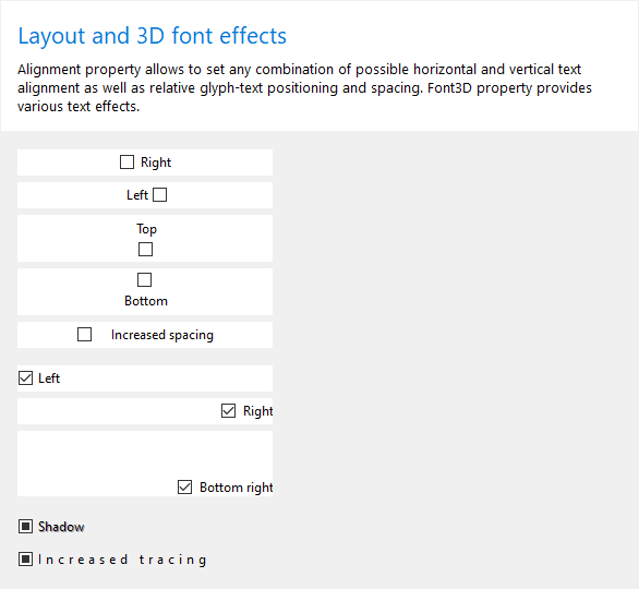
Most of the visual components support transparency, advanced font effects (3D, outline, …), different backgrounds or -effects. In latest version an integrated parser supports display of formatted text (e.g. HTML) for many controls.
All together, they form a solid base for your development.
Finish your projects in record time!
We did not only create a large component suite: We want to help you to achieve your development goals fast and comfortable as well. Therefore almost all components provide component editors allowing fast access to the most important properties. Manipulate common used objects via extended property editors. Check out this unique feature!
Enjoy the object oriented style of LMD-Tools!
Many components are based on a small number of carefully created objects which are used repeatedly in various components. Cut your learning curve: Acquire knowledge of such an object once and be familiar immediately with a broad range of components which use this object.
Team work inside!
Working in a team is more efficient. Realizing this, we made our components and data containers know each other and work with each other. The result: everything fits together really well. Be surprised of what is possible!
Features
- More than 500 components for various development tasks
- Full sourcecode of complete library
- MegaDemo project containing more than 200 single projects
- PrintPack, PlugInPack, SpellPack, InspectorPack, RichPack, ShellPack and SysPack bonus packages included
- ChartPack, DialogPack, DockingPack, BarPack, GridPack, StoragePack, FxPack, TextPack and WebPack included
- The current license includes access to earlier versions (e.g. 2020 to get support for compilers up to Delphi / C ++ Builder 6). If necessary, contact sales with the required product version. This will then be activated in your customer account.
- More than 100 component and property editors
- Supports Delphi/C++ Builder Release XE2 or better
- English online help files for BDS/Delphi/C++ Builder integration
- Free updates for all versions with same major version number via Internet
- 1-year subscription period included with every purchase (full version or update). Subscription period refers to the time frame major updates are free. Purchased license itself is perpetual.
- Free technical support via supportsite, public forum, e-mail, or fax.
- Also available as part of LMD VCL Complete
LMD-Tools site licenses
- A Site License covers unlimited number of developers in same organization at one location
Screenshots
See also: LMD BarPack, LMD ChartPack, LMD DockingPack, LMD FxPack, LMD GridPack, LMD RichPack, LMD ShellPack, LMD StoragePack, LMD SysPack, LMD WebPack
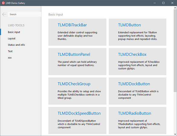
New: demo center
New demo center application provides small control related demos in a single convenient place. Demos are grouped in categories, such as input or layout. In addition, text search by control’s class name is provided.
Each demo page contains a link, which allows to show *.pas demo unit file in Windows file explorer.
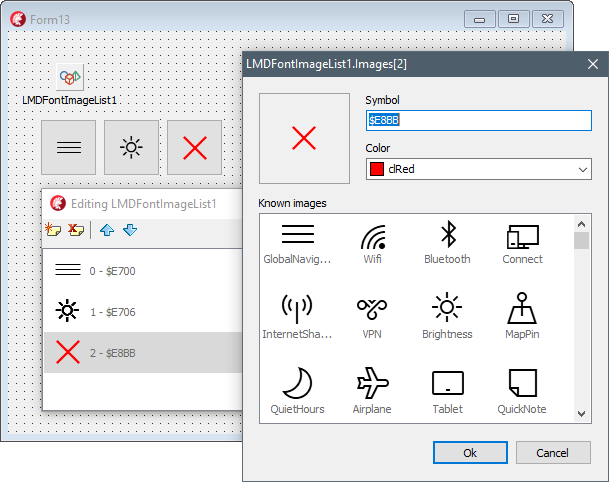
New: font image list
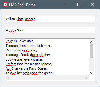
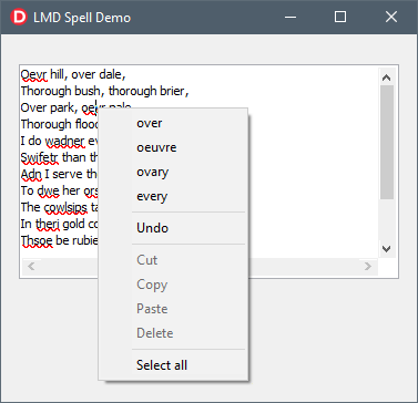
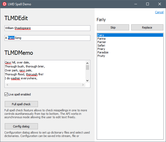
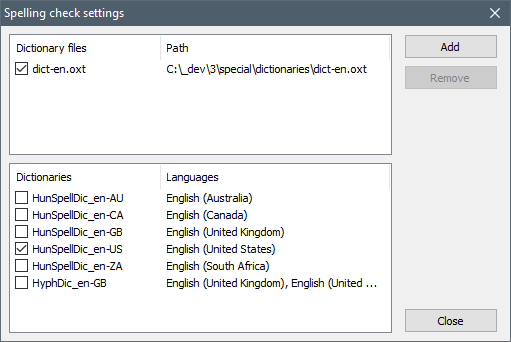
New: spell checking
Visual Features
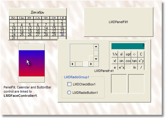
Face controller editor:
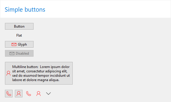
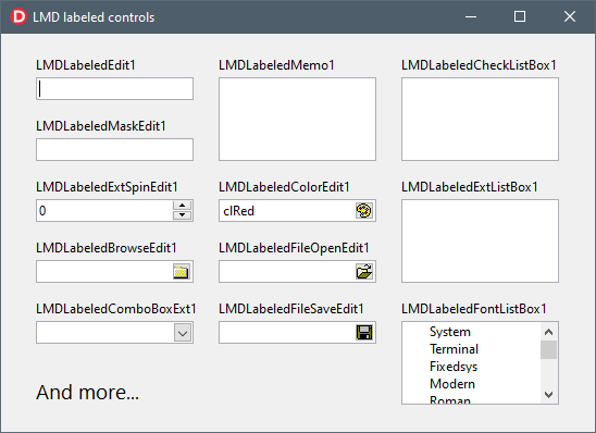
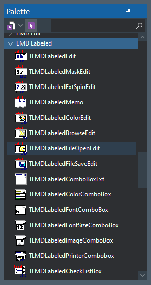
Labeled controls
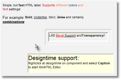
TLMDHTMLLabel control
Caption Panel Group

LMD Edit controls
TLMDEdit component

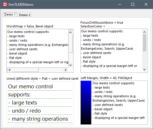
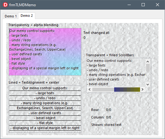
TLMDMemo component
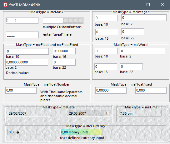
TLMDMaskEdit component
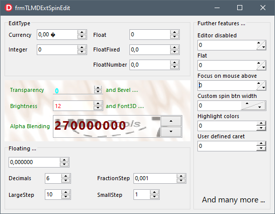
TLMDExtSpinEdit component
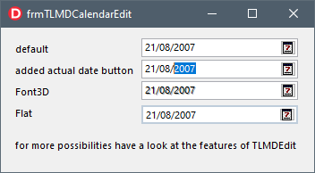
TLMDCalendarEdit component
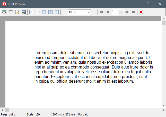
Printing and print preview
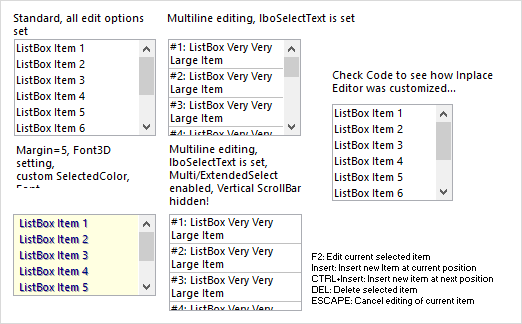
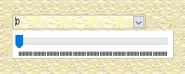
LMD List controls
TLMDListBox component
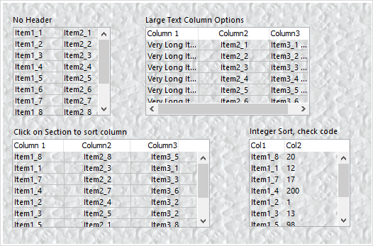
TLMDExtListBox component
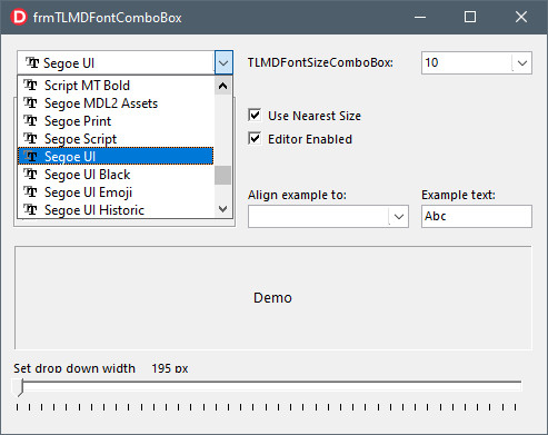
TLMDFontComboBox component
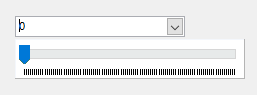
TLMDTrackBarComboBox component
LMD Ext controls
TLMDToolBar
VCL styles:

TLMDButtonBar component
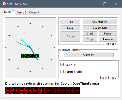
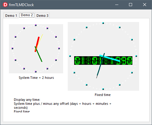
TLMDClock component
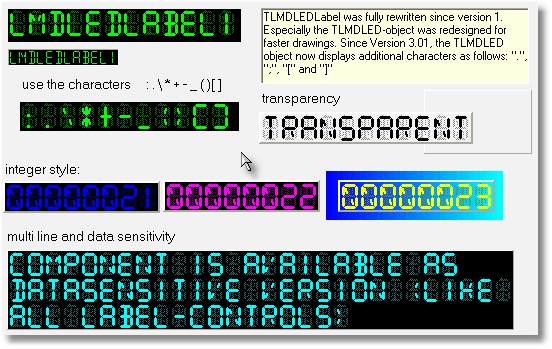
TLMDLedLabel component
TLMDHexView control
Hint and N-Hint components
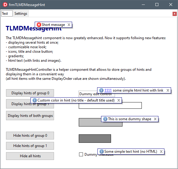
LMDHint supports now new shape forms, gradient effects, html text and images. The color of the border can be customized in balloon mode via BorderColor property.
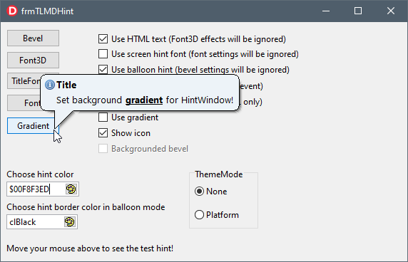
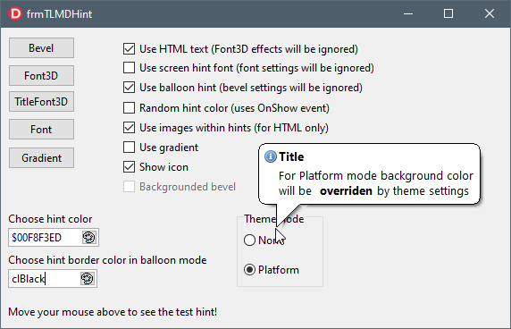
The background of the hint window now can be themed. If theme mode is ttmPlatform, background look is defined by theme settings. On this picture the background is drawn accordingly to basic Vista theme.
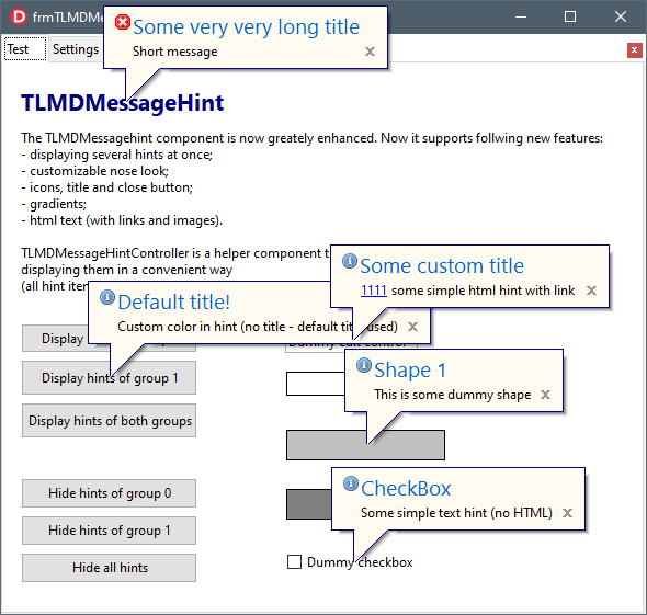
This picture illustrates use of TLMDMessageHintController and new TLMDMesageHint components. Now it is possible to display several hints at once. TLMDMessageHintController is used to store collection of hint messages.
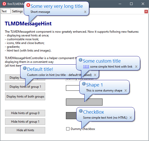
Message hints can be fully customized since they inherit from enhanced LMDShapeHint. This picture illustrates rectangular hints with images and customized titles.
LMD Form controls
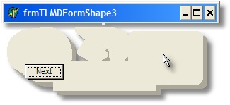
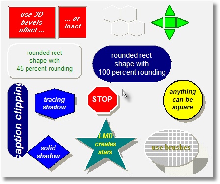
TLMDFormShape component
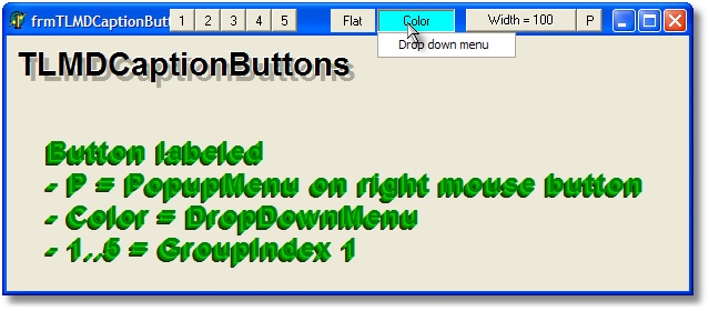
TLMDCaptionButtons.jpg component
LMD MM controls
TLMD3DEffectButton component
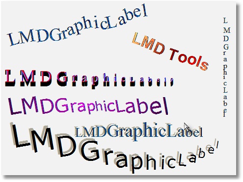
TLMDGraphicLabel component
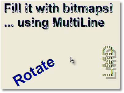
TLMDLabelFill component
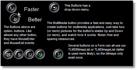
TLMDMMButton component
TLMDPanelShape component
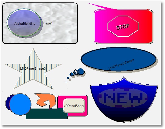
TLMDRepeatedShape component
TLMDShapeButton component
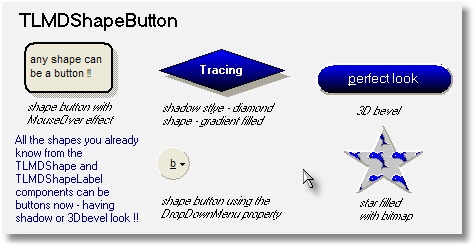
TLMDShapeControl component
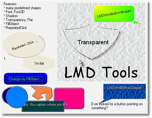
TLMDWndButtonShape component|
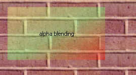
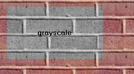
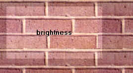
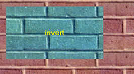
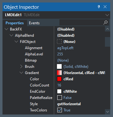
Effects of new TLMDBitmapEffect object
Use alphablending effects to melt one bitmap with the background (the degree of this operation is fully customizable). In the example below a gradient fill was used, but any other bitmap is allowed as well.
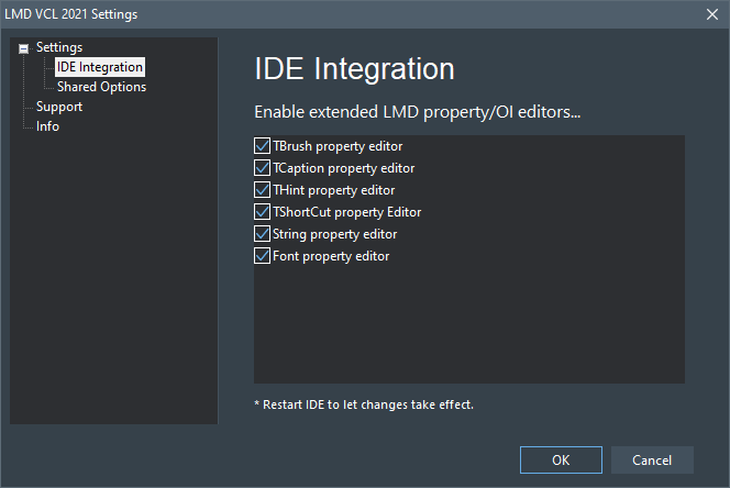
IDE enhancements
Settings tab
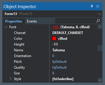
Object Inspector enhancements
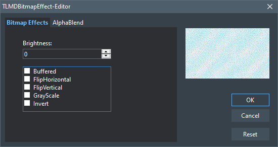
Bitmap effect editor
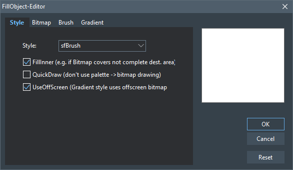
Fill object editor
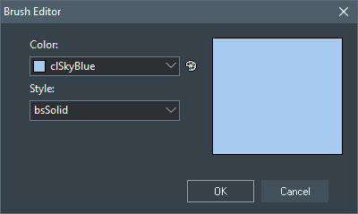
Brush editor
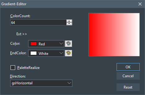
Gradient editor
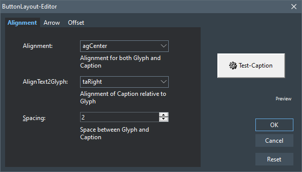
Button layout editor
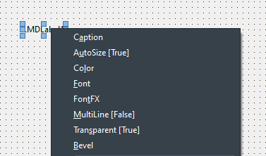
TLMDLabel component editor
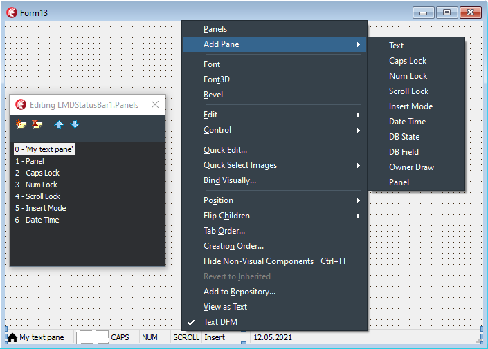
Most LMD-Tools controls provide an additional menu (activated by right mouseclick) which allows access to the most frequently used properties and objects. Moving the cursor to the object inspector is not required in may cases!
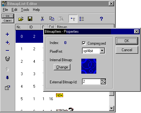
TLMDBitmapList component editor
Several components own really extensive component editors to make designing of an app like a snap. For example the editor above supports addition of Bitmaps via Drag&Drop from Filemanager/Explorer, clipboard data exchange and saving/loading of frequently used bitmaplists.
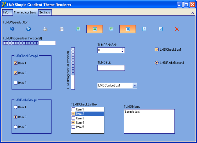
Theme features
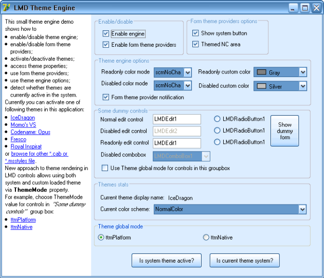
Theme Engine (1)
This picture illustrates application that is themed with msstyles theme renderer. Controls have ThemeMode set to ttmNative, and the current active theme is “IceDragon”.
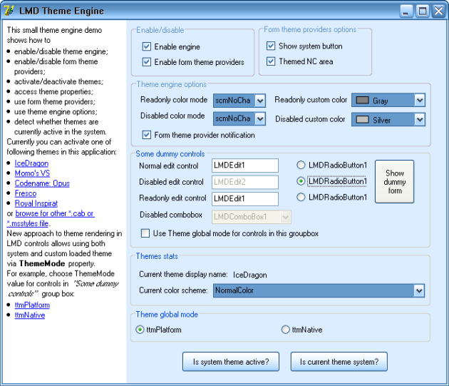
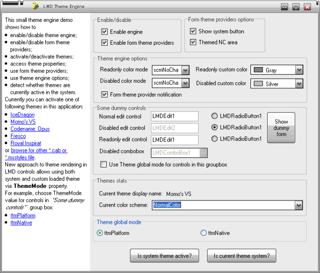
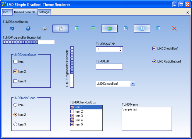
Theme Engine (2)
This picture illustrates application that is themed with msstyles theme renderer. Controls have ThemeMode set to ttmNative, and the current active theme is “IceDragon”. Some controls have ThemeMode set to ttmPlatform to demonstrate that application can use system theme and custom theme at once (see “Some dummy controls” groupbox).
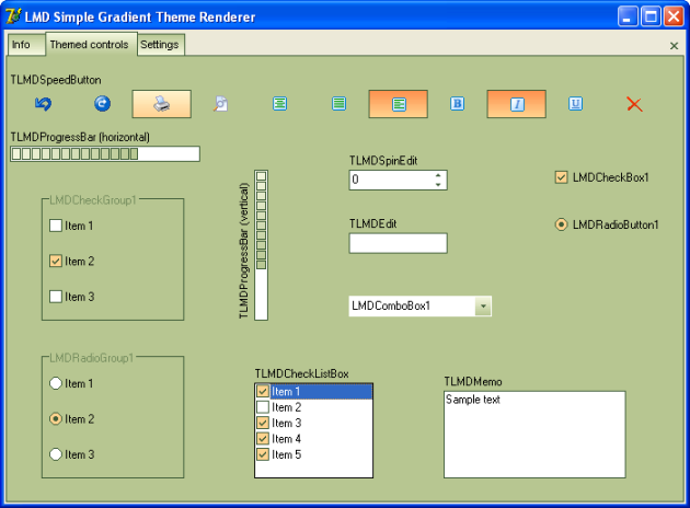
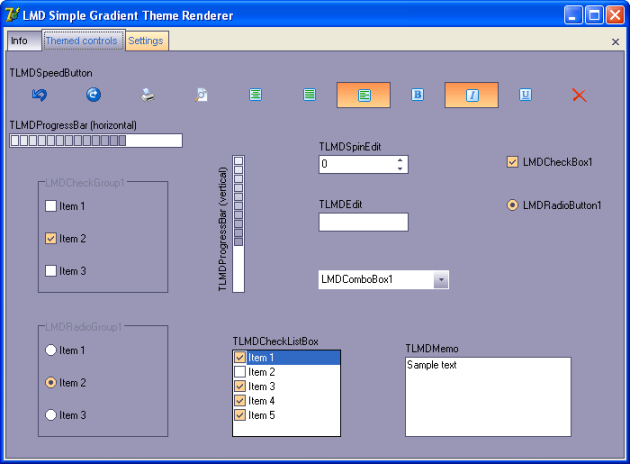
Theme Engine (3)
This picture illustrates application that is themed with msstyles theme renderer. Controls have ThemeMode set to ttmNative, and the current active theme is “MOMO’s VS”.
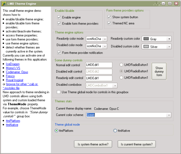
Theme Engine (4)
This picture illustrates application that is themed with msstyles theme renderer. Controls have ThemeMode set to ttmNative, and the current active theme is “Codename: Opus-C” (green color scheme).
New Office standard Theme (1)
This picture illustrates the look of the control drawn in ttmNative mode with predefined “Blue” color scheme of new Office2003-like theme.
New Office standard Theme(2)
This picture illustrates the look of the control drawn in ttmNative mode with predefined “Homestead” color scheme of new Office2003-like theme.
New Office standard Theme(3)
This picture illustrates the look of the control drawn in ttmNative mode with predefined “Metallic” color scheme of new Office2003-like theme.
New Office standard Theme(4)
This picture illustrates that color scheme of new Office2003-like theme can be customized. For each themed element you can change gradient start and end colors, gradient settings, frame colors. For example, gradient style changed to elliptic and gradient colors are changed for speed buttons. Also, page control’s pane is also gradiented.
Components

|
|

|
|

|
|

|
|

|
|

|
|

|
|

|
|

|
|

|
|

|
|

|
|

|
|

|
|

|
|

|
|

|
|

|
|

|
|

|
|

|
|

|
|

|
|

|
|

|
|

|
|

|
|

|
|

|
|

|
|

|
|

|
|

|
|

|
|

|
|

|
|

|
|

|
|

|
|

|
|

|
|

|
|

|
|

|
|

|
|

|
|

|
|

|
|

|
|

|
|

|
|

|
|

|
|

|
|

|
|

|
|

|
|

|
|

|
|

|
|

|
|

|
|

|
|

|
|

|
|

|
|

|
|

|
|

|
|

|
|

|
|

|
|

|
|

|
|

|
|

|
|

|
|

|
|

|
|

|
|

|
|

|
|

|
|

|
|

|
|

|
|

|
|

|
|

|
|

|
|

|
|

|
|

|
|

|
|

|
|

|
|

|
|

|
|

|
|

|
|

|
|

|
|

|
|

|
|

|
|

|
|

|
|

|
|

|
|

|
|

|
|

|
|

|
|

|
|

|
|

|
|

|
|

|
|

|
|

|
|

|
|

|
|

|
|

|
|

|
|

|
|

|
|

|
|

|
|

|
|

|
|

|
|

|
|

|
|

|
|

|
|

|
|

|
|

|
|

|
|

|
|

|
|

|
|

|
|

|
|

|
|

|
|

|
|

|
|

|
|

|
|

|
|

|
|

|
|

|
|

|
|

|
|

|
|

|
|

|
|

|
|

|
|

|
|

|
|

|
|

|
|

|
|

|
|

|
|

|
|

|
|

|
|

|
|

|
|

|
|

|
|

|
|

|
|

|
|

|
|

|
|

|
|

|
|

|
|

|
|

|
|

|
|

|
|

|
|

|
|

|
|

|
|

|
|

|
|

|
|

|
|

|
|

|
|

|
|

|
|

|
|

|
|

|
|

|
|

|
|

|
|

|
|

|
|

|
|

|
|

|
|

|
|

|
|

|
|

|
|

|
|

|
|

|
|

|
|

|
|

|
|

|
|

|
|

|
|

|
|

|
|

|
|

|
|

|
|

|
|

|
|

|
|

|
|

|
|

|
|

|
|

|
|

|
|

|
|

|
|

|
|

|
|

|
|

|
|

|
|

|
|

|
|

|
|

|
|

|
|

|
|

|
|

|
|

|
|

|
|

|
|

|
|

|
|

|
|

|
|

|
|

|
|

|
|

|
|

|
|

|
|

|
|

|
|

|
|

|
|

|
|

|
|

|
|

|
|

|
|

|
|

|
|

|
|

|
|

|
|

|
|

|
|

|
|

|
|

|
|

|
|

|
|

|
|

|
|

|
|

|
|

|
|

|
|

|
|

|
|

|
|

|
|

|
|

|
|

|
|

|
|

|
|

|
|

|
|

|
|

|
|

|
|

|
|

|
|

|
|

|
|

|
|

|
|

|
|

|
|

|
|

|
|

|
|

|
|

|
|

|
|

|
|

|
|

|
|

|
|

|
|

|
|

|
|

|
|

|
|

|
|

|
|

|
|

|
|

|
|

|
|

|
|

|
|

|
|

|
|

|
|

|
|

|
|

|
|

|
|

|
|

|
|

|
|

|
|

|
|

|
|

|
|

|
|

|
|

|
|

|
|

|
|

|
|

|
|

|
|

|
|

|
|

|
|

|
|

|
|

|
|

|
|

|
|

|
|

|
|

|
|

|
|

|
|

|
|

|
|

|
|

|
|

|
|

|
|

|
|

|
|

|
|

|
|

|
|

|
|

|
|

|
|

|
|

|
|

|
|

|
|

|
|

|
|

|
|

|
|

|
|

|
|

|
|

|
|

|
|

|
|

|
|

|
|

|
|

|
|

|
|

|
|

|
|

|
|

|
|

|
|

|
|

|
|

|
|

|
|

|
|

|
|

|
|

|
|

|
|

|
|

|
|

|
|

|
|

|
|

|
|

|
|

|
|

|
|

|
|

|
|

|
|

|
|

|
|

|
|

|
|

|
|

|
|

|
|

|
|

|
|

|
|

|
|

|
|

|
|

|
|

|
|

|
|

|
|

|
|

|
|

|
|

|
|

|
|

|
|

|
|

|
|

|
|

|
|

|
|

|
|

|
|

|
|

|
|

|
|

|
|

|
|

|
|

|
|

|
|

|
|

|
|

|
|

|
|

|
|

|
|

|
|

|
|

|
|

|
|

|
|

|
|
Documentation
- Class Hierachy (based on TLMDObject)
- Class Hierachy (based on TLMDCustomComponent)
- Class Hierachy (based on TLMDControl)
- Class Hierachy (based on TLMDCustomControl)
- Class Hierachy (based on TLMDCustomListBox)
- Class Hierachy (based on TLMDCustomComboBox)
- Class Hierachy (based on TLMDFormCommonDialog)
Downloads
LMD-Tools 2025
| Description | Date | Available Files |
|---|---|---|
| LMD Universal Installer (Trial)
Universal installer - suitable for all LMD 2025 products and licenses. About 2MB in size - only required files for selected installation options and IDEs will be downloaded. If you need offline installation functionality (no internet onnection available/allowed): Zip files with all files for a specific IDE are available (download zip file for your IDE, extract it and run lmdsetup.exe). Source code is included, file sizes > 300MB depending on IDE. Please send feedback about Universal installer technology to mail@lmdsupport.com or use our forum. Installation problems? Read the corresponding LMD Universal Installer Wiki entry. Note: Please find precompiled demos in the respective product sections (LMD Tools, LMD ElPack, LMD IDE Tools, etc.). |
May 10, 2026 |
Universal installer (setup only, 2MB) Delphi/C++Builder 13.X Florence (Offline) Delphi/C++Builder 12.X Athens (Offline) Delphi/C++Builder 11.X Alexandria (Offline) Delphi/C++Builder 10.4 Sydney (Offline) Delphi/C++Builder 10.3 Rio (Offline) Delphi/C++Builder 10.2 Tokyo (Offline) Delphi/C++Builder 10.1 Berlin (Offline) Delphi/C++Builder 10 Seattle (Offline) Delphi/C++Builder XE8 (Offline) Delphi/C++Builder XE7 (Offline) Delphi/C++Builder XE6 (Offline) Delphi/C++Builder XE5 (Offline) Delphi/C++Builder XE4 (Offline) |
| LMD-Tools Helpfiles
Delphi or C++ Builder Help Package for LMD-Tools. Provides automatic installer. Includes helpfiles for standalone packs . |
May 10, 2026 | |
| LMD-Tools precompiled demos
LMDAnyLogger demo includes the AnyLogger console along with precompiled demo app to test the console. Full source of the LMDAnyLogger console application is included in LMD VCL Complete. LMDDemoCenter is the new demo shell for LMD VCL demos (includes currently LMD-Tools controls only). Megademo demonstrates various features of LMD-Tools (compiled version of the MegaDemo project). PrintPack Demo: Demo of PrintPack features, which contains support for many LMD VCL controls. RichPack SDI Demo: Demo of RichPack features in a standalone application. Spellcheck executable demonstrates LMD SpellPack support for LMD (TLMDEdit/Memo) and standard VCL controls LMD VCL Styles demonstrates VCL Styles support Docking Pack demonstrates various features of DockingPack. LMDGrid demonstrates several features of the LMD Grid control LMDPageControl demonstrates the native TLMDPageControl component. LMDTaskDlg demonstrates several features of the TLMDTaskDialog control Because no longer available as standalone packs BarPack, FxPack, SearchPack and SysPack compiled demos can be found here. |
May 10, 2026 |